Most people open a positioning dashboard and see a wall of numbers. This manual fixes that. It explains
what every panel is, what it actually measures, and why a retail trader should care — then shows you the order to read
them in, so gauging any market becomes a repeatable checklist instead of guesswork. Bookmark it; come back any time.
PART 1The Workflow — how the panels fit together
Read this once. It's the map for everything below.
COTVault is not 25 separate tools — it's one instrument with 25 lenses. Every panel answers one specific question about the same underlying data: the CFTC's weekly Commitments of Traders report, which forces the market's biggest players to reveal their positions. The workflow always runs the same direction: wide → narrow. Start with the whole board, pick a market, then interrogate it lens by lens.
STAGE 1
Home
The week's headline: who's most bullish, most bearish, what just moved.
→
STAGE 2
Scanner & Flow
The full 47-market board, ranked. Find your candidates.
→
STAGE 3
Market HQ / Checklist
One market, every lens at once — or the guided 7-question read.
→
STAGE 4
Deep Lenses
Beginner → Advanced panels: drill the questions that matter for this setup.
→
STAGE 5
Your Chart
COT is context, never a trigger. Confirm with your own price analysis.
EXAMPLE
"I want to trade the Euro." — the full checklist, step by step
STEP 1
Is the Euro even interesting this week?
HOME
Check the bias boards and the movers strip. If EUR shows up — extreme positioning or a big weekly shift — you already have a headline. If not, that's information too: no crowd, no story, price analysis carries more of the load.
STEP 2
Where does EUR rank against everything else?
COT SCANNER
Find the Euro FX row: what share of speculator positions are long, the net position, this week's change, and whether it's flagged extreme. Ranking beats reading in isolation — 60% long means little until you see 46 other markets around it.
STEP 3
What does the whole EUR picture look like?
MARKET HQ
Eleven live cards — positioning, extremes, flow, divergence, concentration, pressure, lifecycle and more — one screen. Anything glowing red or teal is a thread worth pulling. HQ is the map of which deep lenses to open next.
STEP 4
Want it graded for you?
COT CHECKLIST
The guided version of steps 5–9: seven questions, each auto-graded bullish / bearish / caution from live data, with a composite verdict at the top. Use it until the routine is second nature — that's exactly what it's for.
STEP 5
Who holds the Euro market?
THE PLAYERS
Commercials (hedgers — the informed side), Large Speculators (funds — the trend crowd) and Small Traders. Who's net long, who's net short, who's been building. Every read starts with knowing whose money is where.
STEP 6
Is positioning stretched, or mid-range?
COT INDEX → EXTREMES & PERCENTILE
The COT Index places today's positioning inside its 3-year range (0–100). Above 80 or below 20 = the crowd is maxed out — late-stage, reversal-prone territory. Also check how many weeks it's been pinned there.
STEP 7
What did the money do THIS week?
NET CHANGE → VELOCITY
Position is where they sit; flow is where they're going. Aggressive buying into an established trend is fuel; aggressive selling at an extreme is the start of an unwind. Velocity tells you which one you're looking at.
STEP 8
Does price agree with the positioning?
DIVERGENCE DETECTION
When price makes new highs but positioning fades, the move is running out of money. When they agree, the trend is funded. Divergence is the single best early-warning lens on the platform.
STEP 9
How fragile is the structure?
CONCENTRATION → PRESSURE & UNWIND
Concentration shows whether a few whales carry one side (air-pocket risk). The Pressure gauge shows how coiled the commercials-vs-specs spring is, and the Unwind tracker shows whether the release has already begun.
STEP 10
Trading a cross like EURGBP?
COT CROSS INDEX
The CFTC only reports dollar pairs — the Cross Index combines two currencies' positioning to synthesize a read for every cross. See all 7 EUR crosses ranked by institutional conviction.
STEP 11
Has this signal actually worked historically?
EDGE LAB
Every COT signal backtested across 47 markets since 2006 — hit rates, average returns, graded honestly (losers get an F right next to the winners). Know the base rate before you lean on any signal.
STEP 12
Now — and only now — the trigger.
YOUR OWN CHART & TIMING
COT is weekly, lagging, and it is context — never a standalone entry signal. Take your verdict to your price chart, your levels, your timing. Positioning tells you which way the floor tilts; your chart tells you when to step.
PART 2The Panel Encyclopedia
Every panel, annotated. Numbered pins on each screenshot are explained below it.
01Home — The Weekly Briefing
FreeWhole-board view
Nav → Home
№ MAP PINS — the gold markers on this screenshot point at locations on the panel; each is explained in the legend beside it. (They are separate from the teal STEP numbers in Part 1.)
1
2
3
4
5
6
7
8
9
10
11
What it is
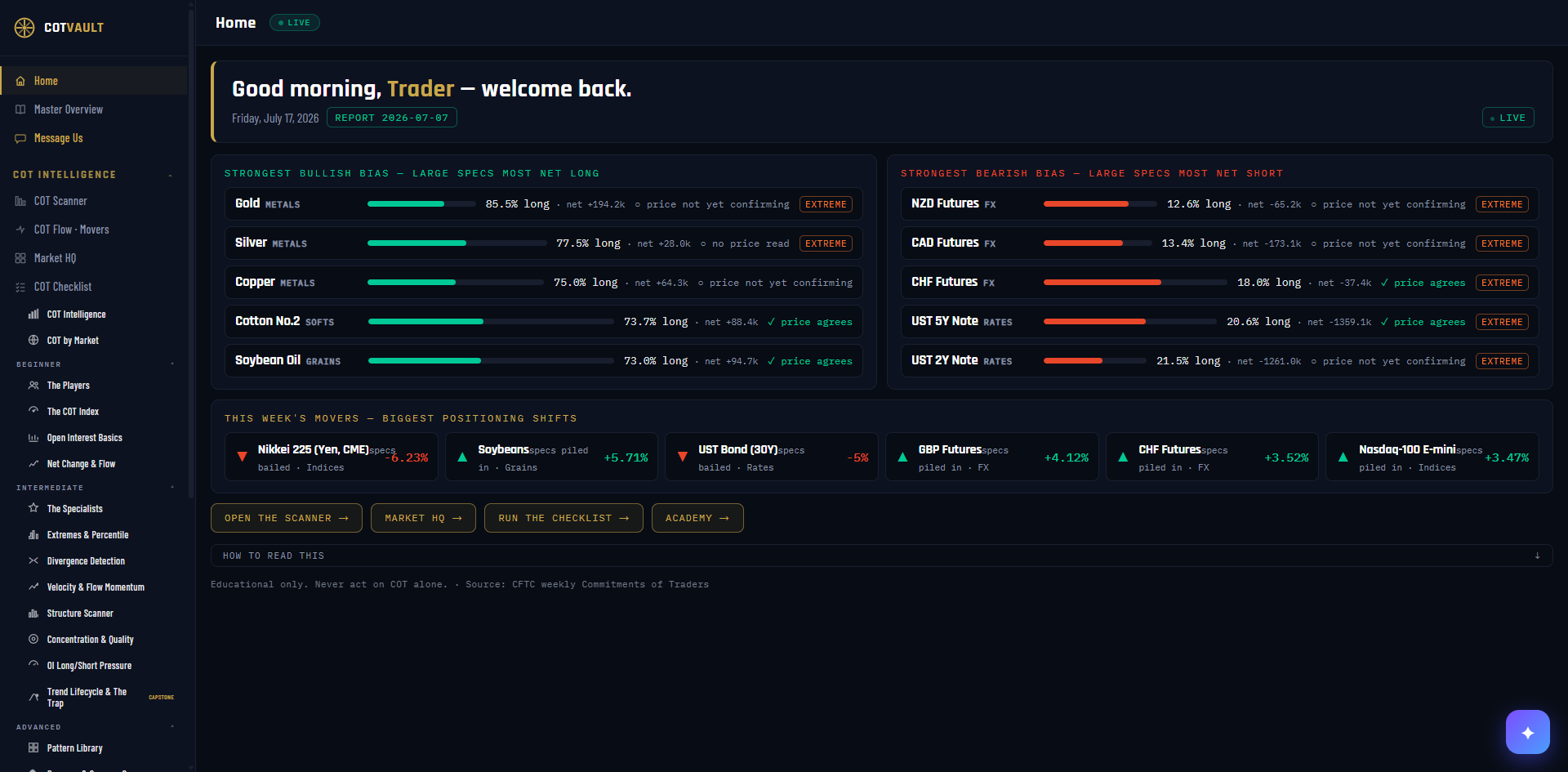
Home is the first screen you see after signing in — a daily briefing that distills the entire weekly CFTC report into one glance: who's most bullishly positioned, who's most bearishly positioned, and where the big money just moved. Think of it as the front page of the newspaper; every other panel is a full article.
What it measures
Every row is built from Large Speculator positioning — the hedge funds and CTAs the CFTC forces to report every week. Two numbers drive everything: % long (of all speculator contracts in that market, what share are bets on higher prices) and net position (long contracts minus short contracts). The panel then checks each featured market's recent price trend against that positioning to tell you whether the market is already moving the way the money is leaning.
Why it's useful to you
Ninety percent of retail traders pick a market first and look for reasons second. Home reverses that: in 30 seconds you know where institutional positioning is stretched (reversal watchlist), where it's flowing (momentum watchlist), and whether price has caught up yet. It also answers the quiet question that matters most: is my market boring this week? A market absent from every board has no positioning story — trade it on technicals alone or look elsewhere.
The 10-second read
Scan for EXTREME tags with a teal ✓ — crowded positioning that price is already confirming. Then check the movers strip for any market on your watchlist. Done.
Use it with: COT Scanner (the full ranked board) ·
Flow · Movers (every weekly shift) ·
Market HQ (drill into anything that caught your eye)
1
Greeting. Time-of-day aware, using your display name (change it any time via the pencil on your name badge, bottom-left of the dashboard).
2
REPORT date — the most important chip on the page. This is the CFTC report week the entire dashboard is reading. COT data is collected each Tuesday and published Friday afternoon — so positioning is always a few days behind price. That lag is normal and built into how every panel should be read.
3
STRONGEST BULLISH BIAS board. The five markets where large speculators are most net LONG right now — the crowd's favorite longs, ranked by conviction.
4
STRONGEST BEARISH BIAS board. The mirror: the five markets where speculators are most net SHORT. Red bars = short conviction.
5
Conviction bar. A visual of how lopsided positioning is — the further the bar extends, the further % long sits from a neutral 50/50. Teal = long-side conviction, red = short-side.
6
% long · net. "85.5% long" means 85.5 of every 100 speculator contracts in Gold are bets on higher prices. "net +194.2k" is the raw count: long contracts minus shorts. Percent shows how one-sided; net shows how big.
7
Price confluence. ✓ price agrees = the last month of price movement already points the same way as positioning (trend confirmed, but you're later). ○ price not yet confirming = the money is leaning before price has moved (earlier, riskier — watch for the turn). "no price read" = no price data cached for that market this hour.
8
EXTREME tag. Positioning is beyond 75% long or below 25% — the crowd is nearly all-in. Extremes are where trends get old and reversals are born, but they can persist for weeks. An EXTREME tag means "investigate," never "trade now" — open Extremes & Percentile and the Pressure gauge next.
9
THIS WEEK'S MOVERS. The six biggest week-over-week shifts in speculator positioning. ▲ piled in = aggressive new buying; ▼ bailed = aggressive exit. Flow often precedes the bias boards — this is where next month's extremes are born.
10
Quick links. The workflow shortcuts — Scanner, Market HQ, Checklist, Academy. Stage 2 of the reading order lives one click away.
11
HOW TO READ THIS. Every panel carries a built-in explainer like this one — collapsed by default, one click open. If you're ever lost on any panel, look for this bar first.
GROUPStart Here — the daily tools
02COT Scanner — The Whole Board, Ranked
FreeWhole-board view
Nav → COT Intelligence → COT Scanner
№ MAP PINS — the gold markers on this screenshot point at locations on the panel; each is explained in the legend beside it. (They are separate from the teal STEP numbers in Part 1.)
1
2
3
4
5
6
7
8
9
10
11
What it is
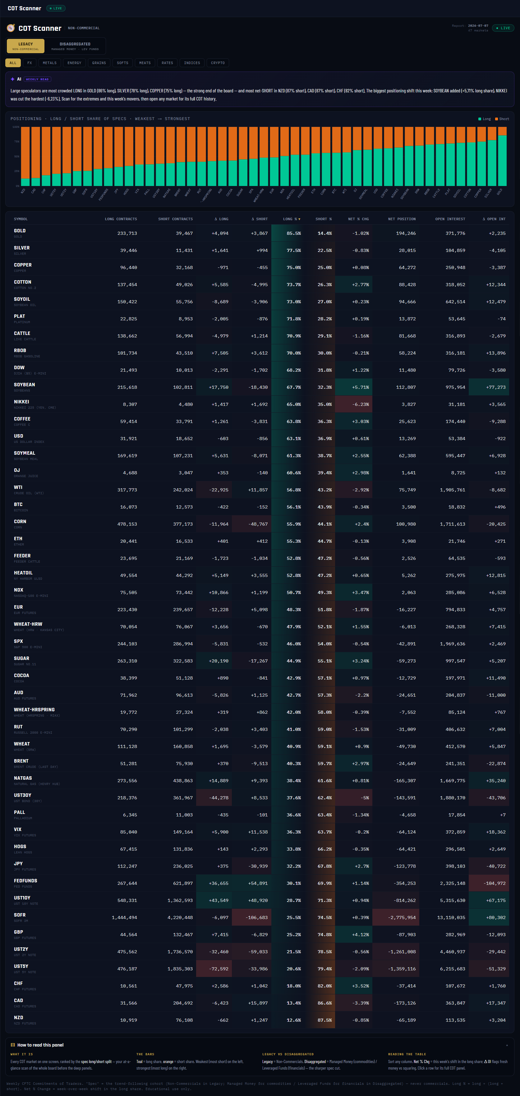
The Scanner is the master board: all 47 COT markets on one screen, ranked strongest to weakest by how one-sided speculator positioning is. Currencies, metals, energy, grains, softs, meats, rates, stock indexes and crypto — every market the deep panels cover, side by side, sortable by any column. It's the panel you open when you don't yet know which market deserves your attention this week.
What it measures
Every row is one market's speculator long/short split: Long % = long contracts ÷ (long + short), so 50% is balanced and anything near the edges is a crowd leaning hard one way. Alongside it: the raw long and short contract counts, the net position (longs minus shorts), open interest, and this week's deltas — Net % Chg is the week-over-week shift in the long share, and Δ Open Int tells you whether that shift came from new money or from positions closing. The LEGACY toggle reads Non-Commercials; DISAGGREGATED swaps in the sharper cut — Managed Money for commodities, Leveraged Funds for financial futures.
Why it's useful to you
A number in isolation lies. "60% long" sounds bullish until you see 46 other markets around it and realize it's mid-pack. The Scanner gives every reading its context in one glance — the crowded extremes at both ends of the board (in the screenshot, Gold at 85.5% long on top, NZD at 87.5% short on the bottom) and the week's biggest shifts in between. It stops the most common retail mistake: deep-diving a market before checking whether anything is even happening there.
The 10-second read
Read the two ends of the bar chart — most-short on the left, most-long on the right — then sort by Net % Chg to see who moved this week. Ends = crowding; movers = flow.
Use it with: COT Flow · Movers (the movers, ranked and charted) ·
Market HQ (drill into any row) ·
Extremes & Percentile (is that crowding historic, or normal?)
1
Panel title + cohort. "NON-COMMERCIAL" names the group you're currently reading — the large speculator crowd. It updates when you flip the report toggle (pin 2), so you always know whose positions the whole board reflects.
2
LEGACY / DISAGGREGATED toggle. Legacy = the classic Non-Commercial read, available for every market. Disaggregated = the professional cut: Managed Money for commodities, Leveraged Funds for financials — the purest speculator cohort the CFTC publishes. Same board, sharper lens.
3
Class tabs. Filter the board to one asset class — FX, METALS, ENERGY, GRAINS, SOFTS, MEATS, RATES, INDICES, CRYPTO — or ALL for the full 47. Rankings recompute within whatever you select.
4
Report date + LIVE chip. The CFTC report week every number on this board comes from (2026-07-07 in the screenshot), plus the market count. Almost every week that is one date for the whole board; if a market's CFTC ingest is behind, its row carries its own older date and the header says how many are behind, so you always know what you are comparing.
5
AI WEEKLY READ. A plain-English summary generated from the board itself: which markets are most crowded long, most net-short, and the week's biggest add and cut (in the screenshot, Soybean +5.71% added, Nikkei −6.23% cut). It always matches the table below it — it's a narration of this data, not an opinion.
6
Positioning bar chart. Every market as a stacked bar — teal = long share, orange = short share — arranged weakest (most short) on the left to strongest (most long) on the right. The shape of the whole board in one glance: a lot of tall teal on the right means the spec crowd is broadly risk-on.
7
Table header — every column sorts. Symbol, Long/Short Contracts, Δ Long, Δ Short, Long %, Short %, Net % Chg, Net Position, Open Interest, Δ Open Int. Click any header to re-rank the board by that question. The ▼ marks the current sort.
8
LONG % column (default sort). The share of speculator contracts that are long, heat-shaded so extremes glow. This is the ranking number: comparable across every market regardless of size, which is exactly why the board leads with it instead of raw contracts.
9
NET % CHG + Δ OI. Net % Chg = how many percentage points the long share moved since last week — the "what just happened" column. Read it with Δ Open Int: a shift on rising OI = fresh money entering with conviction; a shift on falling OI = old positions closing out. Same shift, very different meaning.
10
Top row — the most crowded long. In the screenshot Gold leads the board at 85.5% long. Top and bottom rows are the crowding extremes — the markets where the speculator crowd is closest to all-in, and where the reversal-watch panels earn their keep. Click any row to open that market's full COT panel.
11
HOW TO READ THIS PANEL. The built-in explainer — collapsed by default, one click open. Covers the bars, the two report lenses, and the table columns.
03COT Flow · Weekly Movers — Who Piled In, Who Bailed
VaultWhole-board view
Nav → COT Intelligence → COT Flow · Movers
№ MAP PINS — the gold markers on this screenshot point at locations on the panel; each is explained in the legend beside it. (They are separate from the teal STEP numbers in Part 1.)
1
2
3
4
5
6
7
8
9
10
11
12
What it is
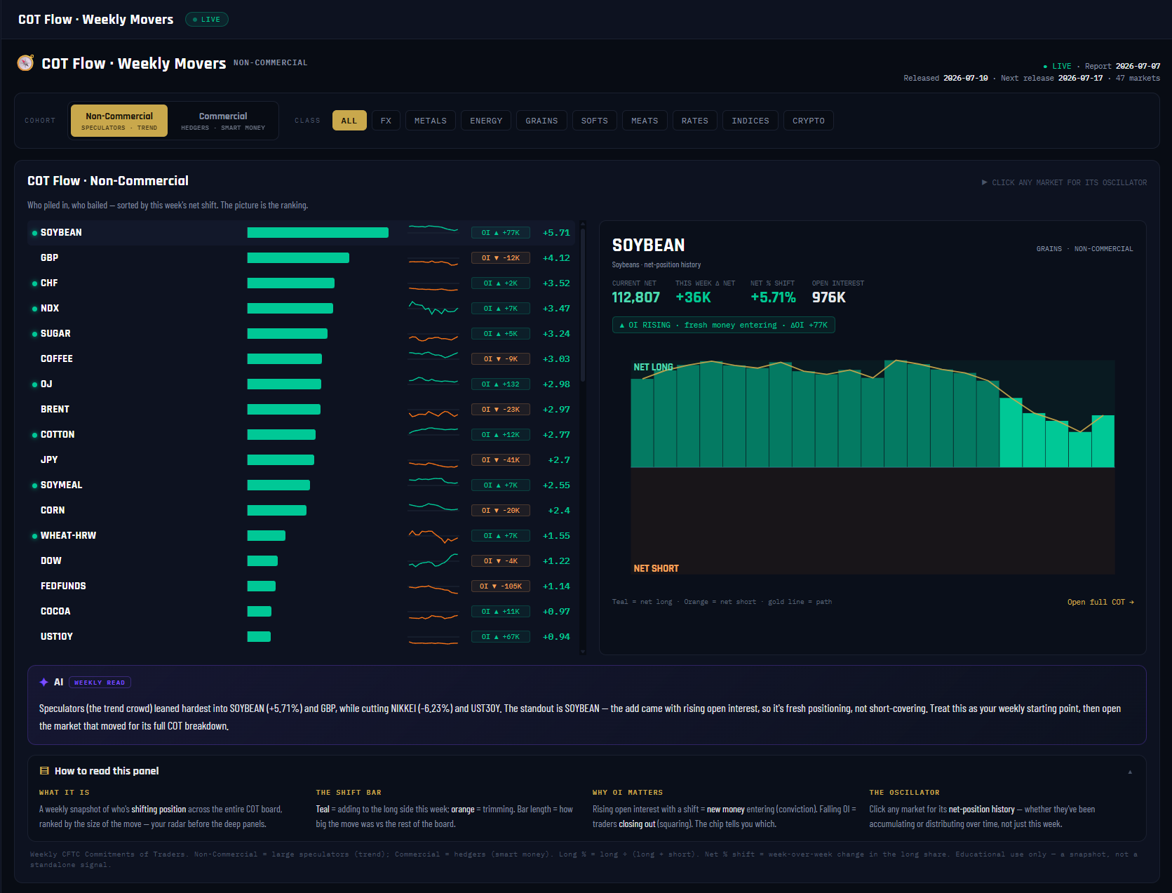
The Scanner ranks where positioning sits; Flow ranks what it did. This board sorts every COT market by the size of this week's positioning shift — who piled in at the top, who bailed at the bottom — with a click-through detail card showing any market's full net-position history. It's the "what changed since last Friday" front door.
What it measures
For the cohort you pick — Non-Commercial (the speculator crowd) or Commercial (the hedgers) — each market gets a net % shift: this week's long share minus last week's, in percentage points. That one number ranks the board. Around it: the raw net position and its weekly change in contracts, an open interest chip (rising OI = new money entering; falling OI = positions being squared), and a sparkline of up to two years of net-position history so you can see whether this week's move extends a build or interrupts one. A glowing conviction dot marks shifts of 1.5% or more that came with rising OI.
Why it's useful to you
Extremes take months to form; they're born in weeks like the ones at the top of this board. Flow catches the build while it's happening — before the market shows up on any extremes list. It also protects you from the classic misread: a big shift on falling open interest is mostly old positions closing, not a new bet. In the screenshot, Soybean tops the board at +5.71% with the OI RISING verdict — that's fresh positioning, the kind worth following up.
The 10-second read
Read the top three and bottom three shift bars, then check each one's OI chip: big shift + rising OI = conviction, big shift + falling OI = housekeeping. Click anything interesting for its oscillator.
Use it with: COT Scanner (where positioning sits after the move) ·
Market HQ (every lens on the market that moved) ·
The Players (who's on the other side of the shift)
1
Panel title + cohort label. "NON-COMMERCIAL" names whose flows you're ranking. Everything on the board — bars, sparklines, the detail card — reads that one group.
2
Cohort toggle. Non-Commercial = the large speculator crowd, the trend-followers. Commercial = the hedgers, historically the informed contrarian side. Flip it to see the same week from the opposite chair — heavy commercial buying is often the mirror image of spec selling.
3
Class tabs. ALL / FX / METALS / ENERGY / GRAINS / SOFTS / MEATS / RATES / INDICES / CRYPTO — narrow the movers board to one asset class.
4
The three dates. Report 2026-07-07 (the Tuesday positions were counted), Released 2026-07-10 (the Friday the CFTC published), Next release 2026-07-17. Positioning is always a few days behind price — these chips keep the lag honest.
5
Shift bars — the ranking itself. Teal = adding to the long side this week, orange = trimming; bar length = the size of the move versus the rest of the board. In the screenshot Soybean leads at +5.71. The picture is the ranking — the biggest stories are always at the two ends.
6
Sparkline column. Each market's recent net-position path (up to two years, weekly). It answers the question the one-week number can't: is this shift the continuation of a long build, or a sudden break from one?
7
OI chips. "OI ▲ +77K" = open interest rose that many contracts this week. Rising OI with a shift = new money entering (conviction). Falling OI = traders closing out (squaring). The same +3% shift means opposite things depending on this chip.
8
Oscillator detail card. Click any market to open its deep view here — the current net position (Soybean: 112,807 net long), this week's change (+36K), and the net % shift, all in the cohort you selected.
9
The OI verdict chip. The card's one-line conclusion: ▲ OI RISING · fresh money entering or ▼ OI FALLING · positions being squared. This is the conviction filter, stated in plain words.
10
Net-position history chart. Weekly bars of the group's net position — teal above zero (net long), red below (net short) — with a gold path line tracing the journey. Accumulation and distribution campaigns that a single weekly number hides are obvious here.
11
AI WEEKLY READ. A plain-English narration of the board: who leaned hardest into what, who cut, and which add came with rising open interest (the standout). Generated from the same rows you're looking at — it always matches the bars.
12
HOW TO READ THIS PANEL. The built-in explainer — the shift bar, why OI matters, and what the oscillator shows. One click open whenever you need a refresher.
04Market HQ — Every COT Lens, One Screen
VaultSingle-market view
Nav → COT Intelligence → Market HQ
№ MAP PINS — the gold markers on this screenshot point at locations on the panel; each is explained in the legend beside it. (They are separate from the teal STEP numbers in Part 1.)
1
2
3
4
5
6
7
8
9
10
11
12
What it is
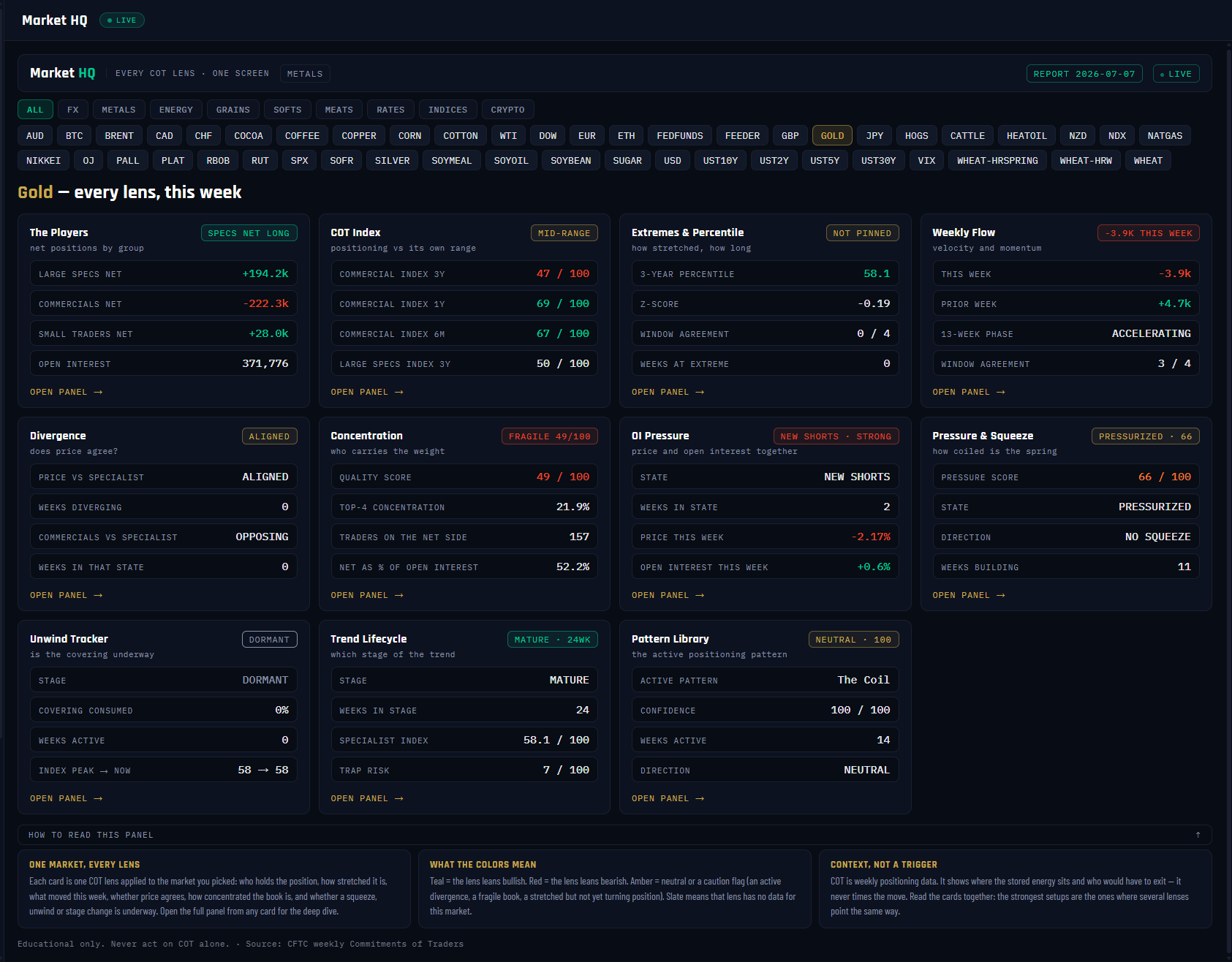
Market HQ is the one-market command center: pick any of the 47 COT markets and see all eleven analytical lenses at once — one card each for The Players, COT Index, Extremes, Weekly Flow, Divergence, Concentration, OI Pressure, Pressure & Squeeze, Unwind, Trend Lifecycle and Pattern Library. Every card carries a verdict chip, its four key numbers, and an "Open panel →" link into the full deep-dive. It's the map you read before deciding which deep panel deserves the next ten minutes.
What it measures
Nothing new — and that's the point. Each card is fed by the same canonical endpoint as its full panel, so the number on the card and the number on the deep panel are always identical. The Players card shows the three groups' net positions; the COT Index card shows the Commercial index on 3-year, 1-year and 6-month windows (0–100); Extremes shows percentile, z-score and weeks pinned; Weekly Flow shows this week's net contract change and the 13-week phase; and so on through pressure score, unwind stage, lifecycle stage and the active pattern. Eleven independent computations, one report week.
Why it's useful to you
The deep panels are powerful but there are eleven of them — opening each one for every market you're curious about doesn't scale. HQ compresses the full workup into one screen so you can triage: anything glowing teal or red is a thread worth pulling; a wall of amber and slate means a low-information week. In the screenshot, Gold reads mostly mid-range (COT Index MID-RANGE, extremes NOT PINNED, divergence ALIGNED) but three cards stand out — Concentration FRAGILE 49/100, OI Pressure NEW SHORTS, Pressure & Squeeze PRESSURIZED 66 — telling you exactly which three panels to open next.
The 10-second read
Scan the eleven verdict chips for color: teal = the lens leans bullish, red = bearish, amber = caution. Count how many point the same way, then open the panels behind the outliers.
Use it with: COT Checklist (the same read, graded and sequenced for you) ·
COT Scanner (find which market deserves an HQ visit) ·
The Players (the natural first drill-down)
1
Panel title. "Every COT lens · one screen" is the contract: eleven cards, one market, one report week. The class chip next to it names the asset class of the selected market (METALS for Gold).
2
Class chips. ALL / FX / METALS / ENERGY and the rest — filter the market grid below to one asset class before picking.
3
Market chips grid. Every market on the platform, one chip each — the selected one (GOLD in the screenshot) is highlighted. Switch markets here and all eleven cards refetch and repaint.
4
REPORT chip + LIVE. The CFTC report week every card is reading (2026-07-07). All eleven lenses are computed from the same weekly report. If a market's ingest is behind, it is marked with its own date rather than shown as current.
5
The Players card. Net positions for all three groups — Large Specs, Commercials, Small Traders — plus open interest. The verdict chip states the speculator side plainly: SPECS NET LONG in the screenshot. This is always the first card to read: whose money is where.
6
COT Index card. The Commercial positioning index on three windows — 3-year (the verdict window), 1-year and 6-month — each 0–100, with the Large Specs 3-year index for contrast. Chips: 80+ = BULLISH EXTREME, 60+ = BULLISH LEAN, MID-RANGE, 40− = BEARISH LEAN, 20− = BEARISH EXTREME. Gold reads MID-RANGE here.
7
Extremes & Percentile card. The 3-year percentile, z-score, how many of the 4 look-back windows agree, and — the chip — how many weeks positioning has been pinned at an extreme. NOT PINNED (as Gold shows) means no sustained extreme; duration only starts counting once positioning pushes past the 70th or below the 30th percentile.
8
Weekly Flow card. This week's net contract change (chip: −3.9K THIS WEEK for Gold — specs trimmed), the prior week for comparison, the 13-week phase (accelerating / trending / decelerating / reversing) and cross-window agreement out of 4.
9
Pressure & Squeeze card. The 0–100 structural-tension score with its state ladder (DORMANT → BUILDING → PRESSURIZED → CRITICAL), squeeze direction and weeks building. Gold's PRESSURIZED · 66 is the kind of amber flag HQ exists to surface — stored energy, worth the full panel.
10
Trend Lifecycle card. Which stage the positioning trend is in (EARLY / MATURE / EXHAUST / SHIFT), weeks in that stage, the specialist index and the trap-risk score. Gold: MATURE, 24 weeks in — an established trend, not a fresh one.
11
OPEN PANEL → links. Every card is a doorway: the link opens that lens's full panel with the same market selected, and a back pill returns you here. HQ summarizes; the panels explain.
12
HOW TO READ THIS PANEL. The color key (teal bullish, red bearish, amber neutral/caution, slate no data) and the standing rule: the strongest setups are the ones where several lenses point the same way — and COT is context, never a trigger.
05COT Checklist — The Seven-Question A-to-Z Read
VaultSingle-market view
Nav → COT Intelligence → COT Checklist
№ MAP PINS — the gold markers on this screenshot point at locations on the panel; each is explained in the legend beside it. (They are separate from the teal STEP numbers in Part 1.)
1
2
3
4
5
6
7
8
9
10
11
12
What it is
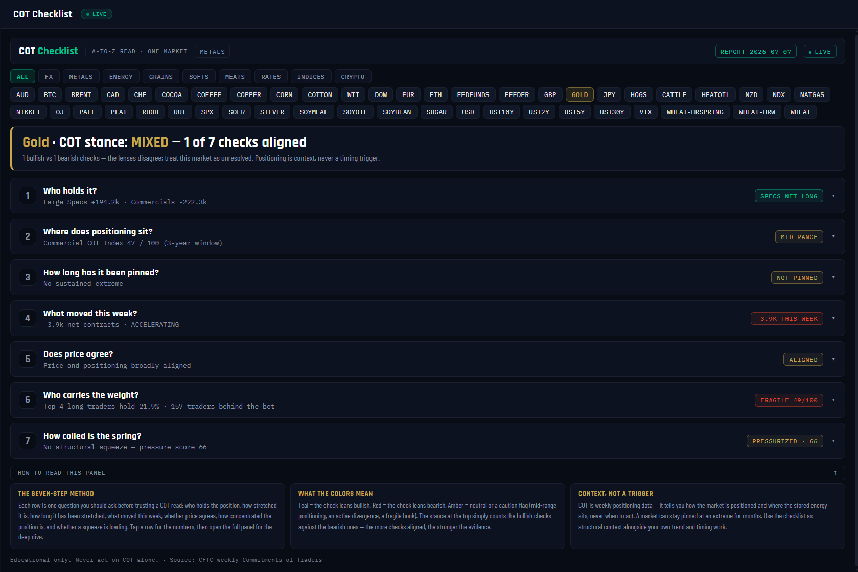
The Checklist is the guided version of a professional COT workup: seven questions, asked in the right order, each auto-graded from live data, with a composite stance at the top. Pick a market and it runs the whole routine for you — who holds it, how stretched it is, how long it's been pinned, what moved this week, whether price agrees, how concentrated the book is, and how coiled the squeeze spring is. Each row expands into the numbers and a plain-English read, with a link to the full panel behind it.
What it measures
Each step reads the same canonical data as its parent panel. Step 1 grades the Large Specs' net position (long or short). Step 2 grades the Commercial COT Index on the 3-year window — 60+ leans bullish, 40− bearish, 80/20 mark extremes. Step 3 counts weeks pinned at an extreme. Step 4 grades this week's net contract flow and its 13-week phase. Step 5 checks price against positioning (confirming, aligned, or diverging). Step 6 scores participation quality — top-4 concentration, trader count, net as % of open interest — as a caution flag rather than a directional vote. Step 7 reads the pressure score and squeeze direction. The stance strip then counts bullish checks against bearish ones.
Why it's useful to you
The most expensive habit in COT reading is cherry-picking: finding the one lens that agrees with the trade you already want. The Checklist makes that impossible — all seven questions get asked, every time, in the same order, and the disagreements are printed at the top. In the screenshot Gold grades MIXED — 1 of 7 checks aligned: Large Specs are +194.2k net long, but the Commercial index sits mid-range at 47, nothing is pinned, and this week's flow was −3.9k. That "unresolved" verdict is itself the finding — it tells you to wait, or to look elsewhere.
The 10-second read
Read the stance strip, then scan the seven verdict chips down the right edge. Several chips one color = evidence stacking; a rainbow = an unresolved market. Expand only the rows that surprise you.
Use it with: Market HQ (the free-scan version of the same lenses) ·
The Players (the full story behind Step 1) ·
Pressure & Squeeze (the deep dive behind Step 7)
1
Panel title. "A-to-Z read · one market" — the Checklist is deliberately single-market. It answers "should I trust a COT read on THIS market?", not "which market should I look at?" (that's the Scanner's job).
2
Market chips. Class filters plus one chip per market — GOLD selected in the screenshot. Switching markets reruns all seven checks and rebuilds the stance.
3
Composite stance strip. The headline verdict: BULLISH LEAN, BEARISH LEAN, MIXED or NEUTRAL, with "N of 7 checks aligned" counting the checks agreeing in the winning direction. In the screenshot: "Gold · COT stance: MIXED — 1 of 7 checks aligned" — the lenses disagree, so the market is treated as unresolved. The strip's left border takes the stance color: teal, red or gold.
4
Step 1 — Who holds it? The three groups' net positions from The Players: in the screenshot, Large Specs +194.2k against Commercials −222.3k, with Small Traders and open interest inside the expanded row. The expanded read also tells you which side has been building over the last month — the accumulating side is the one with conviction.
5
Verdict chip column. One auto-graded chip per step — teal = that check leans bullish, red = bearish, amber = neutral or a caution flag. This column IS the checklist: read it top to bottom before expanding anything.
6
Step 2 — Where does positioning sit? The Commercial COT Index on the 3-year window (Gold: 47/100 — MID-RANGE), with the 6-month, 1-year and Large Specs readings inside. High = Commercials net long versus their own range — historically a bullish backdrop; 80/20 mark extremes worth respecting.
7
Step 3 — How long has it been pinned? Weeks at an extreme, plus the 3-year percentile, z-score and window agreement. A one-week spike and a twelve-week pin are different animals — the longer the pin, the more fuel stored for the eventual unwind. Gold: NOT PINNED.
8
Step 4 — What moved this week? This week's net contract change against last week's, with the 13-week phase. Gold: −3.9k this week while the longer flow reads ACCELERATING — the windows disagree, so the near-term cut may just be a correction inside the larger build.
9
Step 5 — Does price agree? The divergence check: price CONFIRMING positioning (funded move), ALIGNED (no tension), or DIVERGING with a week count (tension building). Gold reads ALIGNED — no active divergence either way.
10
Step 6 — Who carries the weight? Participation quality: the quality score, top-4 concentration, trader count and net as % of OI. Gold: FRAGILE 49/100 — top-4 hold 21.9% of the long side, 157 traders behind it. This step colors as a caution, not a direction — a fragile book has a narrow exit whichever way you lean.
11
Step 7 — How coiled is the spring? The pressure score (0–100), state and squeeze direction from the Pressure gauge. Gold: PRESSURIZED · 66 with no squeeze direction — structural tension present, release not yet loaded one way.
12
HOW TO READ THIS PANEL. The seven-step method, the color key, and the rule that outranks everything: the stance simply counts checks — a market can stay pinned for months, so positioning is context, never a timing trigger.
06COT Intelligence — The Signal Board
VaultWhole-board view
Nav → COT Intelligence → COT Intelligence
№ MAP PINS — the gold markers on this screenshot point at locations on the panel; each is explained in the legend beside it. (They are separate from the teal STEP numbers in Part 1.)
1
2
3
4
5
6
7
8
9
10
11
12
What it is
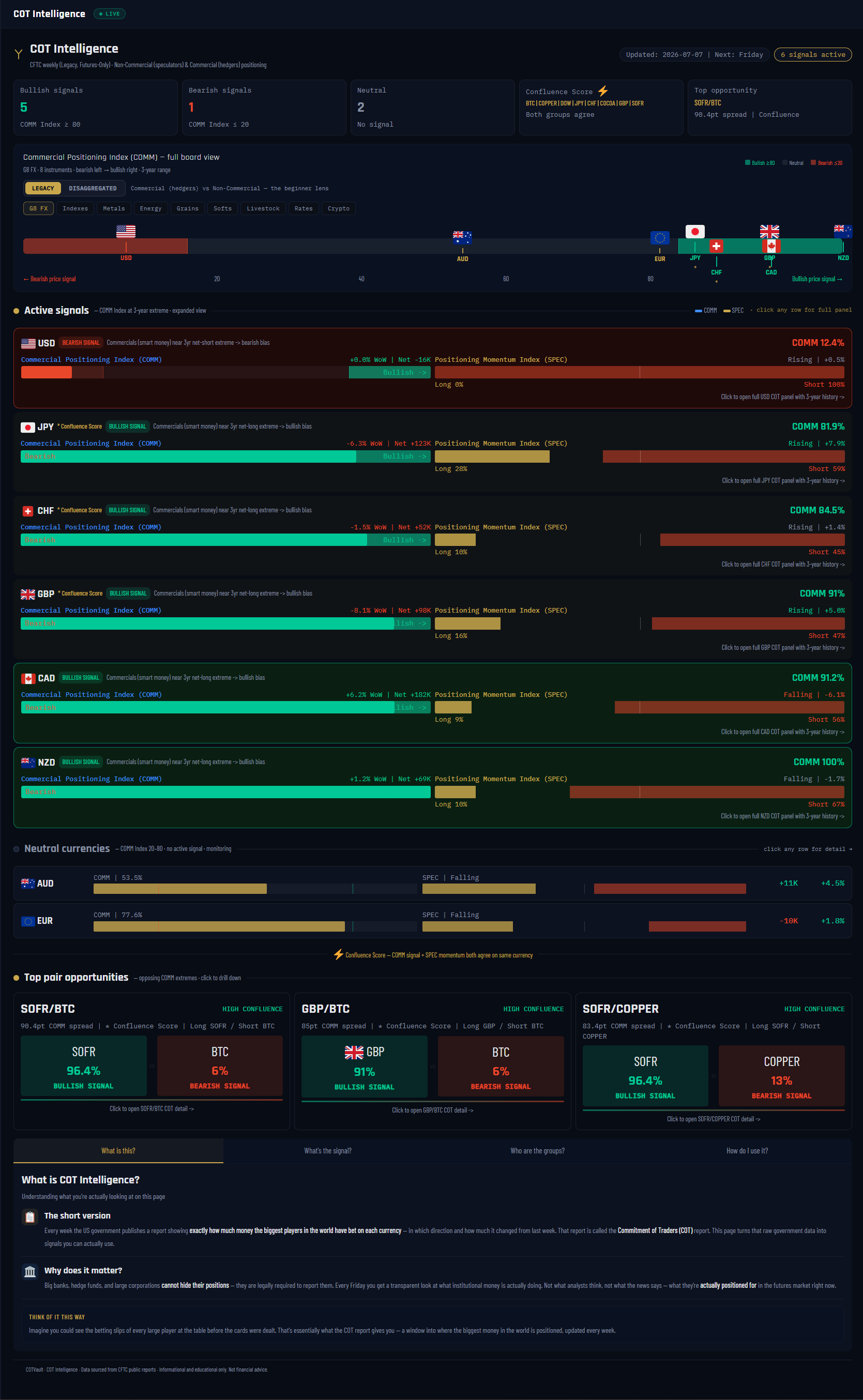
COT Intelligence is the signal board: the currency panel that turns raw weekly positioning into a short list of active bullish and bearish signals, a spectrum showing where every currency sits between the two extremes, and auto-surfaced pair matchups. Where the Scanner ranks and the deep panels explain, Intelligence decides what counts as a signal — and shows you only what cleared the bar this week.
What it measures
The engine is the Commercial positioning index (COMM): each currency's Commercial net position placed inside its 3-year range on a 0–100 scale. Platform convention: high COMM = Commercials heavily net long = bullish backdrop. A signal fires only at the edges — COMM ≥ 80 is bullish, ≤ 20 is bearish; everything between is neutral and merely monitored. Each active row also shows the week-over-week change, the net contract position, and the SPEC Positioning Momentum bars (the speculator long/short split). When the COMM signal and the SPEC momentum agree on the same currency, it earns the ⚡ Confluence Score — the strongest read this board produces. The DISAGGREGATED toggle swaps in specialist positioning (Managed Money / Leveraged Funds), read as positioning states rather than buy/sell signals.
Why it's useful to you
Most weeks, most currencies are noise — mid-range positioning with nothing to say. This board's job is to keep you out of those and point you at the exceptions. In the screenshot the week produced 5 bullish, 1 bearish, 2 neutral: NZD's Commercials at 100 (maximum of the 3-year range), GBP at 91, CAD at 91.2 — while USD sits at 12.4, bearish. It then does the pairing math for you: a bullish-extreme currency against a bearish-extreme one is where positioning gives a trade the widest tailwind, and those matchups are surfaced automatically with their COMM spread.
The 10-second read
Read the three counter cards, then the spectrum: flags at the far right are bullish signals, far left bearish. Anything with the ⚡ Confluence mark outranks everything else on the board.
Use it with: The COT Index (how the 0–100 number is built) ·
COT Scanner (the same week across all 47 markets) ·
Market HQ (full workup on any signal currency)
1
Panel title. The subheader states the source and both cohorts: CFTC weekly (Legacy, Futures-Only) · Non-Commercial (speculators) & Commercial (hedgers) positioning.
2
Signal counter cards. The week in three numbers — Bullish signals (COMM ≥ 80), Bearish signals (COMM ≤ 20), Neutral (everything between). In the screenshot: 5 bullish, 1 bearish, 2 neutral — an unusually loud week.
3
Confluence Score ⚡ card. Lists the currencies where the COMM signal and the SPEC momentum both point the same way. Aligned signals are the board's highest-conviction reads; unaligned ones are weaker — the hedgers are leaning but the crowd hasn't followed (or vice versa).
4
Top opportunity card. The single widest matchup on the board — in the screenshot SOFR/BTC with a 90.4-point COMM spread. The bigger the spread between one market's index and another's, the harder positioning leans into that pairing.
5
LEGACY / DISAGGREGATED toggle + class tabs. Legacy = the Commercial-vs-Non-Commercial beginner lens with the signal semantics above. Disaggregated = the specialist lens (Managed Money for commodities, Leveraged Funds for financials) shown as positioning states — EXTREME / STRETCHED / LEANING — because a speculator extreme is a crowding fact, not a buy signal. Class tabs filter the board.
6
The COMM spectrum. Every currency's flag placed along the full 0–100 range — bearish price signal on the left (≤ 20), neutral middle, bullish on the right (≥ 80). One glance shows the whole board's shape: clustered flags mean a quiet week, flags at both walls mean pair opportunities.
7
Active signals rows. Only currencies at an extreme appear here, expanded. In the screenshot USD is the lone bearish row — COMM 12.4, meaning the dollar's Commercials are nearly as net short as they've been in three years. Click any row for that currency's full COT detail panel.
8
COMM index bar + WoW + net. Each row's bar shows where the index sits in its 0–100 range with the 20/80 signal lines marked, plus the week-over-week change and the Commercials' net contract position — level, direction and size in one line.
9
SPEC Positioning Momentum bars. The speculator side of the same currency — the long/short split of Non-Commercial positions. This is the confluence check made visible: a bullish COMM signal with specs already building long earns the ⚡; specs leaning the other way means the hedgers are early and the crowd hasn't turned.
10
Neutral currencies section. Everything with COMM between 20 and 80 (AUD and EUR in the screenshot) — compressed to one line each, no signal, monitoring only. Deliberately boring: this section exists so you don't manufacture trades out of mid-range noise.
11
Top pair opportunities. Auto-surfaced matchups where one market's index is high (≥ 70) and another's low (≤ 30), ranked by spread with HIGH CONFLUENCE pairs first, each stated as "Long X / Short Y". The screenshot's leader: SOFR/BTC, HIGH CONFLUENCE. Take the pairing to your own chart — this is the wind direction, not the entry.
12
Beginner explainer tabs. Four tabs — What is this? / What's the signal? / Who are the groups? / How do I use it? — a built-in mini-course covering the report, the 80/20 thresholds, the three trader groups and the workflow, ending with the rule that governs the whole platform: COT sets the backdrop; your chart times the entry.
07COT by Market — The Single-Market Deep Dive
VaultSingle-market view
Nav → COT Intelligence → COT by Market (or click any market on the Intelligence board)
№ MAP PINS — the gold markers on this screenshot point at locations on the panel; each is explained in the legend beside it. (They are separate from the teal STEP numbers in Part 1.)
1
2
3
4
5
6
7
8
9
10
11
What it is
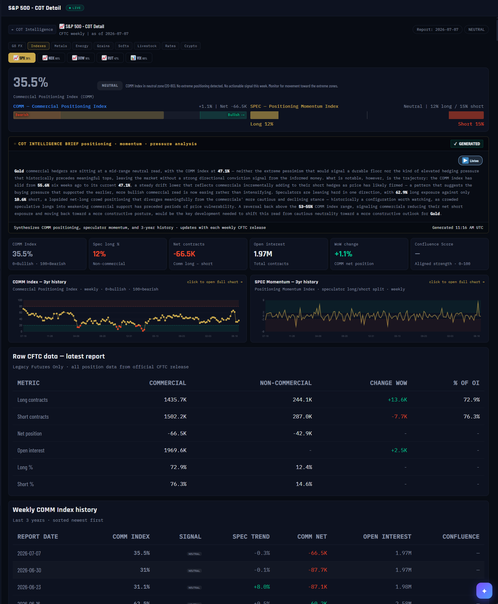
The full dossier on one market — every COT number the CFTC publishes for it, this week and three years back, on a single page. You usually arrive here by clicking a market on the COT Intelligence board; the class tabs and market chips at the top let you jump anywhere without leaving.
What it measures
Everything, for one market: the COMM Index headline (commercial positioning inside its 3-year range — the screenshot shows the S&P 500 at 35.5%, NEUTRAL), the SPEC momentum read with the crowd’s long/short split, the exact raw CFTC table (long, short, net, open interest and week-over-week change for Commercials and Non-Commercials), and the full weekly history so you can see how every reading evolved.
Why it's useful to you
Boards compress; this page shows the receipts. When a scanner reading surprises you, come here to see the actual contracts behind it before you trust it. It’s also the bridge to the price chart — the two history minicharts click through to the full COMM Index Chart with candles (next entry).
The 10-second read
Headline % and its badge → the two gauge bars (commercials vs the crowd) → any surprise, scroll to the raw table and confirm the contracts.
Use it with: COT Intelligence ·
Market HQ · the COMM Index Chart (below)
1
Market title + back link. Which market you’re dissecting, with one-click return to the Intelligence board. The report-week chip sits top-right.
2
Class tabs + market chips. Jump between asset classes and markets without leaving the deep dive. Each chip shows the market’s current spec-long share.
3
COMM Index headline. Commercial positioning inside its 3-year range with its signal badge. Note this page’s scale note: on this board the index is displayed with 0 = bullish, 100 = bearish — read the badge, not just the number.
4
The two gauge bars. COMM (commercial positioning with net contracts and weekly change) and SPEC (the crowd’s momentum with its long/short split — here 12% long vs 15% short).
5
COT Intelligence Brief. The AI analyst’s written read of positioning, momentum and pressure — regenerated with each weekly CFTC release.
6
Listen. Every brief can be read aloud — same voice system as the rest of the platform.
7
Stat cards. The week at a glance: COMM Index, spec long %, net contracts, total open interest, week-over-week change, and the confluence score when signals align.
8
COMM Index — 3-year history. Every weekly reading; red dots mark extreme-zone visits. Click to open the full chart with price candles.
9
SPEC momentum — 3-year history. The crowd’s weekly positioning swings over the same window. Also clicks through to the full chart.
10
Raw CFTC table. The unprocessed numbers from the official release — longs, shorts, net, open interest, weekly change, share of OI, for both cohorts. When in doubt, this table is the ground truth.
11
Weekly history table. Three years of report-by-report readings, newest first — index, signal, spec trend, commercial net, open interest.
08COMM Index Chart — Price Over Positioning
VaultSingle-market view
COT by Market → click either history chart
№ MAP PINS — the gold markers on this screenshot point at locations on the panel; each is explained in the legend beside it. (They are separate from the teal STEP numbers in Part 1.)
1
2
3
4
5
6
7
8
What it is
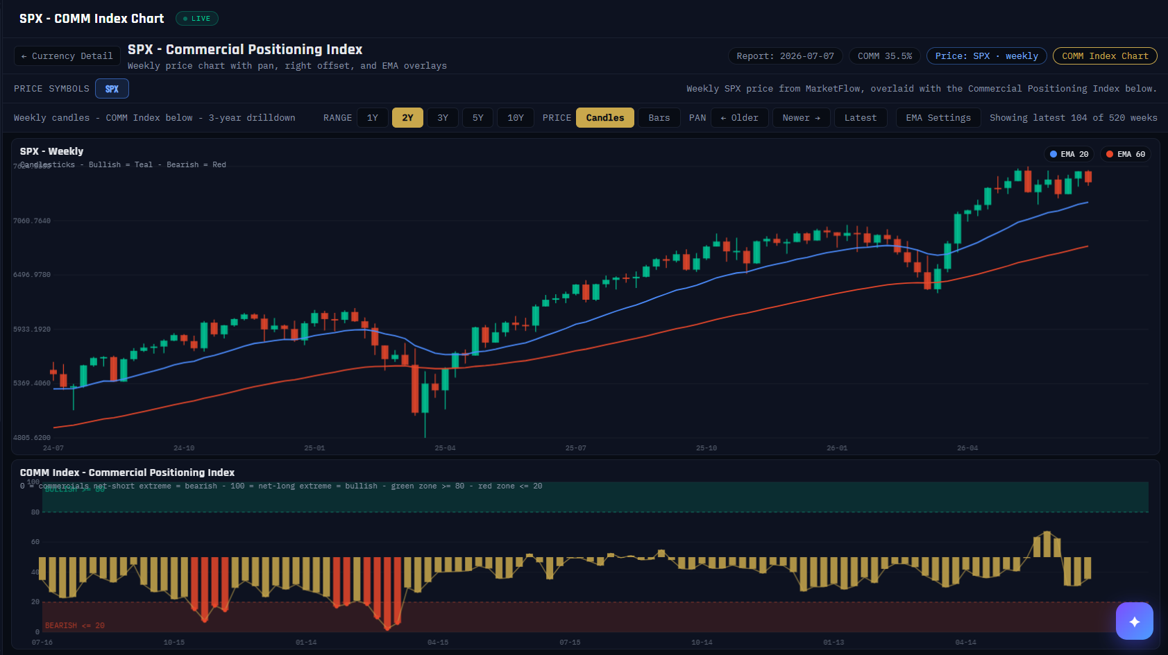
The panel where positioning finally meets price: weekly candles on top, the Commercial Positioning Index bar-for-bar underneath, on one shared timeline. This is where the theory of every other panel becomes visible — you can see commercial extremes lining up with turns in the actual chart.
What it measures
Top pane: weekly OHLC candles (teal up, red down) with 20- and 60-week EMA overlays, pannable across up to ten years. Bottom pane: the COMM Index, 0–100 — on this chart 100 = commercials at their net-long extreme = bullish backdrop, with the green zone ≥ 80 and red zone ≤ 20 shaded on the scale itself.
Why it's useful to you
It’s the receipts for the contrarian thesis. Scroll any market’s history and watch what happened after the bars pinned in a zone. It’s also the honesty check — you’ll see extremes that resolved slowly or late, which is exactly why the platform pairs positioning with pressure, readiness and your own price analysis before anything is acted on.
The 10-second read
Find the last time the lower pane entered a shaded zone, then look straight up at what the candles did next. Repeat across history — that’s the panel’s whole lesson.
Use it with: COT by Market (above) ·
The COT Index ·
Divergence Detection
1
Title + back link. Which market and which lens (COMM here; a SPEC variant exists for the crowd’s side), with a one-click return to the detail page.
2
Context chips. The report week, the current COMM Index reading, and the price series being drawn (weekly, from the live price feed).
3
Range + style controls. 1Y–10Y windows, candles or bars, and PAN to walk backward through history — Older / Newer / Latest.
4
Window counter. How much of the available history you’re seeing (here 104 of 520 weeks).
5
Price pane. Weekly candles with EMA-20 and EMA-60 overlays — enough structure to see trend without turning this into a trading terminal.
6
EMA legend. Which overlay is which; EMA settings are adjustable.
7
COMM Index pane. The same weeks as the candles above, bar for bar. Gold bars = mid-range; bars turn red in the bearish zone. Alignment with the price pane is the entire point.
8
The zones. BULLISH ≥ 80 (commercials near their net-long extreme) and BEARISH ≤ 20 shaded directly on the scale — no mental math required.
GROUPThe Beginner boards — the fundamentals
09The Players — Who Holds the Market
VaultSingle-market view
Nav → Beginner → The Players
№ MAP PINS — the gold markers on this screenshot point at locations on the panel; each is explained in the legend beside it. (They are separate from the teal STEP numbers in Part 1.)
1
2
3
4
5
6
7
8
9
10
11
12
What it is
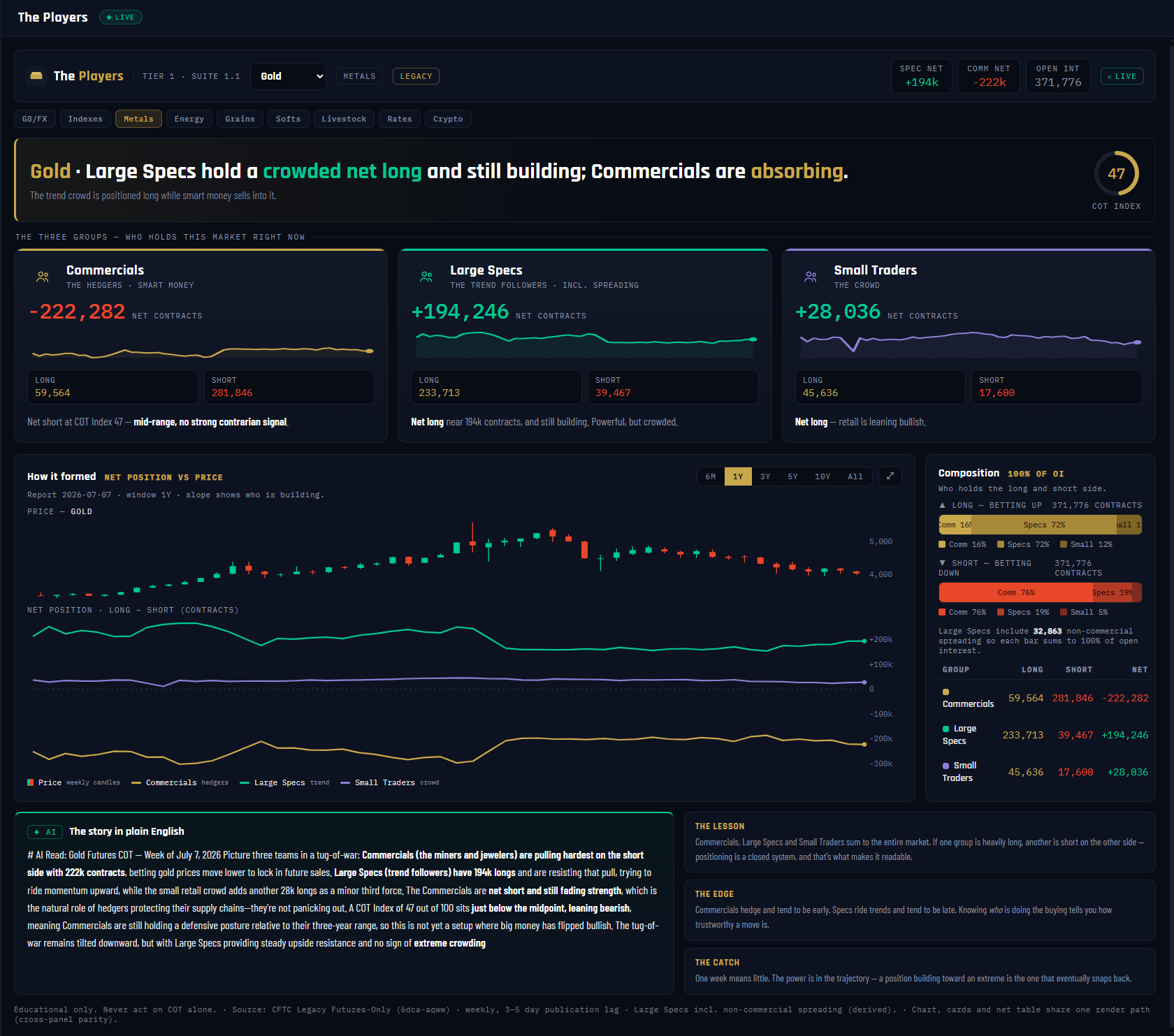
The Players is where every deep read begins: it splits one market into the three groups the CFTC's Legacy report tracks — Commercials, Large Speculators and Small Traders — and shows exactly whose money sits where. In the Gold example, Large Specs hold a crowded +194,246 net long while Commercials sit -222,282 net short on the other side. Every other panel assumes you know this picture; this one draws it.
What it measures
For each group the panel takes long contracts minus short contracts = net position, straight from the week's Legacy Futures-Only report (2026-07-07 here). The Composition bars restate the same data as shares of total open interest — 371,776 contracts in Gold — with non-commercial spreading folded into Large Specs so each bar sums to exactly 100% of OI. The COT Index dial places the Commercials' net inside its 3-year range on a 0–100 scale: high = Commercials heavily net long = bullish backdrop. Gold reads 47 — mid-range.
Why it's useful to you
A move means different things depending on who is doing the buying. Commercials are hedgers — historically early, buying weakness and selling strength. Large Specs are the trend crowd — right mid-trend, wrong at the turns. When you see Specs maxed long and Commercials absorbing the other side (exactly Gold's picture here), you know the trend is mature and running on the crowd's money. Skipping this panel is how retail traders end up buying a market whose informed side is quietly selling to them.
The 10-second read
Verdict banner first, then the three net cards: who's long, who's short, how big. Glance at the dial — near 80 or 20 means the backdrop itself is stretched. Done.
Use it with: The COT Index (how stretched is this net, historically) ·
Net Change & Flow (what these groups did this week) ·
The Specialists (the sub-groups hiding inside "Large Specs")
1
Market picker. The dropdown drives the whole panel — Gold here, tagged METALS and LEGACY (the report family this Tier 1 panel reads). Switch markets and every card, chart and narrative recomputes.
2
Stat chips. The headline in three numbers: SPEC NET +194k, COMM NET -222k, OPEN INT 371,776. If you read nothing else, read these.
3
Verdict banner. The panel's one-line conclusion: "Large Specs hold a crowded net long; Commercials are absorbing." Plain English before any chart.
4
COT Index mini-dial. The Commercials' net placed in its 3-year range, 0–100. High = Commercials heavily net long = bullish backdrop; low = bearish. Gold's 47 says the backdrop itself is neutral even though the Specs are crowded.
5
Commercials card. The hedgers — producers, processors, banks hedging real exposure. Net -222,282 with the full long/short split below. They are short because someone must be — they sell strength to the crowd.
6
Large Specs card. Funds and CTAs — the trend crowd. Net +194,246. This is the position that measures how crowded the Gold trend is.
7
Small Traders card. Positions too small to require reporting — mostly retail. Net +28,036, riding along with the Specs.
8
"How it formed" chart. Each group's net position drawn against price over the selected window. The trajectory matters more than the level — a net building toward an extreme is the one that eventually snaps back.
9
Window tabs. 6M / 1Y / 3Y / 5Y / 10Y / All — how much history the chart shows. Lookback only; it changes no calculation.
10
Composition — 100% of OI. Who holds the long side and who holds the short side, as shares of open interest. Positioning is a closed system: every long has a short on the other side, and these bars prove it sums.
11
✦ AI — "The story in plain English." A cached note regenerated once per CFTC release: the three-group tug-of-war, who's building, who's fading. Educational context, never a trade call.
12
The Lesson / The Edge / The Catch. The built-in teaching cards: the groups sum to the whole market, knowing who is buying tells you how trustworthy a move is, and one week means little — trajectory is the tell.
10The COT Index — Positioning on a 0–100 Dial
VaultSingle-market view
Nav → Beginner → The COT Index
№ MAP PINS — the gold markers on this screenshot point at locations on the panel; each is explained in the legend beside it. (They are separate from the teal STEP numbers in Part 1.)
1
2
3
4
5
6
7
8
9
10
11
12
What it is
Raw net positions don't travel: is Commercials -222k in Gold a lot, or nothing? The COT Index answers that by rescaling a group's net position into 0–100 against its own history — 100 = the most net long that group has been in the window, 0 = the most net short. It's the platform's single most reused number, and this panel is where you learn to read it properly.
What it measures
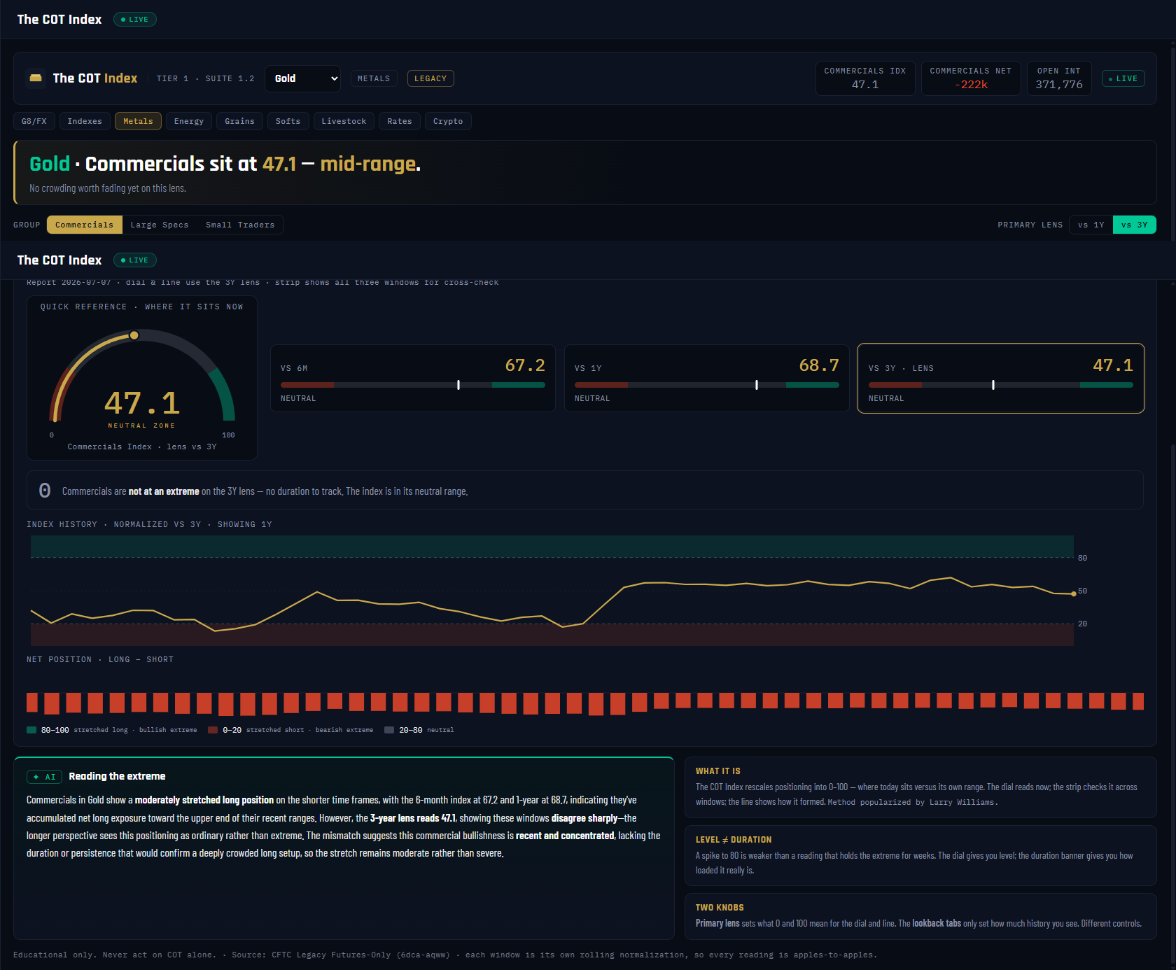
A rolling percentile: today's net position placed inside its trailing min–max range. The default window is 3 years (156 weekly reports); the strip also computes 6-month and 1-year versions so you can see whether the windows agree. For Gold's Commercials on 2026-07-07 they don't: vs 6M = 67.2, vs 1Y = 68.7, vs 3Y = 47.1 — elevated against recent history, ordinary against the full three years. The 0–100 convention never inverts: high = that group heavily net long, and on the Commercials that means a bullish backdrop. Extremes live at roughly 80/20; the duration banner starts counting once the index holds the near-extreme band (75/25) for consecutive weeks.
Why it's useful to you
This is the number that turns "big" into "stretched." A market can carry a huge net for years — the COT Index tells you when that net is at the edge of everything it has done in three years, which is where trends get old and reversals are born. It also stops a classic beginner mistake: reacting to a 6-month spike that the 3-year lens shows is mid-range noise. Gold here is exactly that lesson — 68.7 on the 1-year lens, 47.1 on the 3-year: no extreme, no story yet.
The 10-second read
Dial first: above 80 or below 20 = stretched, anywhere else = context only. Then the duration banner — an extreme that has held for weeks outranks a fresh spike every time.
Use it with: The Players (the raw nets behind the index) ·
Extremes & Percentile (the same idea, stress-tested across 4 windows) ·
Market HQ (this dial beside every other lens)
1
Market picker. Gold selected. Everything on the panel — dial, window cards, history — recomputes per market from the Legacy Futures-Only data.
2
Stat chips. COMMERCIALS IDX 47.1 · NET -222k · OPEN INT 371,776. The index and the raw net it was computed from, side by side.
3
Verdict banner. "Commercials sit at 47.1 — mid-range." The panel's conclusion in one line, before you touch a control.
4
GROUP toggle. Commercials / Large Specs / Small Traders — the index can be computed on any group's net. Default is Commercials, the platform's lead read: high = Commercials heavily net long = bullish.
5
PRIMARY LENS toggle. vs 1Y / vs 3Y — this sets what 0 and 100 mean for the dial and the history line. It's a different knob from the lookback tabs, which only set how much history you see.
6
Quick-reference dial. Where the group sits right now on the chosen lens: 47.1, squarely in the neutral zone of the 0–100 scale.
7
VS 6M card — 67.2. Against just the last 26 weeks, Commercials lean toward the long end of their recent range.
8
VS 1Y card — 68.7. The one-year lens agrees with the six-month: elevated, approaching but not at the 80 line.
9
VS 3Y · LENS card — 47.1. The default, highlighted lens: against three full years, this positioning is mid-range. When short windows say "stretched" and the 3-year says "ordinary," trust the longer lens — or wait for them to agree.
10
Duration banner. Counts consecutive weeks the index has held beyond the near-extreme band (≥75 or ≤25). Gold: "not at an extreme — no duration to track." Level tells you where; duration tells you how loaded it really is.
11
Index history chart. The full index line on the 3-year lens with the 80/20 extreme bands shaded — see every past visit to the edges and what the index did afterwards.
12
Net position strip. The raw weekly net (long minus short bars) underneath the index — the untransformed data the 0–100 line was built from, so the rescaling never becomes a black box.
11Open Interest Basics — The Size of the Crowd
VaultSingle-market view
Nav → Beginner → Open Interest Basics
№ MAP PINS — the gold markers on this screenshot point at locations on the panel; each is explained in the legend beside it. (They are separate from the teal STEP numbers in Part 1.)
1
2
3
4
5
6
7
8
9
10
What it is
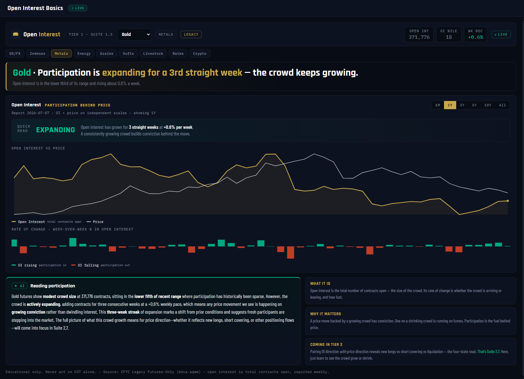
Open interest is the total number of contracts open in a market — the size of the crowd, counted the same way for every futures market on earth. This panel teaches you to read one thing and one thing only: is the crowd arriving or leaving, and how fast. In Gold, participation has been expanding for a third straight week.
What it measures
Three numbers from the weekly report (2026-07-07): OPEN INT 371,776 — the contract count itself; OI %ILE 18 — where that count sits in its trailing 3-year range (18th percentile = a historically thin crowd); and WK ROC +0.6% — this week's rate of change. The QUICK READ verdict — EXPANDING / STEADY / THINNING — comes from a smoothed 3-week rate of change with a volatility-scaled dead-band, so a single noisy week can't flip the state, and the streak counts how many consecutive weeks the direction has held.
Why it's useful to you
Participation is the fuel gauge behind price. A move backed by a growing crowd has conviction — new money is funding it. The same move on a shrinking crowd is running on fumes: positions closing, nobody new arriving. Gold's read — expanding, but only from the 18th percentile — says fresh interest is returning to a thin market. One discipline this panel enforces: rising OI is not bullish by itself. Whether that new money is fresh longs or fresh shorts needs price direction — deliberately saved for Tier 2.
The 10-second read
QUICK READ chip first — EXPANDING, STEADY or THINNING — then the streak. Growing crowd = funded moves; shrinking crowd = fading conviction. That's the whole panel.
Use it with: Net Change & Flow (which group the new contracts belong to) ·
Velocity & Flow (how fast the specialist crowd is moving) ·
Market HQ (the OI Pressure card pairs OI with price — the Tier 2 payoff)
1
Market picker. Gold selected. OI is market-wide — no group toggle here, because open interest belongs to everyone at once.
2
Stat chips. OPEN INT 371,776 · OI %ILE 18 · WK ROC +0.6%. Size, historical rank, and this week's change — the whole panel in three chips.
3
Verdict banner. "Participation expanding for a 3rd straight week." The conclusion in plain English, streak included.
4
Window tabs. 6M / 1Y / 3Y / 5Y / 10Y / All — lookback for the charts below. Display only; the verdict math doesn't change.
5
QUICK READ chip. The three-state participation verdict: EXPANDING, 3 straight weeks at +0.6%/wk. Built on a smoothed rate of change with a dead-band, so it means a trend, not a blip.
6
OI vs price overlay. Open interest (gold line) drawn against price (white) over the selected window. Watch whether rallies and declines happen on a growing or shrinking crowd — that's the habit this chart builds.
7
Rate-of-change bars. Week-over-week % change in OI: teal = money arriving, red = money leaving. Streaks of one color are what the QUICK READ chip is summarizing.
8
✦ AI — "Reading participation." A cached note per CFTC release describing the crowd's size and direction — and deliberately stopping short of interpreting price direction.
9
What it is / Why it matters cards. The built-in lesson: OI is the size of the crowd; participation is the fuel behind price.
10
COMING IN TIER 2 teaser. Pairing OI direction with price direction unlocks the four-state read — new longs vs short covering vs liquidation. That's Suite 2.7's job; here you just learn to see the crowd grow or shrink.
12Net Change & Flow — What the Money Did This Week
VaultSingle-market view
Nav → Beginner → Net Change & Flow
№ MAP PINS — the gold markers on this screenshot point at locations on the panel; each is explained in the legend beside it. (They are separate from the teal STEP numbers in Part 1.)
1
2
3
4
5
6
7
8
9
10
11
What it is
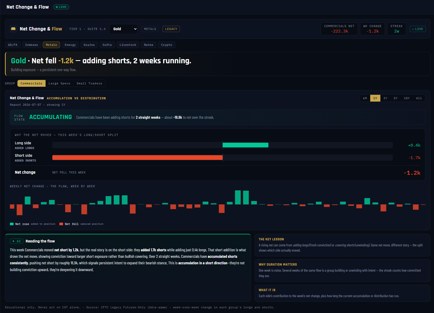
The Players shows where the money sits; this panel shows where it's going. Net Change & Flow takes one group's week-over-week shift and — the part most COT tools skip — splits it into which side actually moved. In Gold this week, the Commercials' net fell 1.2k, and the split reveals it came from adding shorts, not dumping longs.
What it measures
For the selected group (Commercials here, net -222.3k): the weekly net change (-1.2k on 2026-07-07), decomposed into the long side (+0.4k added) and the short side (~1.7k of fresh shorts — a -1.7k drag on net). The FLOW STATE verdict — ACCUMULATING / DISTRIBUTING / NEUTRAL — runs on a smoothed 3-week net-change signal with a volatility-scaled dead-band, and it's direction-aware: a net-short group adding shorts is ACCUMULATING (growing its dominant-side exposure), which is exactly Gold's read — 2 weeks running, about -16.9k over the streak.
Why it's useful to you
The same net move can mean opposite things. A rising net from adding longs is fresh conviction; the identical rise from covering shorts is an unwind — old positions closing, not new belief arriving. The split bars are the only place on the Beginner tier that shows you the difference. And the streak enforces the other discipline: one week of flow is noise; several weeks of the same flow is a group acting with intent. Gold's read — Commercials quietly pressing shorts for a second week — is a small but real lean against the crowd's long.
The 10-second read
FLOW STATE chip + streak first, then the split: did the net move because of fresh positions or closing ones? Fresh = conviction; closing = unwind. Multi-week streak = intent.
Use it with: The Players (the position this flow is changing) ·
Velocity & Flow (the same idea with acceleration and cross-window checks) ·
Open Interest (is the whole crowd growing while this group moves?)
1
Market picker. Gold selected — the flow math reruns per market from the same Legacy Futures-Only series The Players reads.
2
Stat chips. COMMERCIALS NET -222.3k · WK CHANGE -1.2k · STREAK 2w. Position, this week's move, and how long the flow has run.
3
Verdict banner. "Net fell -1.2k — adding shorts, 2 weeks running." Note it names the driver (adding shorts), not just the number.
4
GROUP toggle. Commercials / Large Specs / Small Traders — every group's flow is computed; you pick which story to read. Checking whether the Specs and Commercials are flowing in opposite directions is a classic use.
5
FLOW STATE chip. ACCUMULATING (-16.9k over the streak). Careful: accumulating is not the same as bullish — it means growing dominant-side exposure. A net-short group adding shorts, as here, is accumulating its short.
6
"Why the net moved" split. The week's long-side and short-side changes as separate bars: longs +0.4k vs shorts -1.7k (contribution to net). This is the panel's core lesson made visible.
7
Net change readout. The two bars resolved into one number: -1.2k. Longs added minus shorts added.
8
Weekly net-change bars. Every week's move in one chart — teal = net rose, red = net fell. Clusters of one color are streaks; alternating colors are noise.
9
✦ AI — "Reading the flow." Cached per CFTC release: which side actually drove the move and whether the streak shows persistent intent. Positioning only — it never mentions price.
10
The key lesson card. A rising net can come from adding longs (fresh conviction) or covering shorts (unwinding). Same net move, different story — the split shows which.
11
Why duration matters / What it is cards. One week is noise; several weeks of the same flow is a group building or unwinding with intent — the streak counts commitment.
GROUPThe Intermediate boards — the sharper cut
13The Specialists — Inside the Large Specs
VaultSingle-market view
Nav → Intermediate → The Specialists
№ MAP PINS — the gold markers on this screenshot point at locations on the panel; each is explained in the legend beside it. (They are separate from the teal STEP numbers in Part 1.)
1
2
3
4
5
6
7
8
9
10
11
12
What it is
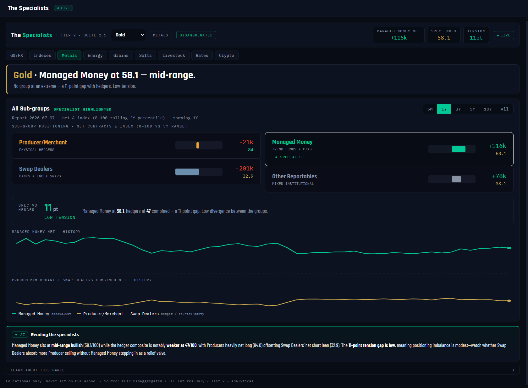
Tier 1's "Large Specs" is a blunt instrument — it lumps hedge funds, banks and pension money into one number. The Specialists cracks it open using the CFTC's finer report families: for a commodity like Gold, the Disaggregated report's four sub-groups, with Managed Money — the trend funds and CTAs — starred as the specialist whose behavior actually drives the crowd read. (For FX markets the panel routes to the TFF report and stars Leveraged Funds instead.)
What it measures
Each sub-group's net position and its 0–100 index (that net placed in its trailing 3-year range — same convention as everywhere: high = net long). Gold, week 2026-07-07: Managed Money +116k at 58.1 (mid-range), Producer/Merchant -21k at 84, Swap Dealers -201k at 32.9, Other Reportables +78k at 38.1. The panel then combines the two hedging groups (Producer/Merchant + Swap Dealers) into a hedger composite and measures the TENSION — the point gap between the specialist's index and the hedgers'. Gold reads 11pt — LOW TENSION; 35 points or more flags HIGH.
Why it's useful to you
The blunt Legacy number can hide a war. "Large Specs neutral" might really be trend funds maxed long while index-tracking swap money is heavily short — a coiled setup Legacy can't show you. Tension is the shortcut: when specialist and hedgers are sharply opposed, one group is eventually proven wrong, and those are the most interesting markets on the board. Gold's low-tension 11pt gap says the opposite: nobody is stretched, no war to trade around.
The 10-second read
Find the ★ SPECIALIST card — its index is your crowd read. Then the tension readout: HIGH = groups sharply opposed, worth drilling; LOW = quiet market.
Use it with: Extremes & Percentile (stress-test the specialist's reading across windows) ·
Velocity & Flow (how fast the specialist is moving) ·
Pressure & Squeeze (when tension turns into a coiled spring)
1
DISAGGREGATED chip. Which report family this market routes to. Metals, energy and ags read the Disaggregated report; FX reads TFF. The routing — and which sub-group gets the star — is automatic per market class.
2
Stat chips. MANAGED MONEY NET +116k · SPEC INDEX 58.1 · TENSION 11pt. The specialist's position, its 3-year rank, and the gap to the hedgers.
3
Verdict banner. "Managed Money at 58.1 — mid-range." The specialist's state in one line; the tension detail follows below.
4
Producer/Merchant card. The physical hedgers — miners, refiners, fabricators. Net -21k at index 84: high on their own range, and on this group high = net long side of their range = a bullish lean from the most informed hands.
5
Swap Dealers card. Banks and index-swap desks. Net -201k at 32.9 — the biggest short in the market, largely the mechanical other side of index-fund demand.
6
Managed Money card — ★ SPECIALIST. Trend funds and CTAs, net +116k at 58.1. This is the group whose index feeds Extremes, Velocity and the rest of Tier 2.
7
Other Reportables card. Large accounts that fit no other bucket — mixed institutional. Net +78k at 38.1.
8
SPEC VS HEDGER tension readout. Specialist index minus the hedger composite: an 11-point gap — LOW TENSION. At 35+ the banner turns red: the groups are sharply opposed and one of them will be proven wrong.
9
Managed Money net history. The specialist's net over time — the trajectory behind today's 58.1. Watch whether the trend crowd is building toward an edge or drifting mid-range.
10
Hedger composite history. Producer/Merchant + Swap Dealers combined net. Its mirror-image dance with the line above is the structural opposition every later panel measures.
11
✦ AI — "Reading the specialists." Cached per CFTC release: the specialist's state, the contrast with the hedger side, and what the tension means as setup context — never a trade call.
12
Learn about this panel. The collapsed education bar — including the tension read: high tension is where the most interesting setups form.
14Extremes & Percentile — Is the Stretch Real?
VaultSingle-market view
Nav → Intermediate → Extremes & Percentile
№ MAP PINS — the gold markers on this screenshot point at locations on the panel; each is explained in the legend beside it. (They are separate from the teal STEP numbers in Part 1.)
1
2
3
4
5
6
7
8
9
10
11
12
What it is
The Beginner COT Index gives you one number on one window. This panel interrogates it: is that "extreme" real, or a short-window artifact? It runs the specialist's positioning through four normalization windows at once, adds a z-score as a second lens, and counts agreement and duration — a full cross-examination before you're allowed to call anything stretched.
What it measures
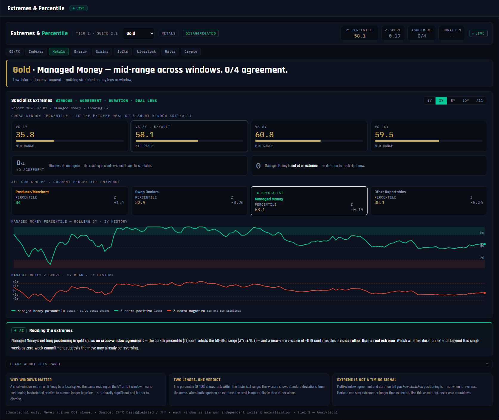
The specialist's net position (Managed Money in Gold) as a percentile across four windows — 1Y / 3Y / 5Y / 10Y — where the 3Y default matches the stored index exactly. Gold, week 2026-07-07: 1Y 35.8 · 3Y 58.1 · 5Y 60.8 · 10Y 59.5 — mid-range on every lens. Beside it, the z-score (-0.19 standard deviations from the 3-year mean) reads the same data on a different scale. AGREEMENT 0/4 counts how many windows confirm a stretched reading (past roughly 70/30, heading for the true 80/20 extreme zone); DURATION counts consecutive weeks the extreme has held. Gold scores zero on both — nothing is stretched.
Why it's useful to you
This panel exists to kill false alarms. A 1-year window can scream "extreme!" about a positioning level the 5-year window has seen a dozen times — trade the short-window spike and you're fading nothing. Multi-window agreement plus a confirming z-score plus multi-week duration is the difference between a structural extreme and noise. Gold is the clean negative example: 0/4 agreement, z-score near zero, no duration — a low-information week, and knowing that saves you from inventing a story.
The 10-second read
Agreement count first: 3/4 or 4/4 = a real extreme, 0–1 = ignore. Then duration — a stretch that has held for weeks is loaded; a fresh spike is just a spike.
Use it with: The Specialists (whose percentile this is) ·
The COT Index (the beginner version of the same math) ·
Pressure & Squeeze (what a confirmed extreme can coil into)
1
Stat chips. 3Y PERCENTILE 58.1 · Z-SCORE -0.19 · AGREEMENT 0/4 · DURATION —. Four chips, four tests; Gold fails all four to qualify as an extreme.
2
Verdict banner. "Mid-range across windows. 0/4 agreement." When nothing is stretched the panel says so plainly instead of manufacturing a lean.
3
Window tabs. 1Y / 3Y / 5Y / 10Y / All — the lookback for the history charts below. The window matrix above always shows all four regardless.
4
VS 1Y card — 35.8. Against just the last year, Managed Money sits in the lower-middle of its range — the one lens leaning the other way, which is itself informative.
5
VS 3Y · DEFAULT card — 58.1. The highlighted default lens, identical to the specialist index used across the platform. Mid-range.
6
VS 5Y and VS 10Y cards — 60.8 / 59.5. The long-baseline lenses. A reading that's stretched here is structurally significant; Gold's isn't stretched anywhere.
7
Agreement banner — 0/4 NO AGREEMENT. Counts the windows confirming a stretched read. "Window-specific, less reliable" is the panel's warning when lenses disagree; 3/4+ is when an extreme deserves the name.
8
Duration banner. Consecutive weeks the extreme has held. Gold: not at an extreme, so nothing to count. Duration is how loaded, never when it reverses.
9
All sub-groups snapshot. Every Disaggregated group's current percentile side by side, the ★ SPECIALIST highlighted at 58.1 — check whether any other group is at an edge the specialist isn't.
10
Percentile history. The specialist's rolling 3-year percentile with the 80/20 extreme zones shaded — every past trip to the edges and how long each one lasted.
11
Z-score history. Standard deviations from the 3-year mean, ±1σ and ±2σ gridlines. When percentile and z-score agree on an extreme, the read is more reliable than either alone — two lenses, one verdict.
12
✦ AI — "Reading the extremes." Cached per CFTC release. For Gold this week it flags the readings as noise rather than a real extreme — the honest call when 0/4 windows agree.
15Divergence Detection — When Price and the Money Disagree
VaultSingle-market view
Nav → Intermediate → Divergence Detection
№ MAP PINS — the gold markers on this screenshot point at locations on the panel; each is explained in the legend beside it. (They are separate from the teal STEP numbers in Part 1.)
1
2
3
4
5
6
7
8
9
10
11
What it is
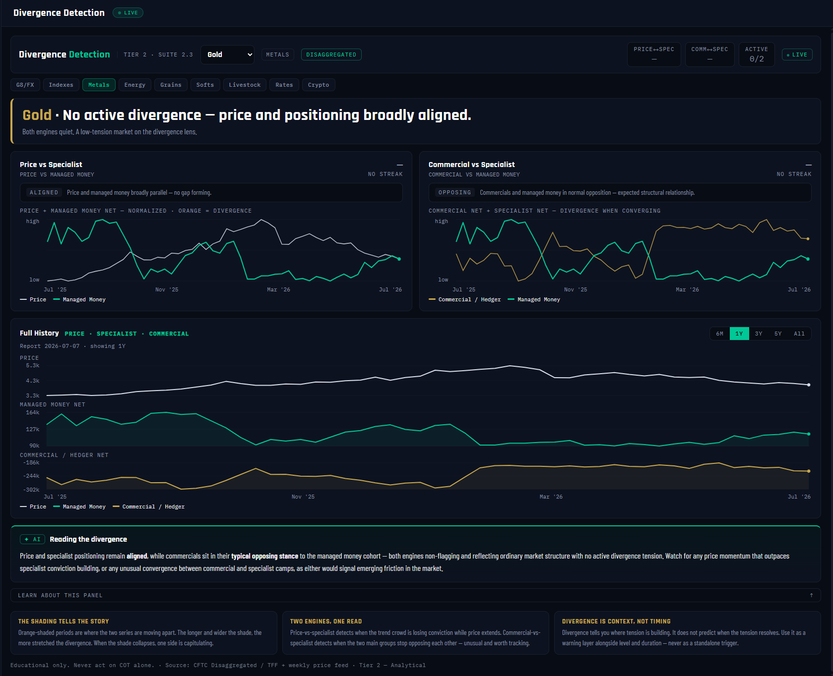
The first Intermediate panel to put price and positioning on the same chart — and the platform's early-warning lens. Two engines run side by side: one watches for price pulling away from the specialist crowd, the other watches the Commercials-versus-specialist relationship for unusual behavior. In Gold this week both are quiet: 0 of 2 active — "No active divergence — price and positioning broadly aligned."
What it measures
Both series are rescaled to 0–100 and aligned to the CFTC report week, then compared on their recent paths. Engine 1 (price vs specialist) reads DIVERGING when the two paths have pulled meaningfully apart without moving together, CONFIRMING when they're advancing in step, ALIGNED when they're simply parallel — Gold reads ALIGNED. Engine 2 (Commercials vs specialist) knows these groups are supposed to sit on opposite sides, so ordinary OPPOSING — Gold's read — never flags; it only fires on unusual CONVERGING (the groups moving together for weeks) or SHARPLY OPPOSING (both pinned at opposite extremes). Each engine reports its state and streak length in weeks.
Why it's useful to you
New price highs with fading positioning means the move is running out of money — advances nobody is funding tend to fail, and this panel spots that gap weeks before the chart does. Just as valuable is what it does with a quiet week: it tells you plainly there's no tension, instead of letting you squint a story into the chart. Gold here is the calibration example — a funded, aligned, low-tension market where the divergence lens correctly says "nothing to see."
The 10-second read
ACTIVE count first: 0/2 = aligned, move on. If an engine is flagging, check its streak — a divergence widening for weeks is a conviction gap building, and the orange shading shows exactly where.
Use it with: Velocity & Flow (is the specialist slowing while price runs?) ·
Extremes & Percentile (divergence from an extreme is the strongest combination) ·
COT Checklist (step 5, "Does price agree?", is this panel graded)
1
Stat chips. PRICE↔SPEC — · COMM↔SPEC — · ACTIVE 0/2. The dashes mean neither engine has a flagging streak to report this week.
2
Verdict banner. "No active divergence — price and positioning broadly aligned." Both engines quiet = a low-tension market on this lens.
3
Engine 1 card — Price vs Specialist. State ALIGNED (current gap 28%): price and Managed Money are tracking each other. DIVERGING here is the classic warning — price extending while the trend crowd stops following.
4
Engine 2 card — Commercial vs Specialist. State OPPOSING — the normal structural relationship, not a flag. This engine only fires when the two groups unusually converge, or sit pinned at opposite extremes for weeks.
5
Price + specialist overlay. Both series normalized onto one chart. Orange shading marks periods where they pull apart — the wider and longer the shade, the more stretched the divergence; when it collapses, one side is capitulating.
6
Commercial vs specialist overlay. The two groups' normalized nets — the mirror-image dance is normal; watch for the rare stretches where the mirrors break.
7
Full History window tabs. 6M / 1Y / 3Y / 5Y / All — lookback for the three-track chart below.
8
PRICE track. Gold's weekly price, aligned to the report calendar so every visual comparison is honest to the data's timing.
9
MANAGED MONEY NET track. The specialist crowd's net beneath the price it's chasing — the pair Engine 1 is comparing, laid bare.
10
COMMERCIAL / HEDGER NET track. The hedgers' net on the third rail — Engine 2's other half. Three stacked tracks let you replay any historical divergence by eye.
11
✦ AI — "Reading the divergence." Cached per CFTC release and grounded strictly in the engine states — when nothing is flagging it says so, and it never dresses normal opposition up as a warning.
16Velocity & Flow Momentum — How Fast the Money Is Moving
VaultSingle-market view
Nav → Intermediate → Velocity & Flow Momentum
№ MAP PINS — the gold markers on this screenshot point at locations on the panel; each is explained in the legend beside it. (They are separate from the teal STEP numbers in Part 1.)
1
2
3
4
5
6
7
8
9
10
11
12
What it is
Net Change told you what moved this week; Velocity asks the sharper questions — is the flow speeding up or slowing down, and does it hold across timeframes? It's positioning momentum for the specialist crowd (Managed Money in Gold), with no price feed at all: pure money-flow physics — velocity, acceleration, and a phase.
What it measures
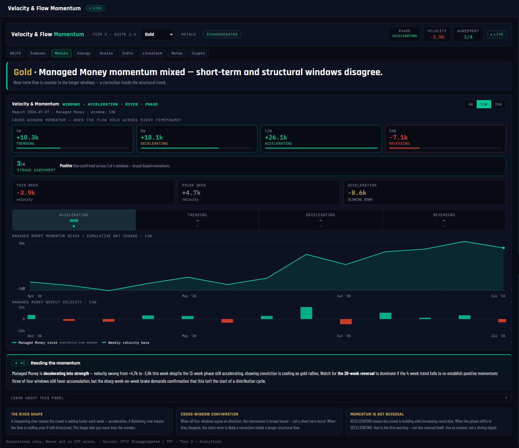
Velocity = the week-over-week change in the specialist's net (Gold: -3.9k this week vs +4.7k prior — an acceleration of -8.6k, slowing down). The flow is then summed over four windows — 4W +10.3k · 8W +18.1k · 13W +26.1k · 26W -7.1k — and each window gets a phase: ACCELERATING / TRENDING / DECELERATING / REVERSING, based on whether the flow's second half is faster, steady, slower, or flipped versus its first. The 13-week window is primary (Gold: ACCELERATING), and AGREEMENT 3/4 counts how many windows share the near-term direction. The momentum river charts the cumulative net change — its shape is the read.
Why it's useful to you
Deceleration is the earliest warning positioning data can give: the crowd is still long, still adding — just less eagerly each week — and that loss of appetite shows here long before the net position or price rolls over. The cross-window check protects you from the opposite error: treating one soft week as a turn. Gold is a live example of both — a 13-week accelerating build, but this week's velocity went negative and the 26-week window reads REVERSING, so the panel calls the momentum mixed rather than letting either story win.
The 10-second read
Phase strip first — where is the crowd in ACCELERATING → TRENDING → DECELERATING → REVERSING? Then agreement: 4/4 = broad-based flow; a disagreement means the short-term is likely a correction inside the structural trend.
Use it with: Net Change & Flow (this week's move, split by side) ·
Divergence Detection (is price outrunning this slowing flow?) ·
Unwind Tracker (when deceleration at an extreme becomes the exit)
1
Stat chips. PHASE ACCELERATING · VELOCITY -3.9k · AGREEMENT 3/4. Note the built-in tension: the 13-week phase is accelerating while this single week ran negative — exactly what the panel below unpacks.
2
Verdict banner. "Momentum mixed — short-term and structural windows disagree." The panel refuses a clean directional call when the windows conflict.
3
4W card — +10.3k TRENDING. The last four weeks of flow summed: still adding to the long, at a steady pace.
4
8W card — +18.1k DECELERATING. Same direction, but the second half of the window ran slower than the first — appetite easing.
5
13W card — +26.1k ACCELERATING. The primary window: a substantial quarter-year build that sets the headline phase.
6
26W card — -7.1k REVERSING. The structural window flipped sign mid-window — the half-year story disagrees with the quarter, and that's the read to respect.
7
Agreement banner — 3/4 STRONG AGREEMENT. Three of four windows share the near-term direction. 4/4 means broad-based flow; anything less means the flow has a timeframe seam in it.
8
This week / Prior week / Acceleration cards. -3.9k vs +4.7k = acceleration -8.6k, SLOWING DOWN. Velocity is the speed; acceleration is the change in speed — the earlier of the two tells.
9
Phase strip. The four-stage cycle with NOW on the active phase. The canonical path is ACCELERATING → TRENDING → DECELERATING → REVERSING; the shift into DECELERATING is the first warning, not the reversal itself.
10
Momentum river. Cumulative net change over the selected window. A steepening river = the crowd adding faster each week; a flattening river = flow stalling even while still directional. The shape tells you more than any single number.
11
Weekly velocity bars. Every week's raw Δnet — teal added, red reduced. This is the unsmoothed data the windows, phases and river are all built from.
12
✦ AI — "Reading the momentum." Cached per CFTC release. For Gold it flags the honest nuance: decelerating into strength — a crowd still long, buying less eagerly. Context on commitment, never a timing trigger.
17Structure Scanner — The Gross Behind the Net
VaultSingle-market view
Nav → Intermediate → Structure Scanner
№ MAP PINS — the gold markers on this screenshot point at locations on the panel; each is explained in the legend beside it. (They are separate from the teal STEP numbers in Part 1.)
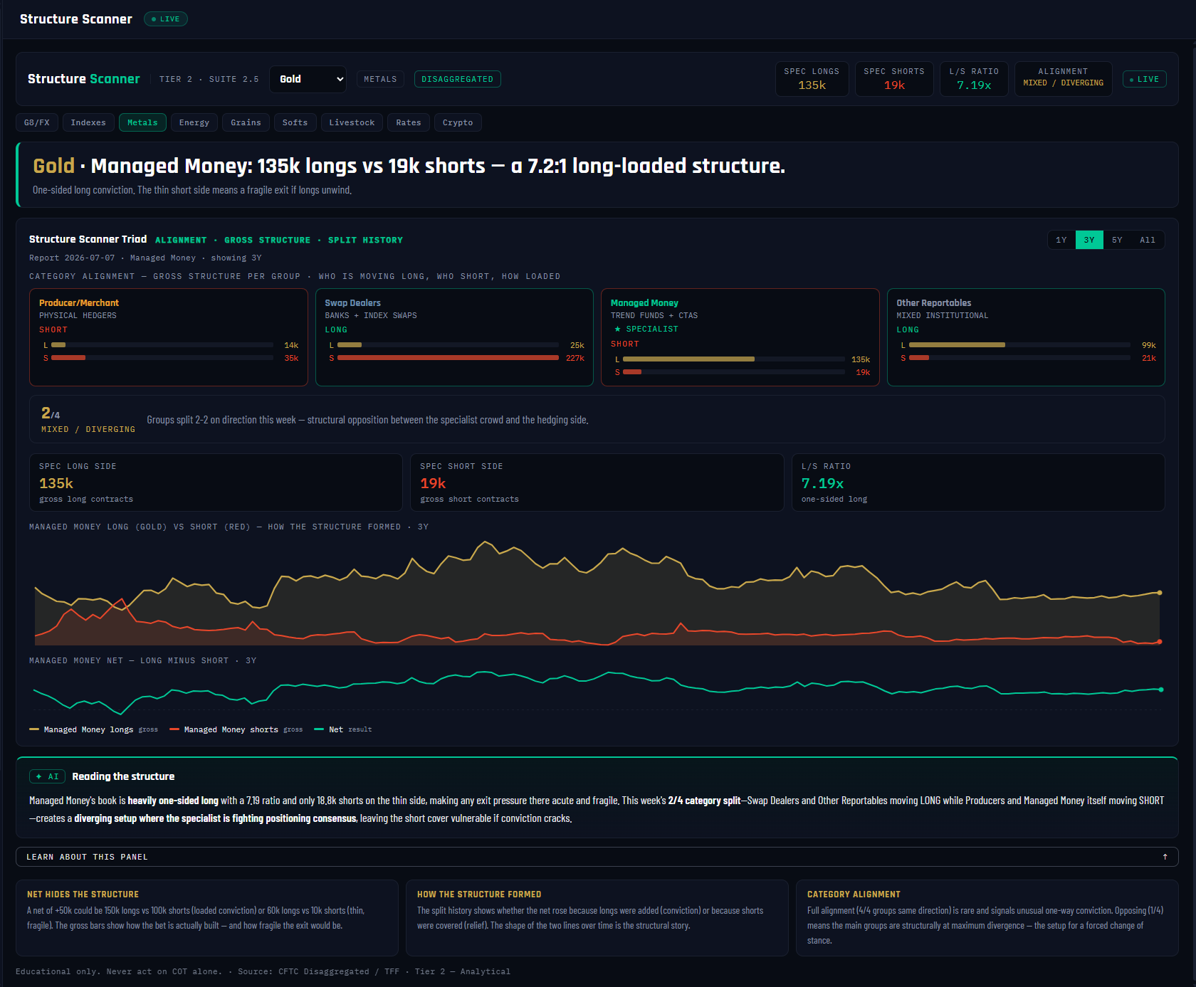
1
2
3
4
5
6
7
8
9
10
11
12
What it is
Every panel so far has shown you the net — longs minus shorts. The Structure Scanner shows you the gross: how many long contracts and how many short contracts each group actually holds. That distinction matters more than it sounds. A net of +116k could be 135k longs against 19k shorts, or 400k longs against 284k shorts — the same net, two completely different markets. The first is a one-way conviction bet; the second is a heavily contested battlefield.
What it measures
Three things. First, the gross long/short loading of all four report groups — one card each, with the specialist crowd starred. Second, the specialist's long-to-short ratio: in the Gold screenshot, Managed Money holds 135k longs against just 19k shorts — a 7.19:1 long-loaded structure (anything beyond 2:1 counts as one-sided long; below 0.5:1 is one-sided short; between is a contested book). Third, category alignment: which direction each group moved this week — a group counts as LONG or SHORT only if its net shifted by more than a thousand contracts, otherwise it reads MIXED. Spreading positions are excluded throughout because they carry no direction.
Why it's useful to you
Because the gross structure tells you where the fragile exit is. In Gold's 7.2:1 book, the short side is thin — if those crowded longs ever need to leave, there is almost nobody on the other side to sell to, so the exit becomes an air pocket. The alignment read adds the week's tactical picture: Gold shows 2/4 MIXED / DIVERGING, the normal state where specialists and hedgers pull against each other. When it flips to 3/4 or 4/4 — every group shifting the same way in the same week — that's rare, one-way conviction across the entire report, and worth your full attention.
The 10-second read
Check the L/S ratio chip first: beyond 2:1 either way, note which side is thin — that's the fragile exit. Then glance at alignment: 3/4 or 4/4 means the whole report moved together this week.
Use it with: Concentration & Quality (how few hands hold that loaded side) ·
Velocity & Flow (is the loaded side still building?) ·
Pressure & Squeeze (has the loading become structural tension?)
1
Panel title + market dropdown. Structure Scanner · Tier 2 · Suite 2.5, reading Gold on the Disaggregated report — so the starred specialist is Managed Money.
2
Stat chips. The whole verdict in four numbers: SPEC LONGS 135k · SPEC SHORTS 19k · L/S RATIO 7.19x · ALIGNMENT MIXED. Everything below unpacks these.
3
Verdict banner. "135k longs vs 19k shorts — a 7.2:1 long-loaded structure." The plain-English headline: this net was built almost entirely from the long side.
4
Producer/Merchant card. The physical hedgers' gross book, with a direction chip showing which way they moved this week (here: SHORT). Direction is the week's shift, never the level.
5
Swap Dealers card. The banks' book — carrying a heavy 227k gross short in Gold, yet their chip reads LONG because they added this week. Level and movement are separate facts; this panel shows both.
6
Managed Money card — ★ SPECIALIST. The crowd this market's read anchors on: 135k longs / 19k shorts. Its weekly chip reads SHORT — even a crowded long book can trim in any given week.
7
Other Reportables card. The fourth group — large traders that fit neither hedger nor fund buckets. Completes the 4-group alignment count.
8
Alignment banner. Gold reads 2/4 MIXED / DIVERGING — normal structural opposition. The ladder runs OPPOSING (0–1) → MIXED (2) → STRONG (3) → FULL AGREEMENT (4); the top rung means all four groups shifted the same direction in one week.
9
Gross history chart. Managed Money's long side (gold line) and short side (red line) plotted separately over 3 years. You can see how the net formed — longs built while shorts stayed flat, i.e. fresh conviction, not short covering.
10
Net line. The familiar net (long minus short) below the gross tracks — so you can see exactly what the single net line hides in the chart above it.
11
AI "Reading the structure." A two-sentence plain-English read: how loaded the book is, which side is thin, and what the alignment means. Refreshed each report week.
12
Education cards. NET HIDES THE STRUCTURE / HOW IT FORMED / CATEGORY ALIGNMENT — the built-in lesson if any of the above needs a refresher.
18Concentration & Quality — Who Stands Behind the Bet
VaultSingle-market view
Nav → Intermediate → Concentration & Quality
№ MAP PINS — the gold markers on this screenshot point at locations on the panel; each is explained in the legend beside it. (They are separate from the teal STEP numbers in Part 1.)
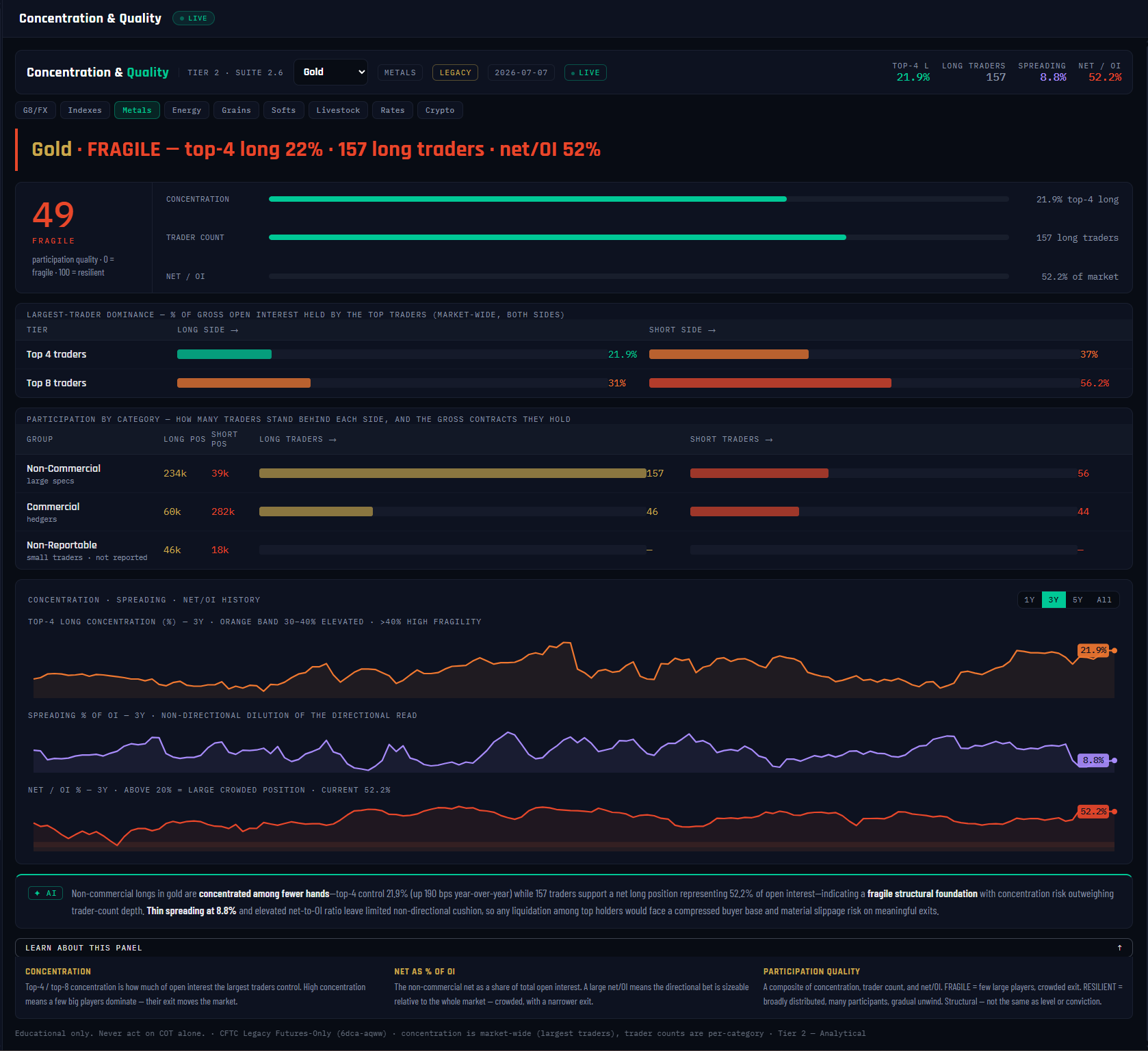
1
2
3
4
5
6
7
8
9
10
11
12
What it is
Two markets can show the identical net position — and one is a house of cards while the other is bedrock. The difference is who stands behind the bet: is it four whales or two hundred independent funds? Is the bet a rounding error against total open interest, or half the market? This panel grades the quality of participation behind the number every other panel reports.
What it measures
Three ingredients, averaged into one 0–100 quality score (0 = fragile, 100 = resilient). Concentration — the share of open interest held by the market's four largest traders, straight from the CFTC's Legacy report. Trader count — how many Large Speculators actually stand on the net side. Bet size — the net position as a percentage of total open interest. Everything anchors on the side that would have to exit: Gold's Large Specs are net long, so the panel reads the top-4 long concentration (21.9%) and the long-trader count (157). One honest caveat baked into the design: the CFTC publishes concentration market-wide only, so the per-group rows show trader counts (which are per-category) — the panel never fabricates per-group concentration.
Why it's useful to you
Because fragility decides how a position ends. Gold scores 49 — FRAGILE in the screenshot: the top-4 share is moderate, but the net bet is a huge 52.2% of open interest, so most of the market is already leaning one way. A fragile book doesn't predict a reversal — it predicts the character of one: when a concentrated, oversized bet unwinds, there's little depth to absorb it and the move is violent. A resilient book (many traders, small bet, low concentration) unwinds gradually. Same COT extreme, very different risk.
The 10-second read
Read the dial: RESILIENT (70+) = deep, distributed book; FRAGILE (below 50) = narrow exit. Then check net/OI — above roughly 20% the bet is oversized for its market.
Use it with: Pressure & Squeeze (is the fragile book also under tension?) ·
Unwind Tracker (has the fragile exit started?) ·
Market HQ (this quality score as one card among eleven)
1
Panel title + market dropdown. Concentration & Quality · Tier 2 · Suite 2.6, on Gold. This panel always reads the CFTC Legacy report — concentration and trader counts live there.
2
Stat chips. TOP-4 L 21.9% · LONG TRADERS 157 · SPREADING 8.8% · NET/OI 52.2%. The four raw facts the quality score is built from.
3
Verdict banner. "FRAGILE — top-4 long 22% · 157 long traders · net/OI 52%." One line, the whole story: the crowd is broad, but the bet is enormous relative to the market.
4
Quality score dial. Gold reads 49. The ladder: FRAGILE below 50, MODERATE 50–69, RESILIENT 70+. An average of the three component scores beside it.
5
Component bars. The three ingredients scored 0–100: concentration (lower top-4 share = higher score), trader count (more traders = higher), and net/OI (smaller bet = higher). See which one is dragging the grade — for Gold it's the bet size.
6
Largest-trader dominance. Top-4 and top-8 gross concentration, long side vs short side — the CFTC's own whale-watch numbers. A lopsided pair (heavy on one side only) tells you which side the whales are carrying.
7
Participation by category. Gross longs/shorts and trader counts for Non-Commercial (157 long traders in Gold), Commercial (46) and Non-Reportable — the Small Traders, whose counts the CFTC doesn't collect.
8
Top-4 concentration history. The net-side top-4 share over time (21.9% now). A rising line means the position is migrating into fewer hands — quality decaying even if the net never moves.
9
Spreading % history. Non-directional spread positions as a share of OI (8.8%). High spreading dilutes every directional read — it's volume that takes no side.
10
Net/OI % history. The bet as a share of the whole market — 52.2% now, and the chart marks the ~20% line above which a bet counts as crowded. Gold is far beyond it.
11
AI analysis. Two sentences: the read (what the quality data shows), then the risk — here, that the position is concentrated among fewer hands, a fragile foundation.
12
Education cards. CONCENTRATION / NET AS % OF OI / PARTICIPATION QUALITY — the full lesson behind each metric, one click away.
19OI Long/Short Pressure — The Four-State Read
VaultSingle-market view
Nav → Intermediate → OI Long/Short Pressure
№ MAP PINS — the gold markers on this screenshot point at locations on the panel; each is explained in the legend beside it. (They are separate from the teal STEP numbers in Part 1.)
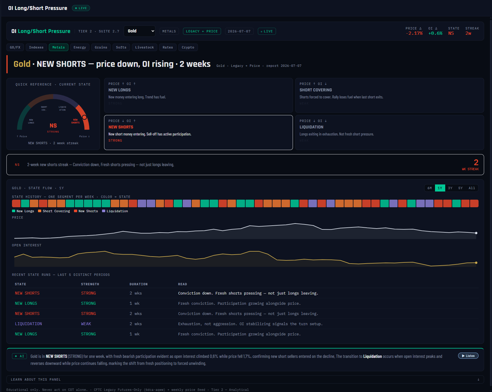
1
2
3
4
5
6
7
8
9
10
11
12
What it is
Price tells you which way the market moved. Open interest tells you who paid for it. Cross the two and every week lands in one of exactly four states — the classic futures-desk read this panel automates. A falling price means something completely different when open interest is rising (new shorts attacking) than when it's falling (old longs giving up). Same candle, opposite story.
What it measures
Each week, the sign of the price change × the sign of the OI change: NEW LONGS (price ↑, OI ↑ — fresh conviction, STRONG) · SHORT COVERING (price ↑, OI ↓ — a rally on borrowed time, WEAK) · NEW SHORTS (price ↓, OI ↑ — fresh shorts pressing, STRONG) · LIQUIDATION (price ↓, OI ↓ — exhaustion, not aggression, WEAK). STRONG means fresh participation is funding the move; WEAK means the move is running on positions closing. A dead-band keeps it honest: when price moves less than 0.1% and OI less than 0.2%, the prior state carries over instead of flipping on noise. In the screenshot Gold reads NEW SHORTS, 2 weeks running — price −2.17% with OI +0.6%: the decline is being driven by fresh shorts entering, not just longs leaving.
Why it's useful to you
Because it separates moves worth respecting from moves about to stall. Retail traders chase every rally; this read tells you whether the rally has new money underneath it or is just shorts buying their way out (a fuel tank that empties). Better still, the states transition in readable ways — Gold's NEW SHORTS shifts to Liquidation the moment OI peaks and turns down while price keeps falling, which is exactly what the panel tells you to watch for. Four states, four playbooks.
The 10-second read
Read the active quadrant and its strength: STRONG = fresh money funding the move, respect it. WEAK = the move runs on closing positions — it stalls when the closing exhausts. Then note the streak.
Use it with: Velocity & Flow (which group is driving the OI change) ·
Divergence Detection (does positioning agree with the price leg?) ·
Pressure & Squeeze (OI expansion is one of its five components)
1
Panel title + market dropdown. OI Long/Short Pressure · Tier 2 · Suite 2.7, on Gold. The data badge reads Legacy + Price — the one Intermediate panel that pairs CFTC data with a weekly price feed, aligned to the same report week.
2
Stat chips. PRICE Δ −2.17% · OI Δ +0.6% · STATE NS · STREAK 2w. The two deltas are the entire input; the state is their crossing.
3
Verdict banner. "NEW SHORTS — price down, OI rising · 2 weeks." The four-state read in plain English, with its duration.
4
Quick-reference state dial. The current state (NS) and its strength class at a glance — the panel's answer before you read anything else.
5
NEW LONGS quadrant. Price ↑ + OI ↑: fresh conviction — participation growing alongside price. The strongest bullish configuration.
6
SHORT COVERING quadrant. Price ↑ + OI ↓: the rally is shorts exiting, not buyers arriving — borrowed time; it stalls when the covering pool exhausts.
7
NEW SHORTS quadrant — active. Price ↓ + OI ↑, highlighted and marked STRONG: fresh shorts are pressing Gold, not just longs leaving. Conviction is on the downside this week.
8
LIQUIDATION quadrant. Price ↓ + OI ↓: exhaustion — longs exiting without new shorts replacing them. Weak, and often late in a decline.
9
State history strip. One colored segment per week across the whole window. Read it like weather history: long single-color runs are trending participation; rapid color-flipping is a market with no participation story. Grey segments mark weeks with no aligned price data.
10
Price and Open Interest tracks. The two raw ingredients plotted separately beneath the strip, so you can verify any state with your own eyes: find the week, check which way each line moved.
11
Recent state runs. The last five distinct state periods with their durations — the market's recent "participation narrative" in table form.
12
AI analysis + Listen. Two sentences: the current state and whether the move has fresh participation, then the transition watch — for Gold's NEW SHORTS: when OI peaks and turns down while price is still falling, it shifts to Liquidation.
20Trend Lifecycle & The Trap — Where the Trend Is in Its Arc
VaultSingle-market viewCapstone
Nav → Intermediate → Trend Lifecycle & The Trap
№ MAP PINS — the gold markers on this screenshot point at locations on the panel; each is explained in the legend beside it. (They are separate from the teal STEP numbers in Part 1.)
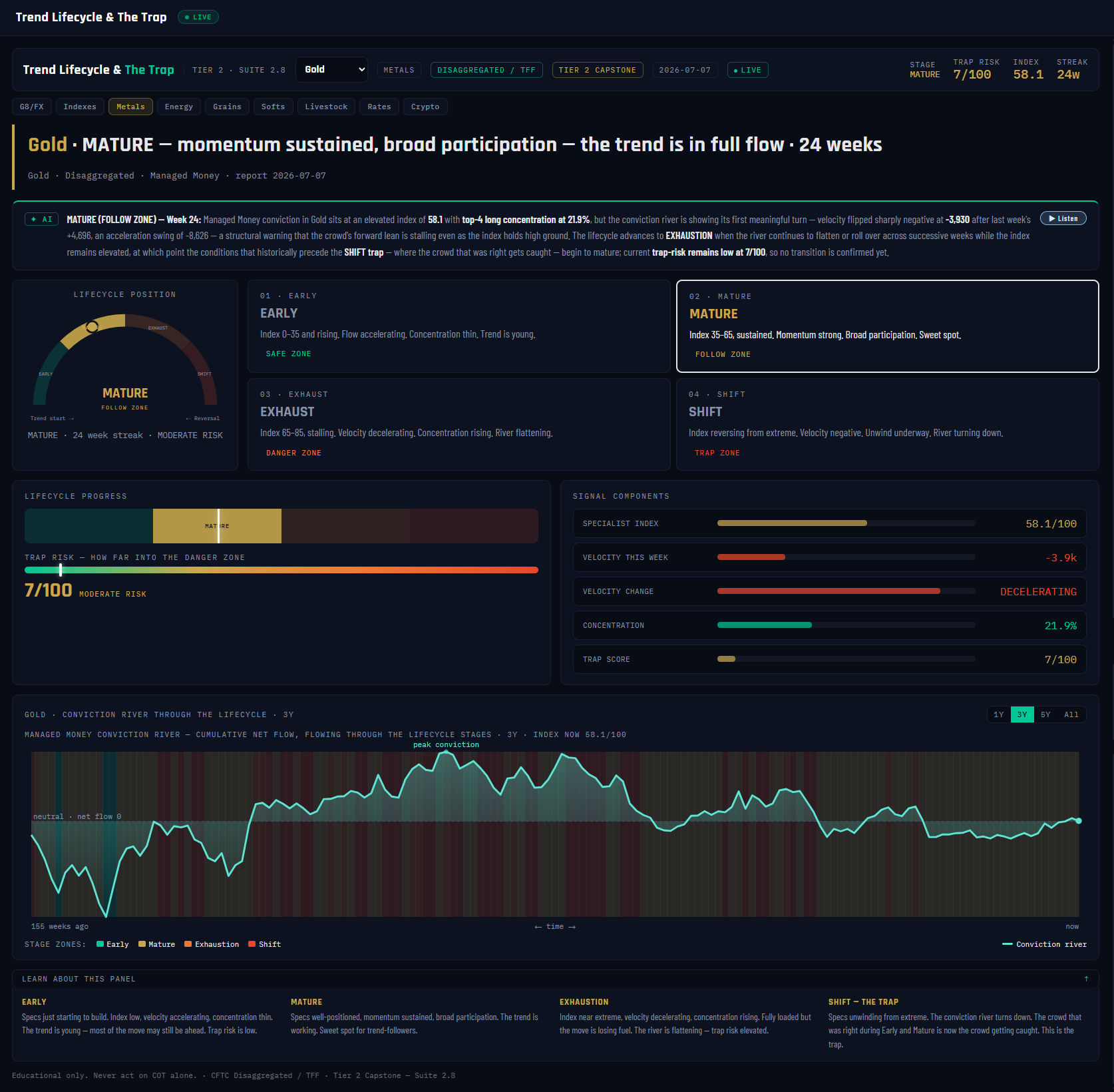
1
2
3
4
5
6
7
8
9
10
11
12
What it is
The Intermediate capstone — it takes everything the previous panels measure separately (the COT Index, velocity and acceleration, concentration) and fuses them into one question: where is the specialist crowd in the arc of its trend? Because the same bullish reading means opposite things depending on when it appears: index 60 while flow accelerates off a low base is a young trend worth following; index 60 while flow dies and the position crowds into fewer hands is a trend running out of road.
What it measures
Four stages, classified every week from the index, velocity and acceleration. EARLY (safe zone) — index low and rising, flow accelerating, the trend is young. MATURE (follow zone) — index mid-range and sustained, momentum strong, broad participation: the sweet spot. EXHAUSTION (danger zone) — index high but stalling, velocity decelerating, concentration rising. SHIFT (trap zone) — the index reverses from its extreme, velocity turns negative, the unwind is underway. On top sits the trap-risk score (0–100): how high the index sits, how hard flow is decelerating, and how concentrated the position is — scaled down in early stages so a young trend can't false-alarm. Gold reads MATURE, 24 weeks in stage, trap risk just 7/100: index 58.1, velocity −3.9k and decelerating, but nowhere near the danger zone.
Why it's useful to you
This is the panel that names the Trap — the cruelest structure in positioning: the crowd that has been right for the entire trend is, at the end of it, maximally exposed with a tiny exit. Late-cycle crowded winners don't get to leave gracefully. The lifecycle read tells you which playbook applies right now: join (Early), follow (Mature), tighten up (Exhaustion), or stand aside from the crowd's side entirely (Shift). For Gold in the screenshot, the message is calm: a 24-week Mature trend, trap risk minimal — the crowd is committed, not cornered.
The 10-second read
Stage + trap thermometer. EARLY/MATURE with low trap risk = the trend has fuel. EXHAUSTION = fully loaded, losing fuel. SHIFT = the trap has closed — the unwind is live.
Use it with: Extremes & Percentile (the index leg of the stage call) ·
Velocity & Flow (the momentum leg) ·
Unwind Tracker (when SHIFT hits, this tracks the release week by week)
1
Panel title + market dropdown. Trend Lifecycle & The Trap · Tier 2 · Suite 2.8 — the Tier 2 Capstone, reading Gold's Managed Money crowd.
2
Stat chips. STAGE MATURE · TRAP RISK 7/100 · INDEX 58.1 · STREAK 24w. The composite verdict and its three main inputs.
3
Verdict banner. "MATURE — momentum sustained… 24 weeks." Stage, one-line meaning, and how long the market has held it.
4
AI lifecycle read + Listen. The week-24 narrative: the stage, its key drivers, and what triggers the next transition — for a Mature trend, watch the river flattening while the index stays high.
5
Lifecycle position gauge. Where Gold sits on the Early → Mature → Exhaustion → Shift arc: squarely in the follow zone.
6
Stage card 01 — EARLY (safe zone). Index low and rising, flow accelerating, concentration thin. Maximum runway; low trap risk by construction.
7
Stage card 02 — MATURE (follow zone), active. Highlighted because it's Gold's current stage: index mid-range and sustained, broad participation, momentum intact.
8
Stage card 03 — EXHAUSTION (danger zone). Index high but stalling, velocity decelerating, concentration rising — the warning stage where trap risk climbs fastest.
9
Stage card 04 — SHIFT (trap zone). The index reverses off its extreme with negative velocity: the unwind is underway and the crowded winner is caught. This is the Trap itself.
10
Progress bar + trap-risk thermometer. Gold's trap risk: 7/100. The score blends index height (40%), deceleration (35%) and concentration (25%), then scales by stage — Early trends are dampened, Shift counts in full.
11
Signal components. The live inputs behind the stage call: index 58.1, this-week velocity −3.9k (DECELERATING), top-4 concentration 21.9%, and the trap score. If you disagree with the verdict, argue with these.
12
Conviction river. Cumulative weekly flow over 3 years, drawn through stage-tinted background bands. The river's shape IS the lifecycle: rising = building, flattening = exhausting, turning down = the Shift. Twenty-four weeks of Mature is visible as one long, steady climb.
GROUPThe Advanced engines — the proprietary layer
21Pressure & Squeeze Gauge — How Coiled Is the Spring
VaultSingle-market view
Nav → Advanced → Pressure & Squeeze Gauge
№ MAP PINS — the gold markers on this screenshot point at locations on the panel; each is explained in the legend beside it. (They are separate from the teal STEP numbers in Part 1.)
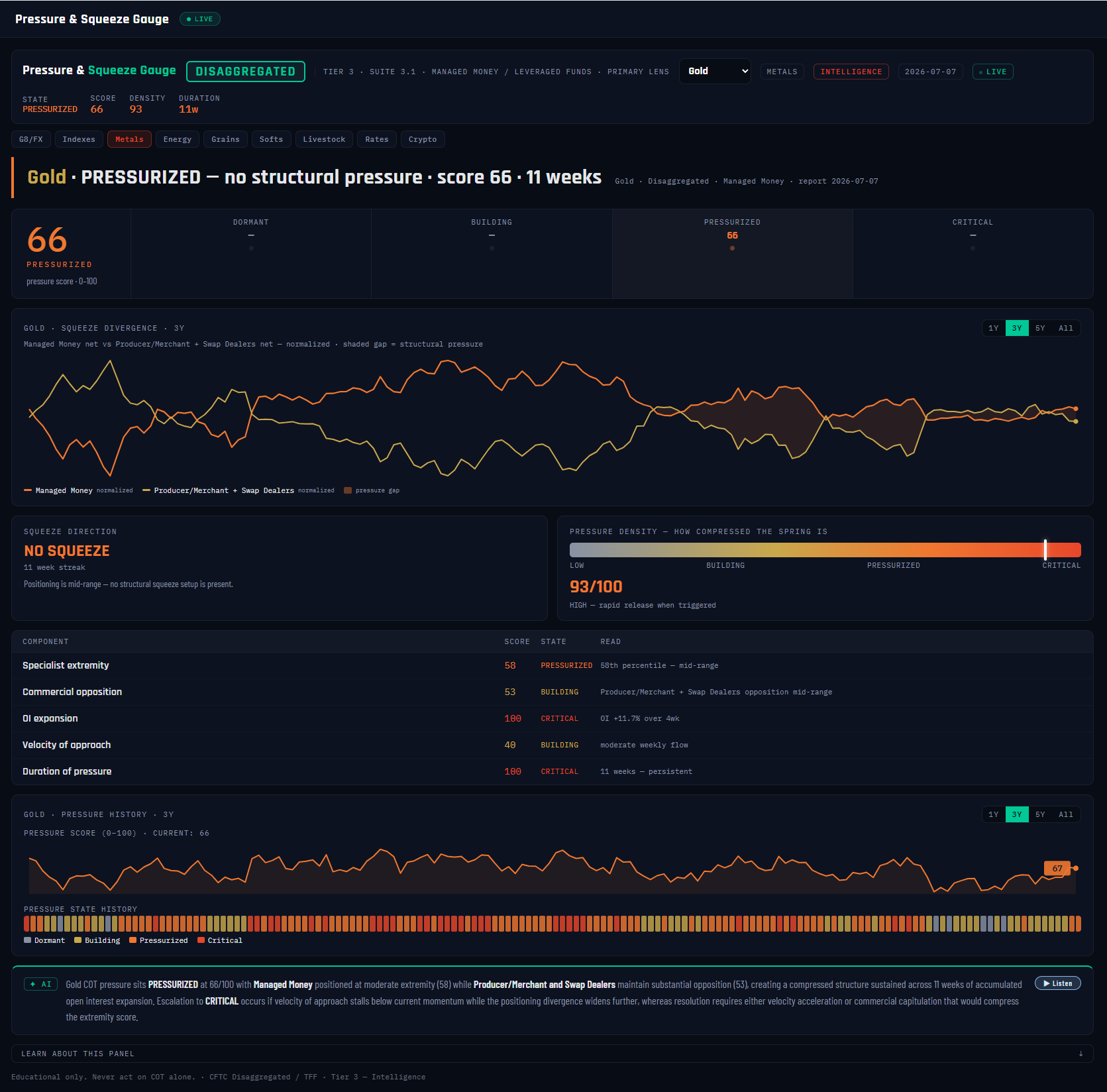
1
2
3
4
5
6
7
8
9
10
11
12
What it is
Every other panel tells you where positioning sits. This one measures the tension stored between the two sides — how coiled the Commercials-versus-specialists spring has become. It is explicitly not a positioning read and not a price prediction: it's a structural-tension detector, built on the observation that when a crowded specialist position and a heavy Commercial position stretch apart while participation grows, the eventual resolution tends to be fast.
What it measures
Five components, weighted into one 0–100 pressure score: specialist extremity (30%) — where the crowd's index sits in its range; Commercial opposition (25%) — how heavily the hedging side leans against them; OI expansion (20%) — whether new money is inflating the standoff; velocity of approach (15%) — how fast the crowd is still piling in; and duration (10%) — how long the pressure has persisted. The score maps to four states: DORMANT (below 30) → BUILDING (30–54) → PRESSURIZED (55–79) → CRITICAL (80+). Gold reads PRESSURIZED at 66, eleven weeks in — driven by two components maxed at 100 (OI expansion and duration) — yet the squeeze direction reads NO SQUEEZE, because Managed Money sits mid-range at 58: a squeeze needs a crowded side (index 65+ for a long squeeze, 35 or below for a short squeeze), and Gold doesn't have one yet. Pressure without a trapped crowd is tension without a victim.
Why it's useful to you
Because the pressure score answers the question the COT Index can't: not "is positioning stretched?" but "is the spring loaded?" An extreme can sit inert for months; pressure that's high and dense historically precedes fast moves. Gold's density of 93 means the pressure built rapidly — and pressure that builds fast tends to release fast when triggered. Treat CRITICAL as "conditions present," never as a timing call: the gauge tells you a fast move is structurally possible, your chart tells you when.
The 10-second read
State first, direction second: PRESSURIZED/CRITICAL + a named LONG or SHORT SQUEEZE = a loaded spring with an identified victim. High density = the release will be rapid. NO SQUEEZE = tension, but no crowded side yet.
Use it with: Unwind Tracker (this panel arms it — the unwind, not the extreme, is the tradable event) ·
Pattern Library (The Snap fires when Critical pressure releases) ·
Edge Lab (the squeeze signal's historical hit rate, graded honestly)
1
Panel title. Pressure & Squeeze Gauge · Tier 3 · Suite 3.1, on the Disaggregated report: Managed Money as the specialist crowd versus Producer/Merchant + Swap Dealers as the Commercial side.
2
State chips. STATE PRESSURIZED · SCORE 66 · DENSITY 93 · DURATION 11w — the full verdict in four numbers.
3
Verdict banner. "PRESSURIZED — no structural pressure · score 66 · 11 weeks." State plus squeeze direction in one line — for Gold, tension is elevated but no side is crowded enough to squeeze.
4
Pressure score readout. The composite 0–100 number: 66. This is the level all four states are cut from.
5
State ladder. DORMANT → BUILDING → PRESSURIZED (66) → CRITICAL. Gold sits on the third rung; 80 is the line where the spring counts as fully compressed.
6
Squeeze divergence chart. Managed Money net and the Commercial net, normalized onto one scale — the shaded gap between them IS the pressure. Watching that gap widen is watching the spring compress in real time.
7
SQUEEZE DIRECTION card. Reads NO SQUEEZE (11-week streak): the specialist index (58) is mid-range, so neither a long wash-out nor a short covering rally is structurally set up — despite the elevated score.
8
PRESSURE DENSITY meter. 93/100 — HIGH. Density gauges how rapidly the pressure accumulated; dense pressure historically releases fast when a trigger arrives ("rapid release when triggered").
9
Component table. The five inputs with Gold's readings: specialist extremity 58, Commercial opposition 53, OI expansion 100 — CRITICAL, velocity 40, duration 100 — CRITICAL. The score is mid-scale because the two extremity components are mid-range — the table shows you exactly why.
10
Pressure score history. The composite score over 3 years (66 now). Prior peaks mark the market's past squeeze setups — useful calibration for what "high" means in this market.
11
Pressure state strip. One colored bar per week — the market's tension history at a glance, and the same state series the Unwind Tracker uses as its trigger condition.
12
AI analysis + Listen. Two sentences: the state and its main drivers, then the escalation watch — for Gold's Pressurized read: if velocity stalls while the divergence gap widens, the state escalates to Critical.
22Pattern Library — Twelve Named Configurations
VaultSingle-market view
Nav → Advanced → Pattern Library
№ MAP PINS — the gold markers on this screenshot point at locations on the panel; each is explained in the legend beside it. (They are separate from the teal STEP numbers in Part 1.)
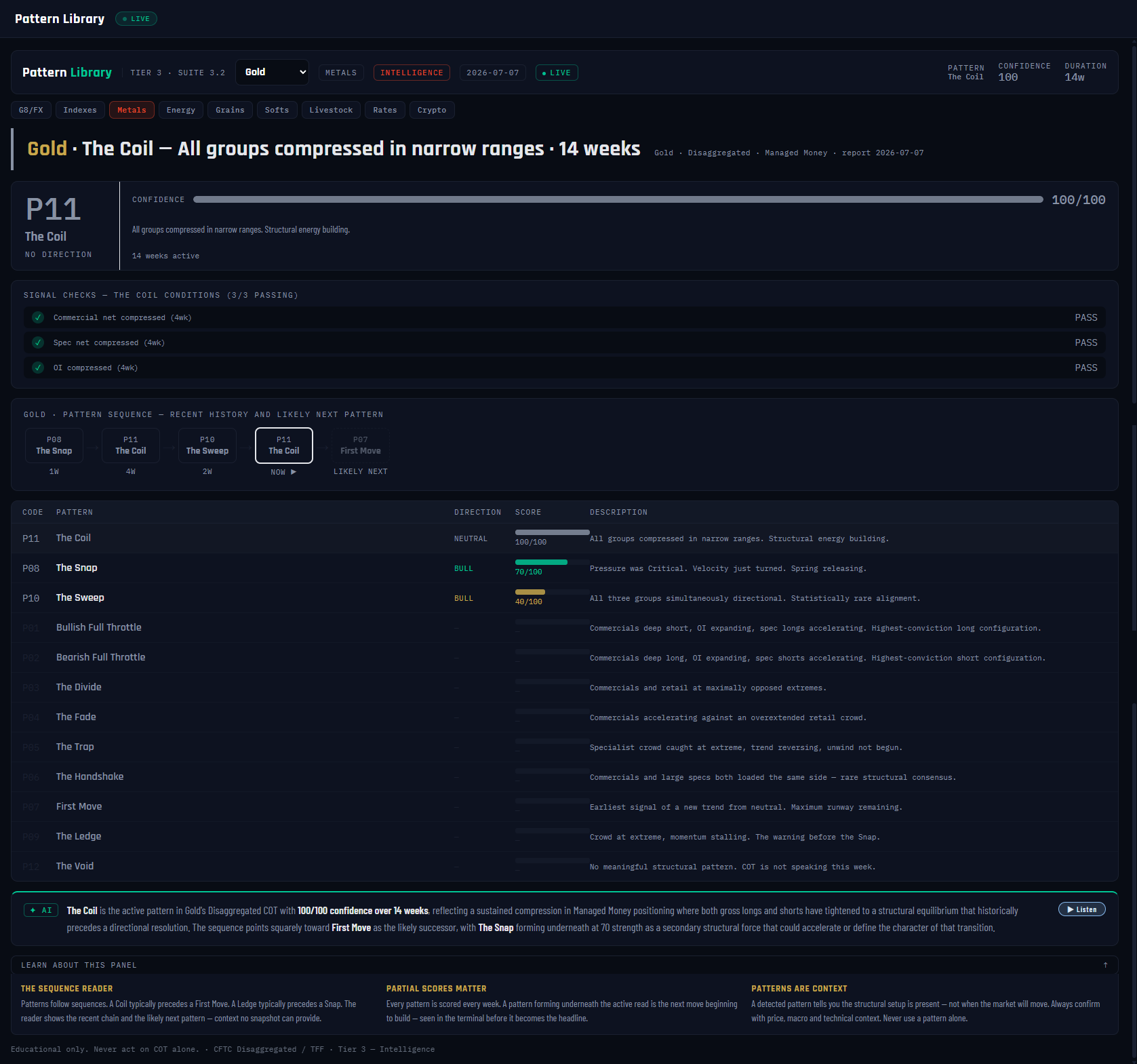
1
2
3
4
5
6
7
8
9
10
11
12
What it is
Experienced COT readers stop seeing numbers and start seeing recurring configurations — Commercials deep short while specs accelerate long, all three groups suddenly moving as one, every group coiled in a narrow range. The Pattern Library encodes twelve of these structures with locked definitions and names, then scores all twelve every week. It's the pattern-recognition instinct of a veteran, made checkable.
What it measures
Each pattern is a checklist of weighted conditions built from the same shared data every other panel uses — the specialist index, Commercial index, Small Trader positioning, velocity, acceleration, OI, and the Suite 3.1 pressure state. The score (0–100) is the percentage of weighted conditions passing, with one crucial guard: each pattern has a defining condition that must pass or the score is zero — no "Ledge" without an actual extreme. The highest scorer at 40+ becomes the active pattern; if nothing clears the bar, the market reads The Void — COT is not speaking this week, and the panel says so honestly at confidence 0. Gold's active pattern is P11 The Coil at 100/100, fourteen weeks running, NO DIRECTION: Commercials, specs and open interest all compressed into unusually narrow 4-week ranges — structural energy building, direction not yet chosen.
Why it's useful to you
Two reasons. First, naming compresses judgment: "The Coil, 100, fourteen weeks" tells you more, faster, than six panels read separately. Second, the sequence reader: patterns tend to succeed each other in readable ways, and the panel shows the recent chain — Gold ran The Snap → The Coil → The Sweep → back to The Coil (NOW), with First Move the likely successor: the historical exit from a Coil is the first directional move out of compression. Meanwhile the full table shows what's forming underneath — The Snap already at 70 (BULL) and The Sweep at 40 (BULL). Patterns are context for what configuration you're standing in, never a timing trigger.
The 10-second read
Active pattern + confidence + duration — then the sequence chain for what history says comes next, and the table for any pattern scoring 60+ underneath the active one.
Use it with: Pressure & Squeeze (The Snap's defining input is prior Critical/Pressurized pressure) ·
Unwind Tracker (when The Trap resolves, this tracks the release) ·
COT Checklist (fold the pattern into the full 7-step read)
1
Panel title + market dropdown. Pattern Library · Tier 3 · Suite 3.2, on Gold. Twelve locked patterns, re-scored every report week.
2
Stat chips. PATTERN The Coil · CONFIDENCE 100 · DURATION 14w. Confidence is the share of the pattern's weighted conditions passing — 100 means every condition holds.
3
Verdict banner. "The Coil — all groups compressed in narrow ranges · 14 weeks." The active pattern's locked definition, plus how long it has held.
4
Active pattern badge. P11 The Coil, tagged NO DIRECTION — the Coil is one of the few patterns that takes no side; it marks stored energy, not a lean. Directional patterns carry a Bullish/Bearish prefix instead.
5
Confidence bar. 100/100 — a full-strength detection. Partial scores (40–79) mean the configuration is present but incomplete; the signal checks below show exactly which condition is missing.
6
Signal checks. The Coil's conditions, 3/3 PASS: Commercial net compressed, spec net compressed, and OI compressed — each within an unusually narrow band of its own history over the last four weeks.
7
Pattern sequence chain. The recent run of active patterns compressed into a timeline — P08 The Snap → P11 → P10 The Sweep → P11 — ending in the predicted successor: P07 First Move, the historical exit from a Coil.
8
NOW marker. Flags the current node on the chain, so you always know which link is live and which is the forecast.
9
Pattern table header. The full library: code, direction, this week's score, and each pattern's locked one-line definition. All twelve are scored every week, not just the winner.
10
P08 The Snap — 70/100, BULL. The strongest pattern forming underneath the Coil: pressure was elevated and velocity has turned. If the Coil breaks, this is a candidate for what it breaks into.
11
P10 The Sweep — 40/100, BULL. A partial detection of all three groups moving the same direction — at 40 it's on the detection threshold, worth a glance, not a headline.
12
AI analysis + Listen. Two sentences: the active pattern and what it structurally means, then what the sequence implies is coming — the successor pattern, or the strongest one forming underneath.
23Unwind Tracker — Tracking the Release
VaultSingle-market view
Nav → Advanced → Unwind Tracker
№ MAP PINS — the gold markers on this screenshot point at locations on the panel; each is explained in the legend beside it. (They are separate from the teal STEP numbers in Part 1.)
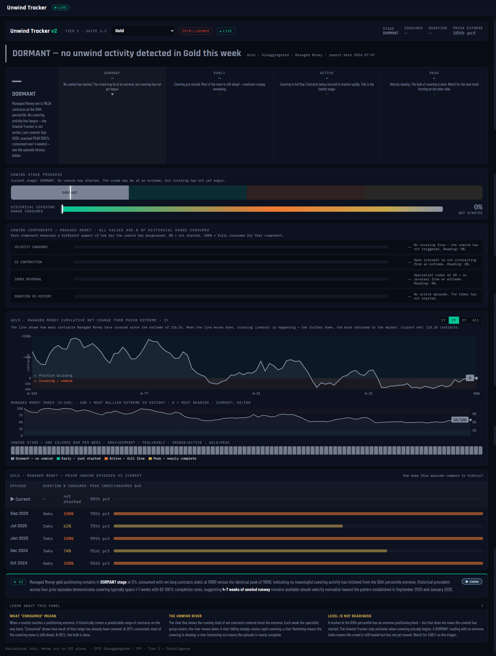
1
2
3
4
5
6
7
8
9
10
11
12
What it is
The whole platform keeps repeating one law: the unwind — not the extreme — is the tradable event. Extremes can sit for months; the money is made (or lost) when the crowded position starts to release, because forced exits feed on themselves. This panel is that law's instrument: it detects when an unwind actually begins after a positioning extreme, then tracks its progress week by week — like a storm tracker for position covering.
What it measures
An unwind triggers on three conditions together: the pressure gauge read Pressurized or Critical in recent weeks, the specialist index printed an extreme (roughly 70+ or 30-and-below), and velocity flipped direction — the crowd started covering. From that trigger the panel measures % consumed: how much of this market's typical historical covering range has been eaten so far, staged as DORMANT → EARLY (under 35%) → ACTIVE (35–74%) → PEAK (75%+). Four components decompose it — covering velocity, OI contraction, index reversal, duration vs history. Gold in the screenshot reads DORMANT: the prior extreme sat at only the 58th percentile, 0% consumed, all four components at zero — no unwind exists this week, and the panel says so plainly rather than inventing one.
Why it's useful to you
Because it answers the question that ruins most contrarian trades: how much is left? Jumping on an unwind at 80% consumed means catching the last of a move; catching it EARLY means most of the covering is still ahead. The episode history is the calibration: Gold's prior unwinds ran to 100% consumed in Sep 2025 and Jan 2025, and 62% in Jul 2025 — so when the next one triggers, you'll know what a full release looks like in this market, and the AI note can honestly frame it as several weeks of remaining runway rather than a guess. Level is not readiness; a DORMANT read is real information: nothing to chase.
The 10-second read
Stage + % consumed. DORMANT = nothing live. EARLY = the release just started — most runway ahead. ACTIVE = mid-release. PEAK = mostly done; the easy part of the move is behind you.
Use it with: Pressure & Squeeze (the upstream gauge — its Pressurized/Critical state arms this tracker) ·
Extremes & Percentile (the extreme this panel waits on) ·
Edge Lab (how unwind-flavored signals have actually performed since 2006)
1
Panel title + market dropdown. Unwind Tracker v2 · Tier 3 · Suite 3.3, on Gold — tracking the Managed Money crowd's covering behavior.
2
Stat chips. STAGE DORMANT · CONSUMED — · PRIOR EXTREME 58th pct. The consumed chip is blank because there is no active episode to measure.
3
Verdict banner. "DORMANT — no unwind activity detected in Gold this week." An honest zero: the most recent positioning peak (58th percentile) never qualified as an extreme, so there is nothing to unwind.
4
Stage cards. DORMANT (active) / EARLY / ACTIVE / PEAK — the four-stage arc every unwind travels. The highlighted card is the current stage; the thresholds are % consumed, not vibes.
5
Stage progress bar. Where inside the arc the current episode sits. Parked at DORMANT for Gold — it starts filling the week a trigger fires.
6
Historical covering range consumed. 0% — NOT STARTED. The headline metric: current covering measured against the median range of this market's own completed unwinds.
7
Unwind components. Velocity consumed / OI contraction / index reversal / duration — each 0% here. During a live episode these tell you which kind of unwind it is: velocity-led (panicky) or slow-bleed.
8
Cumulative net-change river. Two years of accumulated position change from the prior extreme — downhill = covering. During an unwind you literally watch the river drain; flat means the crowd is holding.
9
Specialist index strip. Managed Money's index week by week (58/100 now) — the context track that shows whether positioning is even near the extremes this tracker waits for.
10
Stage color strip. Every week tinted by unwind stage: grey = dormant, teal = early, orange = active, gold = peak. Past episodes appear as colored bursts in a grey field — you can count them at a glance.
11
Prior unwind episodes. The calibration table: each past episode's duration, % consumed and peak index — Sep 2025 ran to 100%, Jul 2025 stopped at 62%, Jan 2025 hit 100%. This is what "typical" means in the consumed metric above.
12
AI analysis + Listen. Two sentences: the stage with the actual contract numbers, then what the episode history implies about remaining covering runway — here framed as roughly 4–7 weeks once an unwind actually triggers.
24Cross Index · FX Pairs — Step 1 of Any Forex Read
VaultCross-market view
Nav → Advanced → Cross Index · FX Pairs
№ MAP PINS — the gold markers on this screenshot point at locations on the panel; each is explained in the legend beside it. (They are separate from the teal STEP numbers in Part 1.)
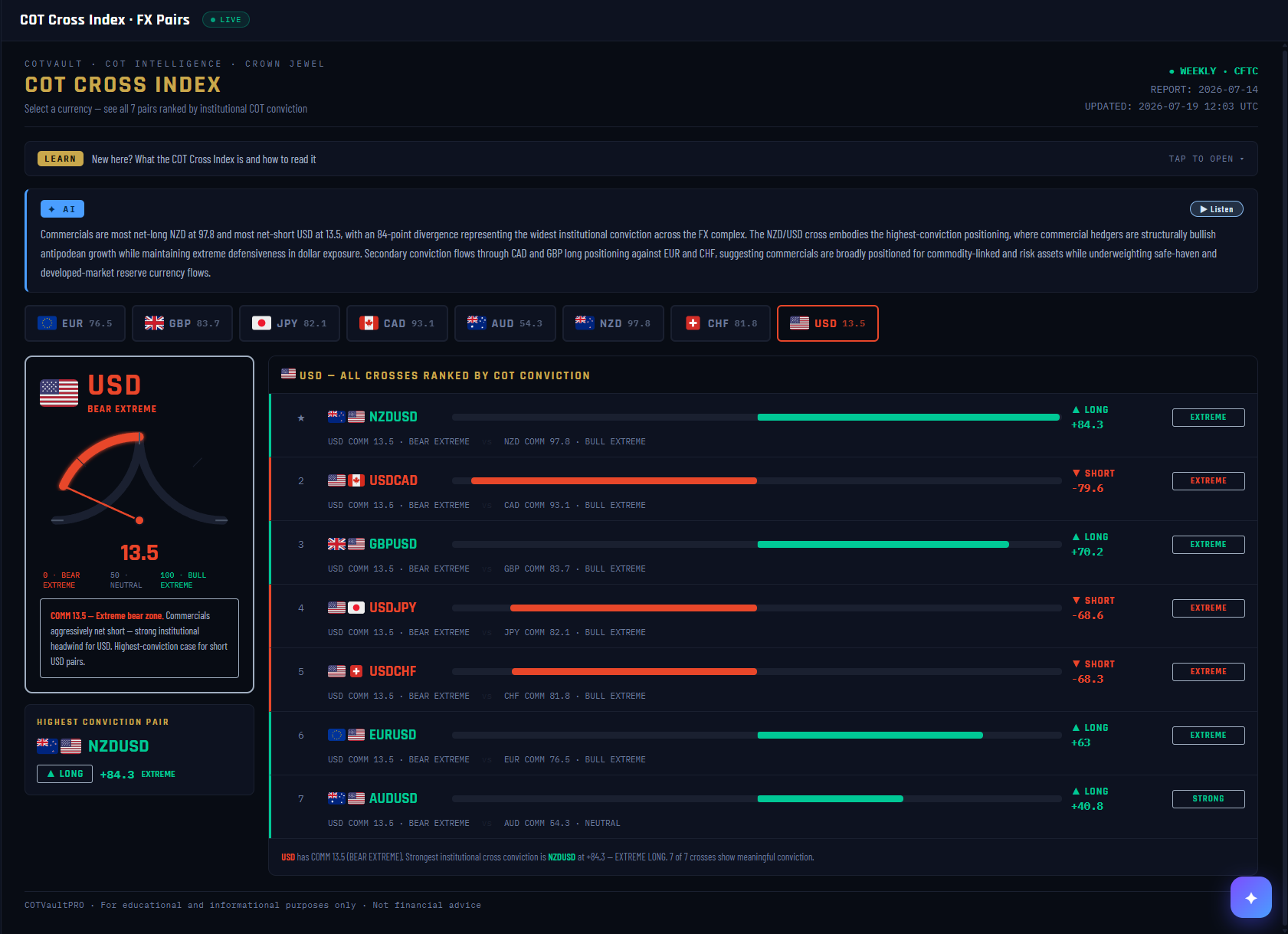
1
2
3
4
5
6
7
8
9
10
11
12
13
14
15
What it is
The panel that translates COT into the pairs you actually trade. COT data is published on individual currency futures — Canadian Dollar, Euro, Yen — but you trade USDCAD and EURUSD. This does the arithmetic for you: pick a currency and it ranks all seven of its crosses by how strongly the commercials lean.
What it measures
Each cross is base currency COT index minus quote currency COT index. In the screenshot the US Dollar sits at 13.5 — a bear extreme, meaning commercials are aggressively net short USD. Against the Canadian Dollar at 93.1, USDCAD scores −79.6, EXTREME SHORT. The bar length is conviction; the sign is direction.
Why it's useful to you
This is the first panel to open when you bring a chart setup to the platform. It answers one question in a single glance — is COT with me or against me on this pair? — before you spend time on per-leg detail. Currency futures are quoted in USD terms, so a long CAD futures position means USDCAD falling. This panel handles that inversion for you, which is exactly where most traders misread COT.
The 10-second read
Find your pair in the ranked list. A long green bar means commercials favour the base currency; a long red bar means they favour the quote. The further from zero, the more the hedgers disagree with anyone taking the other side.
Use it with: Setup Scanner · COT Intelligence · Crowding Meter
1
Panel identity. Marked CROWN JEWEL — for a forex trader this is the highest-value board on the platform, and the one to open first.
2
Report stamp. The CFTC report date this board reads, plus the time the page last refreshed. COT is weekly: collected Tuesday, published Friday.
3
Learn ribbon. Tap to expand a plain-English primer on what the Cross Index is and how to read the bars. Written for someone seeing it for the first time.
4
AI read. Names the widest institutional conviction on the board in sentences — here NZD at 97.8 against USD at 13.5, an 84-point divergence, the widest across the whole FX complex.
5
Currency selector. All eight majors with their live commercial index. Click any one to re-rank the board around it. The numbers here are the raw material every cross below is built from.
6
Selected currency. The gold outline shows which currency the board is currently framed around — the US Dollar in this shot.
7
The gauge. The selected currency's commercial index on a 0–100 dial. 13.5 sits deep in the red bear zone; 50 is neutral; 100 would be an extreme bull reading.
8
Zone label. The plain-word version of the gauge — BEAR EXTREME. This is the headline, and every cross below inherits it.
9
Interpretation box. What the reading means in practice: commercials aggressively net short, a strong institutional headwind for the dollar, and the highest-conviction case for short-USD pairs.
10
Highest conviction pair. The single strongest read for the selected currency — NZDUSD long at +84.3. If you only look at one line on this panel, look at this card.
11
Ranked crosses. All seven pairs for the selected currency, sorted by conviction. Each line shows both legs' commercial index so you can see exactly where the score comes from.
12
A worked example. USDCAD at −79.6: USD commercials at 13.5 (bear extreme) against CAD commercials at 93.1 (bull extreme). Both legs point the same way — a strong hedger case against a long USDCAD position.
13
Conviction bar. Bar length is the size of the divergence, colour is direction: teal for long the pair, red for short. Colour always follows the sign, never the magnitude.
14
Score and direction. The signed number behind the bar, with LONG or SHORT spelled out so there is no ambiguity about which way the pair is being read.
15
Board summary. One sentence restating the selected currency's zone, the strongest cross, and how many of the seven show meaningful conviction — useful as the opening line of a weekly write-up.
25COT Cross Index — Every Market's Stretch, One Matrix
VaultWhole-board view
Nav → Advanced → COT Cross Index
№ MAP PINS — the gold markers on this screenshot point at locations on the panel; each is explained in the legend beside it. (They are separate from the teal STEP numbers in Part 1.)
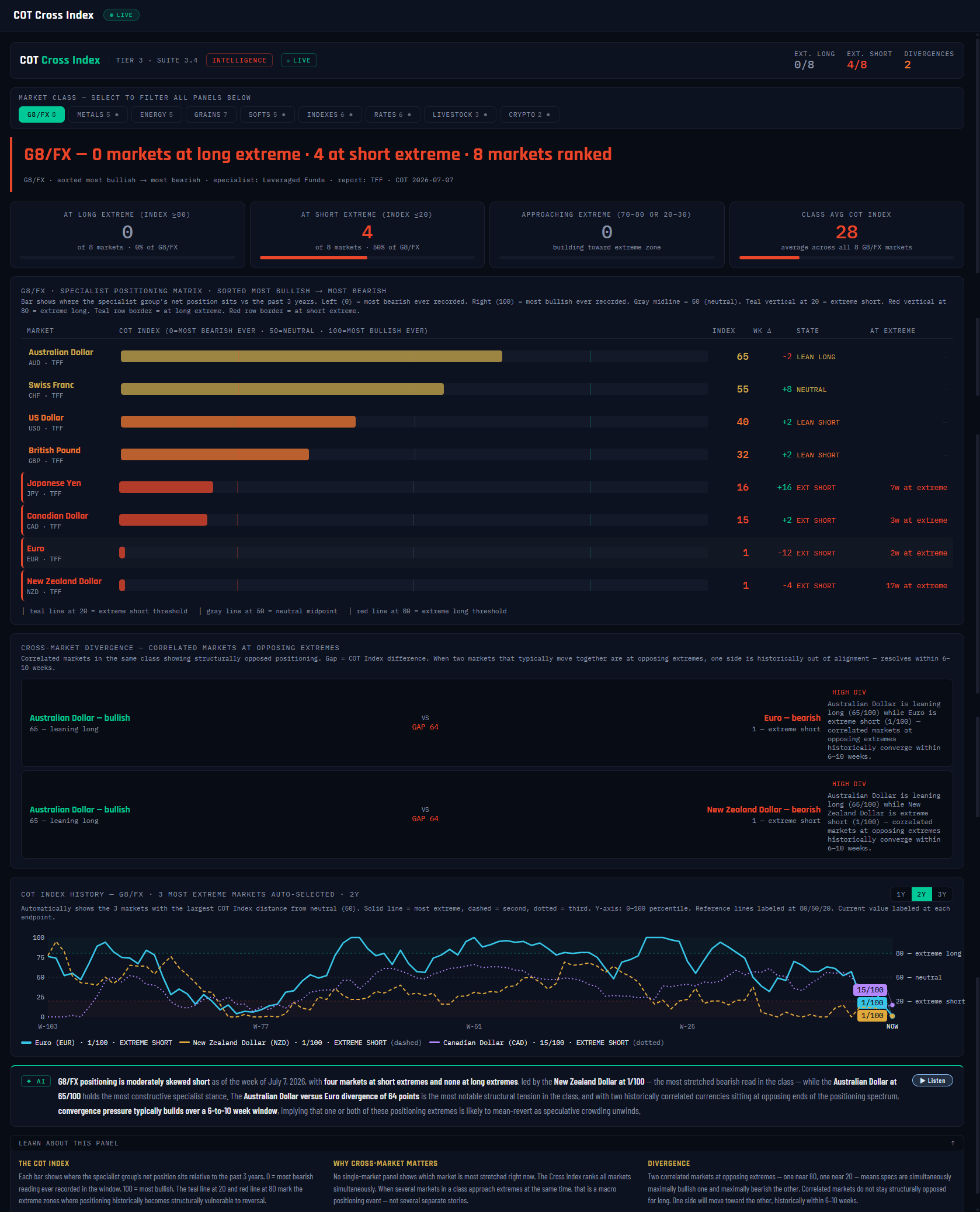
1
2
3
4
5
6
7
8
9
10
11
12
What it is
Every deep-dive panel reads one market at a time. The Cross Index turns the lens sideways: it takes the specialist COT Index of every market in a class and lines them up on one matrix, ranked most bullish → most bearish. In one glance you see which markets the professional speculators have pushed to an extreme, which are merely leaning, and — the panel's signature move — where two correlated markets sit at opposing extremes at the same time.
For FX that last part matters more than anywhere else: the CFTC only reports dollar-denominated contracts, so no report exists for a cross like AUDNZD. Put the two currencies' indexes side by side, though, and the gap between them is the institutional read on the cross — on this screenshot, AUD at 65 against NZD at 1 is a 64-point gap, flagged as a HIGH divergence.
What it measures
Each bar is that market's specialist index: where the specialist group's net position sits inside its past 3 years, scaled 0–100 (100 = most net-long in three years, 0 = most net-short). "Specialist" means the group with the strongest track record for each report family — Managed Money on Disaggregated markets (metals, energy, grains…) and Leveraged Funds on TFF markets (FX, indexes, rates). The state ladder runs EXTREME (≥80 or ≤20) → STRETCHED (70s / 20s) → LEANING (above 55 / below 45) → NEUTRAL. A divergence card fires when a correlated pair shows a gap of 30+ points with one side at 65+ and the other at 35 or below; a gap of 50+ earns HIGH DIV.
Why it's useful to you
Positioning numbers mean little in isolation — 65 is only interesting because everything around it reads 1. Ranking a whole class on one scale gives you relative stretch, which is what cross and spread trades actually run on. And the divergence cards do the pair-hunting for you: correlated markets do not stay structurally opposed for long — historically these gaps converge within 6–10 weeks. That's not a timing signal, but it tells you which cross deserves a spot on the watchlist this week.
The 10-second read
Header chips first: how many markets sit at a long or short extreme. Then the top and bottom of the matrix. Any HIGH DIV card is the week's cross idea — vet it, don't trade it.
Use it with: Extremes Screener (the same hunt across ALL classes, with the commercial leg added) ·
Divergence Detection (does price agree with either leg?) ·
Market HQ (drill into any market that's pinned)
1
Class stat chips. The headline census for the selected class — here G8/FX: EXT. LONG 0/8, EXT. SHORT 4/8, DIVERGENCES 2. Half the FX board pinned at a short extreme is itself the story, before you open a single market.
2
Market-class filter. G8/FX, Metals, Energy, Grains, Softs, Indexes, Rates, Livestock, Crypto — one click re-ranks every section below for that class.
3
Verdict banner. The class read in one sentence: "G8/FX — 0 markets at long extreme · 4 at short extreme." Skewed counts like this mean the extreme is a class-wide theme (here: specialists short most of the FX board), not a single-market quirk.
4
Summary cards. At long extreme / at short extreme / approaching (the 70s and 20s — next week's candidates) / class average index. The average (28 here) anchors what "normal" looks like for this class right now.
5
Matrix columns. INDEX (the 0–100 number), WK Δ (this week's change), STATE (the ladder word) and AT EXTREME (how many consecutive weeks pinned). Weeks-at-extreme is the underrated column — a fresh extreme and a 15-week-old one are different animals.
6
Top of the matrix. AUD at 65, LEAN LONG — the most bullishly positioned market in the class. Note it's not even STRETCHED: in a board this bearish, "most bullish" is relative.
7
Specialist positioning matrix. Every market in the class on one 0–100 scale, sorted most bullish → most bearish. Bar length and color follow the index; this is the panel's core graphic.
8
Bottom of the matrix. NZD and EUR at 1/100 — EXT SHORT, red-bordered, with their weeks-at-extreme counts. Specialists are about as net-short these currencies as they have been in three years.
9
Cross-market divergence cards. Correlated pairs at opposing extremes — AUD (65, leaning long) vs EUR (1, extreme short), GAP 64 · HIGH DIV, and the same against NZD. For FX pairs this is the synthetic cross read the CFTC never publishes.
10
COT Index history chart. The three most extreme markets in the class, auto-selected, with their index paths overlaid — so you can see whether today's extreme is a fresh arrival or a long-running pin.
11
AI note + Listen. The AI read of the class — which extremes and divergences matter this week, in plain English. The Listen button reads it aloud.
12
Education bar. The COT Index / Why cross-market matters / Divergence — the panel's built-in course, collapsed by default. One click if any term above is fuzzy.
26Crowding Meter — The Commercials-vs-Crowd Tension Meter
VaultSingle-market view
Nav → Advanced → Crowding Meter
№ MAP PINS — the gold markers on this screenshot point at locations on the panel; each is explained in the legend beside it. (They are separate from the teal STEP numbers in Part 1.)
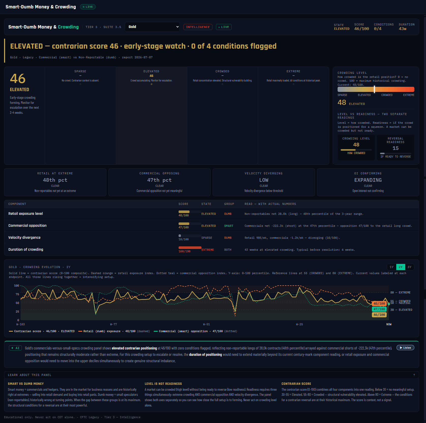
1
2
3
4
5
6
7
8
9
10
11
12
What it is
The panel's on-screen title is "Crowding Meter" — under the hood it is a tension meter between two specific cohorts of the Legacy COT report: the Commercials (the hedgers, historically the informed side that buys weakness and sells strength) and the Small Traders (non-reportables — mostly retail, the crowd that tends to be maxed out at exactly the wrong moment). It scores how hard the crowd is currently leaning against the commercials, and turns that stand-off into a single 0–100 contrarian score with a state ladder: SPARSE → ELEVATED → CROWDED → EXTREME.
What it measures
Four components feed the score: retail exposure (where the small traders' net position sits in its 3-year range), commercial opposition (how hard the commercials are positioned against the crowd's side), velocity divergence (the two groups actively moving in opposite directions this week — the live tug-of-war), and duration (how many weeks the crowding has persisted, measured against a ~6-week historical norm). Four alert conditions sit on top — retail at extreme, commercial opposing, velocity diverging, open interest confirming — and the count of flagged conditions is the panel's honesty check on its own score.
Why it's useful to you
Because crowd-fading is the most abused idea in trading. Retail-heavy positioning is a real, documented headwind — but a crowded market can stay crowded for months. This panel enforces the discipline with two laws. Level is not readiness: the crowding level (how packed the trade is) and reversal readiness (whether it's primed to unwind) are separate readings — on this screenshot Gold shows level 48 but readiness just 15, i.e. somewhat crowded, nowhere near turning. Trajectory over snapshot: the evolution chart shows whether the setup is building or bleeding off — the direction of the score matters as much as its value.
The 10-second read
State chip + conditions count. ELEVATED · 0 of 4 conditions = a watch file, nothing more. It gets interesting when the state hits CROWDED with 2–3 conditions flagged and readiness climbing.
Use it with: Pressure & Squeeze (the commercials-vs-professional-specs spring — the other tension axis) ·
Unwind Tracker (has the release actually begun?) ·
Extremes & Percentile (the raw percentile evidence under the crowd reading)
1
Title + market dropdown. Single-market panel — pick any of the covered markets (Gold here). Runs on the Legacy report: commercials vs non-reportable small traders.
2
Stat chips. STATE ELEVATED / SCORE 46/100 / CONDITIONS 0/4 / DURATION 43w. The 43-week duration with zero conditions flagged tells you this is a long, slow lean — not a coiled reversal setup.
3
Verdict banner. The one-sentence read: "ELEVATED — contrarian score 46 · early-stage watch · 0 of 4 conditions." Always score + stage + condition count, so you can't mistake a watch file for a setup.
4
Contrarian score readout. The headline 0–100 number (46). It blends retail exposure, commercial opposition, velocity divergence and duration — a structure reading, never a timing signal.
5
State ladder. SPARSE → ELEVATED (46, current) → CROWDED → EXTREME. Deliberately different vocabulary from the Pressure gauge's DORMANT→CRITICAL ladder — this one describes crowd level, not release readiness.
6
Crowding level meter. 48/100 — purely how packed the small traders' side is versus its own 3-year history, before any other component is considered.
7
LEVEL VS READINESS split. The panel's first law made visual: crowding level 48 (HOW crowded) beside reversal readiness 15 (IF ready to reverse). A high level with low readiness means the trade can keep grinding on — fading it early is how contrarians lose money.
8
Condition cards. The four tripwires with live values: retail at extreme (48th pct — clear), commercial opposing (47th), velocity diverging (LOW), OI expanding. Each flips to flagged at its own threshold; the flagged count drives how seriously to take the score.
9
Component table. Every input with its 0–100 value and a plain-English read using actual contract numbers — retail exposure 48, commercial opposition 47, velocity divergence 10, duration 100 (43 weeks vs the ~6-week norm). Duration maxed while everything else idles is the signature of a stale, not explosive, crowd.
10
Crowding evolution chart. The contrarian score with the retail and commercial component lines over the past years — the second law in action. Rising into an extreme is a building setup; drifting sideways at 46 is background noise.
11
AI analysis + Listen. Two sentences from the AI analyst: the state, score and flagged conditions with the real contract numbers, then what would have to happen for the score to escalate or resolve.
12
Education cards. The cohort definitions, "Level is not readiness" and the contrarian-score method — the panel's built-in course if any reading above needs unpacking.
27Crowding Evolution — Level vs Readiness, Over Time
VaultSingle-market view
Nav → Advanced → Crowding Evolution
№ MAP PINS — the gold markers on this screenshot point at locations on the panel; each is explained in the legend beside it. (They are separate from the teal STEP numbers in Part 1.)
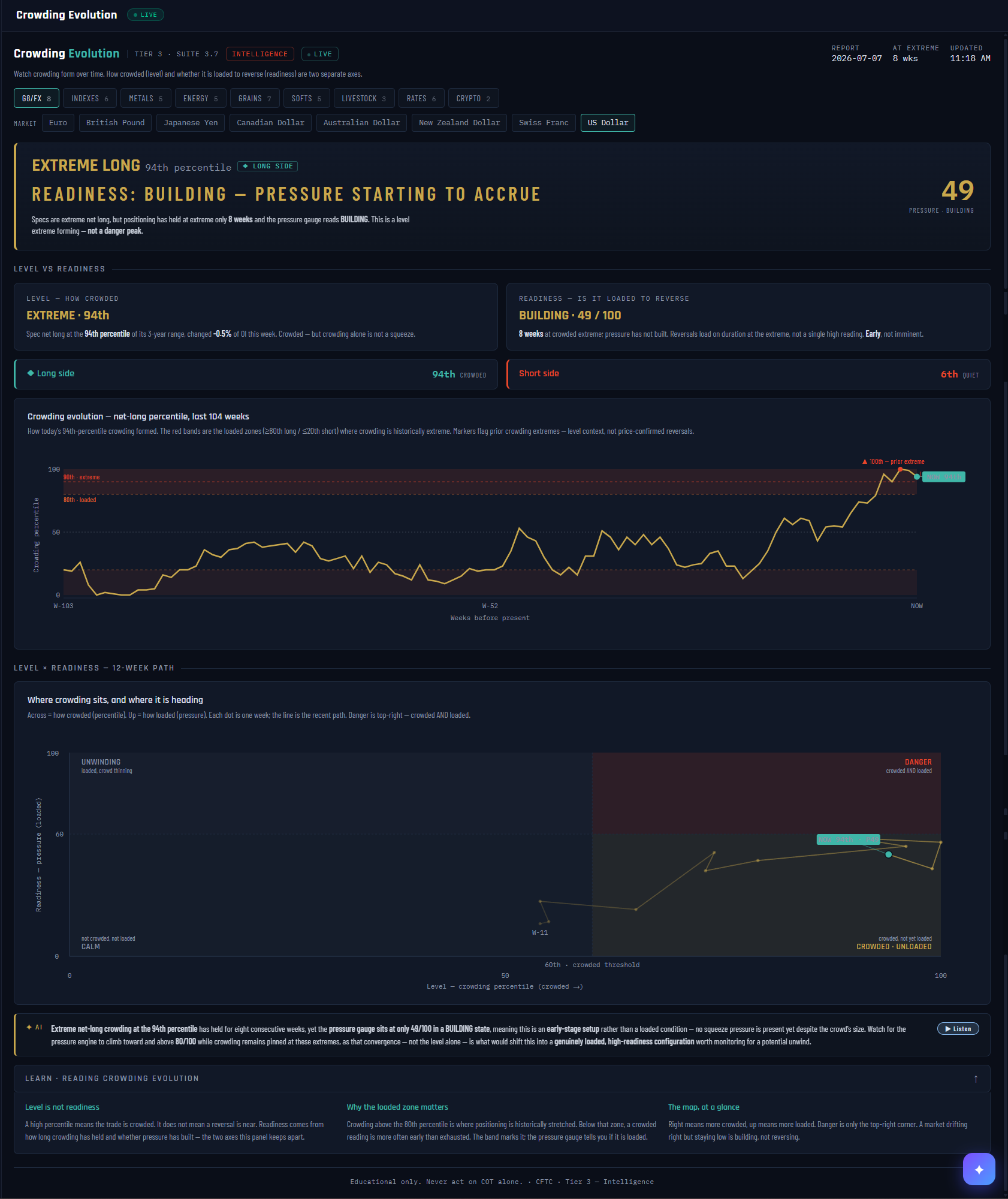
1
2
3
4
5
6
7
8
9
10
11
What it is
The time-lapse of crowding. Where the Crowding panel gives you this week’s photograph, Crowding Evolution runs the film: how today’s crowd formed, how long it has held, and — the panel’s core teaching — whether it is actually loaded to reverse. Its two axes are deliberately kept apart: Level (how crowded) and Readiness (is it loaded).
What it measures
Level = the crowd’s net position as a percentile of its 3-year range — the screenshot shows the US Dollar at the 94th percentile, EXTREME LONG. Readiness = a 0–100 pressure gauge built from how long crowding has held at the extreme and whether squeeze pressure has accrued — here just 49, BUILDING, after 8 weeks at the extreme. Same market, two very different answers: crowded, but not yet loaded.
Why it's useful to you
The most expensive mistake in contrarian trading is shorting a crowd that isn’t finished. This panel exists to prevent exactly that: a 94th-percentile reading alone is a level, not a trigger. Reversals load on duration at the extreme plus pressure, and the path map shows you drifting toward the danger corner — or not — week by week.
The 10-second read
Read the verdict banner’s two lines: the LEVEL line tells you if there’s a crowd; the READINESS line tells you whether it’s early, building, or genuinely loaded. Danger is only when both scream.
Use it with: The Crowding panel ·
Pressure & Squeeze ·
Unwind Tracker
1
Header + report chips. The report week, how many weeks the market has sat at its extreme, and the last update time.
2
Class + market selector. All asset classes; the screenshot has the US Dollar selected.
3
The verdict banner. Level in the headline (EXTREME LONG · 94th percentile), readiness in the sub-line (BUILDING — pressure starting to accrue), and the pressure score on the right. This banner is the whole panel in three lines.
4
LEVEL card. How crowded: the crowd’s percentile, this week’s change, and the reminder the panel lives by — crowding alone is not a squeeze.
5
READINESS card. Is it loaded: weeks at the extreme and the pressure state. Reversals load on duration, not on a single high reading.
6
Long side / short side strips. Both sides ranked at once — here the long side is 94th, CROWDED while the short side sits at the 6th percentile, QUIET.
7
Evolution chart — 104 weeks. How today’s crowding formed. The shaded bands are the loaded zones (≥80th long / ≤20th short); markers flag prior crowding extremes for context.
8
Level × Readiness path map. Each dot is one week: right = more crowded, up = more loaded. The line is the recent 12-week path — you can watch a market drift toward danger.
9
The DANGER corner. Top-right only: crowded AND loaded. The screenshot’s dot sits right of center but well below the corner — crowded, unloaded, early.
10
AI read. The analyst’s synthesis of both axes — here flagging an early-stage setup and naming the exact condition (pressure through 80 while crowding stays pinned) that would change the verdict.
11
LEARN strip. The panel’s three lessons in miniature — level is not readiness, why the loaded zone matters, and how to read the map.
28Setup Scanner — Crowding & Unwind, Every Market at Once
VaultCross-market view
Nav → Advanced → Setup Scanner
№ MAP PINS — the gold markers on this screenshot point at locations on the panel; each is explained in the legend beside it. (They are separate from the teal STEP numbers in Part 1.)
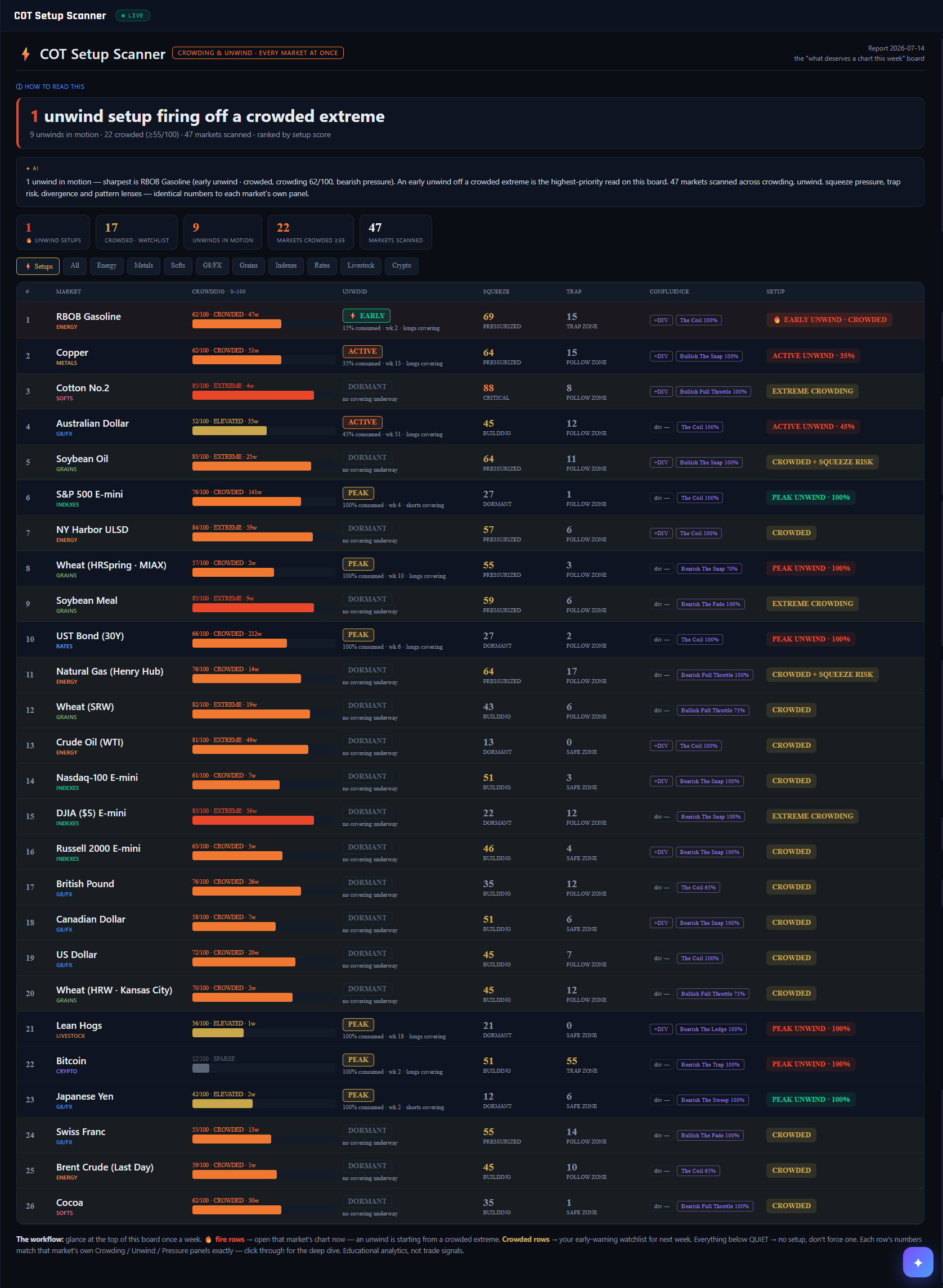
1
2
3
4
5
6
7
8
9
10
11
12
13
What it is
The board that answers “what deserves a chart this week?” Crowding, unwind, squeeze, trap risk, divergence and pattern each had a deep single-market panel — which meant a setup could be forming and you would never know unless you happened to click that market. This runs all 47 markets through all six lenses at once and ranks them.
What it measures
A composite setup score, weighted toward the two readings that matter most: crowding (0–100, how hard the retail crowd leans against the commercials) and unwind stage (DORMANT → EARLY → ACTIVE → PEAK). Squeeze pressure, trap risk, divergence and active pattern add confluence. Every number is pulled from that market's own canonical panel — never recalculated, so the board and the deep dive always agree.
Why it's useful to you
Crowding tells you a setup exists; the unwind turning EARLY tells you it has started. That distinction is the whole point of the board. A 🔥 fire row means covering has just begun off a crowded extreme — the moment to open that market's chart. Crowded-but-dormant rows are next week's watchlist, not today's trade.
The 10-second read
Look only at the top. 🔥 fire rows → open that chart now. Gold crowded rows → watchlist. Everything reading QUIET → no setup this week; don't force one.
Use it with: Crowding Meter · Unwind Tracker · Pressure & Squeeze
1
Panel identity. “Crowding & unwind · every market at once” — the scanner counterpart to the single-market Crowding and Unwind panels.
2
How to read this. Expands a full key: what the crowding score means, what each unwind stage means, and why a fire row outranks everything else.
3
Verdict banner. The headline count of unwind setups firing off a crowded extreme, with the supporting tallies beneath — unwinds in motion, markets crowded, markets scanned.
4
AI read. Names the sharpest setup in sentences, including its crowding score and pressure direction, and restates the priority rule so the board teaches while it reports.
5
Summary chips. Five counts at a glance: fire setups, crowded watchlist, unwinds in motion, markets crowded ≥55, and total markets scanned.
6
Class tabs. ⚡ Setups shows only what is flashing; All shows the full ranking; the rest filter by asset class. The board opens on Setups deliberately.
7
Crowding column. The 0–100 contrarian score with its state word and how many weeks it has held. The bar makes the level scannable without reading numbers.
8
Unwind column. The stage chip — here ⚡ EARLY — with percent consumed, week count, and which side is covering. EARLY is the trigger read; DORMANT means nothing has started.
9
Squeeze. How loaded the spring is, from the Pressure & Squeeze engine. High squeeze under a crowded position is what turns a level into a risk.
10
Trap. Where the market sits in its trend lifecycle. A high trap score means late-stage — the zone where crowds get caught.
11
Confluence chips. Extra agreement from two more engines: +DIV when price and positioning are diverging, plus the active pattern and its confidence.
12
Setup verdict. The synthesised call. 🔥 EARLY UNWIND · CROWDED is the highest-priority read on the board — covering has begun from a stretched position.
13
The workflow footer. The weekly routine in one line: fire rows now, crowded rows next week, quiet rows ignored. Every number here matches that market's own panel exactly.
29Book Comparison — Futures-Only vs Futures + Options
VaultCross-market view
Nav → Advanced → Book Comparison
№ MAP PINS — the gold markers on this screenshot point at locations on the panel; each is explained in the legend beside it. (They are separate from the teal STEP numbers in Part 1.)
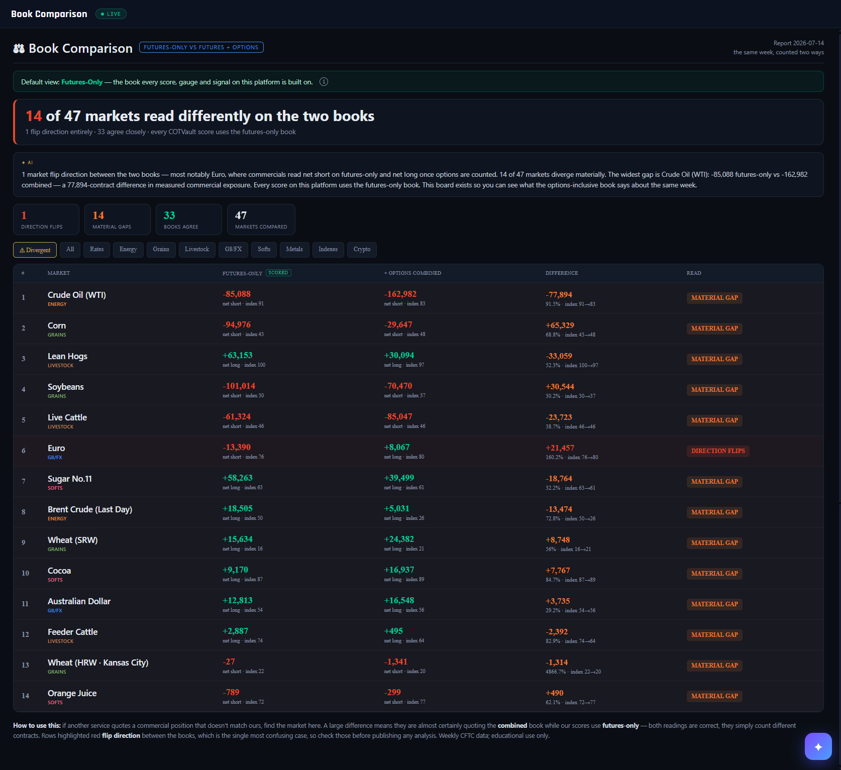
1
2
3
4
5
6
7
8
9
10
11
12
13
14
What it is
The CFTC publishes every COT report in two books: futures contracts alone, and futures plus options converted to their futures-equivalent size. Every score on this platform is built on the futures-only book — the classic standard. This board shows you what the other book says about the same week, side by side.
What it measures
For all 47 markets: the commercial net position and index on each book, the difference between them, and a verdict. 14 of 47 diverge materially this week. The widest is Crude Oil — −85,088 futures-only against −162,982 combined, a 77,894-contract difference in measured commercial exposure. Options-heavy markets like energy, grains and livestock diverge most.
Why it's useful to you
If another service quotes a commercial position that doesn't match ours, this is where you find out why — in seconds, with the arithmetic done. Both readings are correct; they simply count different contracts. Note what the index columns show, though: even where raw positions differ by 90%, the 0–100 index barely moves. That is why the platform's signals hold regardless of which book you prefer.
The 10-second read
Find the market in question. A large Difference means another service is almost certainly quoting the combined book. Red DIRECTION FLIPS rows are the ones that genuinely confuse people — check those before publishing anything.
Use it with: COT Intelligence · Setup Scanner · Academy lesson F2
1
Panel identity. “Futures-only vs futures + options” — the same CFTC week, counted two ways.
2
Default view banner. States plainly which book the platform scores on, so there is never any doubt about where your numbers come from.
3
The ⓘ explainer. Hover for what each book counts, why hedgers in some markets use options heavily, and why neither book is right or wrong.
4
Verdict banner. How many markets read differently, how many flip direction outright, and how many agree closely.
5
AI read. Names the direction flip and the widest gap in sentences, with the actual contract numbers behind both.
6
Summary chips. Direction flips, material gaps, books agree, markets compared.
7
Filter tabs. ⚠ Divergent shows only the markets that disagree; All shows every market; the rest filter by class.
8
Futures-only column. Marked SCORED — this is the book behind every gauge on the platform. Shows net position, side, and the 0–100 index.
9
Combined column. The same week with options included. Compare the two index values, not just the raw nets — that comparison is the real story.
10
Difference column. The gap in contracts, as a percentage, and how the index shifts. Crude's index moves only 91→83 despite a 91.5% gap in raw position.
11
Read column. The verdict: MATERIAL GAP, DIRECTION FLIPS, or books agree.
12
The widest gap. Crude Oil — nearly 78,000 contracts of commercial exposure that the futures-only book does not see, because oil hedgers lean heavily on options.
13
Direction flip. The Euro reads net short on futures-only and net long once options are counted. The one case that looks like a contradiction rather than a nuance — worth checking before you publish any euro analysis.
14
How to use this. The footer states the rule: a large difference means the other service is quoting the combined book; both are correct; check flip rows first.
30Edge Lab — Every Signal's Honest Report Card
VaultWhole-board view
Nav → Advanced → Edge Lab
№ MAP PINS — the gold markers on this screenshot point at locations on the panel; each is explained in the legend beside it. (They are separate from the teal STEP numbers in Part 1.)
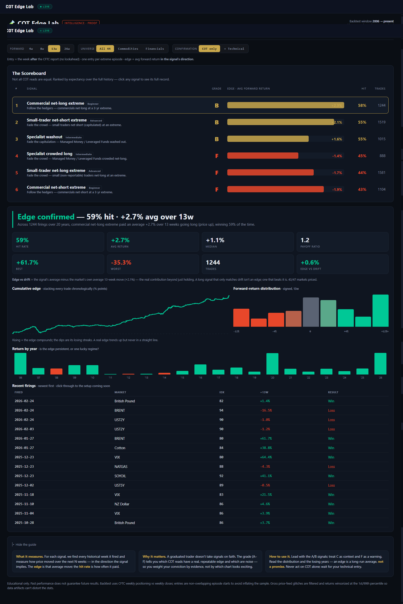
1
2
3
4
5
6
7
8
9
10
11
12
What it is
The proof layer. Every other panel tells you what positioning looks like today; the Edge Lab tells you what each COT signal has actually been worth — every historical firing across the whole market universe since 2006, measured forward. Six core signals sit on the scoreboard: commercial net-long and net-short extremes, specialist washout and crowded-long, and small-trader extremes on both sides. Each gets a letter grade, and losers get an F printed right next to the winners.
What it measures
For each signal, the lab finds every week it fired historically and measures the price move over the next N weeks, in the direction the signal implies. The test is built not to flatter: entry is the week AFTER the report week (COT publishes days after the record date — no lookahead), each extreme episode counts once (the first week it fires, so a 10-week pin doesn't inflate the sample), outliers are trimmed with standard quant hygiene, and the result is compared against baseline drift — the universe's own average N-week move. Beating zero isn't an edge; beating drift is. Grades: A = avg ≥ +2.0% with a hit rate ≥ 58%, B ≥ +1.0%, C ≥ +0.3%, F below that — and no grade at all under 12 trades.
Why it's useful to you
Because signal worship is how retail accounts die. "Commercials at an extreme" sounds authoritative — the Edge Lab tells you it wins about 59% of the time for a ~+2.7% average over 13 weeks, which is a real but modest edge, with plenty of losing trades and losing years inside it. Honest base rates recalibrate everything: you size smaller, you stop expecting every extreme to reverse, you lead with the A/B signals and treat F-graded folklore as the warning it is. A graduated trader weights conviction by evidence, not by which chart looks exciting.
The 10-second read
Scan the GRADE column. B and above = reads worth building a process on; F = reads to stop repeating. Then click your favorite signal and look at its losing years before you fall in love.
Use it with: Extremes Screener (which markets fire the graded signals right now) ·
COT Triggers (fresh firings, the week they happen) ·
Extremes & Percentile (the index behind every backtested entry)
1
FORWARD window. 4w / 8w / 13w / 26w — how far ahead each trade is measured. COT edges are slow; the same signal can grade differently at 4 weeks and 26. The screenshot runs the 13-week window.
2
UNIVERSE toggle. All 44 markets, Commodities only, or Financials only. Some signals earn their grade in commodities and lose it in financials — check both before trusting a read in your market class.
3
CONFIRMATION toggle. COT only = take every firing. + Technical = only count firings where price momentum over the prior 8 weeks already agrees with the signal — the platform's "let the chart confirm the COT bias" rule, backtested. Compare the two to see what waiting for confirmation is worth.
4
GRADE column. The letter verdicts, A–F. On this screenshot the board splits B / B / B / F / F / F — half the platform's own signals fail the test, and the panel says so. That honesty is the product.
5
EDGE bar column. Average forward return per firing, drawn as a bar — teal right of zero, red left. The visual answer to "how much is this signal actually worth?"
6
Scoreboard row. One row per signal: thesis, grade, average edge, hit rate, trade count. Row 1 — Commercial net-long extreme: grade B, +2.3% average, 58% hit rate, 1,244 trades. Click any row to open its full tearsheet below.
7
Stat tiles. The selected signal in full: hit rate, average and median return, payoff ratio, best and worst trade, trade count, and edge vs drift — the only tile that proves the signal beats simply holding the market.
8
Cumulative edge curve. Every historical trade stacked in sequence. A healthy edge climbs unevenly with visible drawdowns; a curve that only ever rises should make you suspicious, and this one doesn't pretend.
9
Return distribution. The histogram of all forward returns. Note how much of the mass sits left of zero even for a B-graded signal — an edge is a shifted distribution, not a guarantee.
10
Return by year. The persistence check: average return per calendar year since 2006. Every real edge has losing years — knowing they exist in the backtest is what keeps you in the strategy when one happens live.
11
Recent firings table. The latest actual entries — date, market, index at firing, the forward move, win or loss. The bridge between the aggregate statistics and trades you can recognize on a chart.
12
Guide cards. What it measures / Why it matters / How to use it: lead with A/B signals, treat C as context, read F as a warning — and remember an edge is a long-run average, not a promise about the next trade.
31Extremes Screener — The Radar for Stretched Positioning
VaultWhole-board view
Nav → Advanced → Extremes Screener
№ MAP PINS — the gold markers on this screenshot point at locations on the panel; each is explained in the legend beside it. (They are separate from the teal STEP numbers in Part 1.)
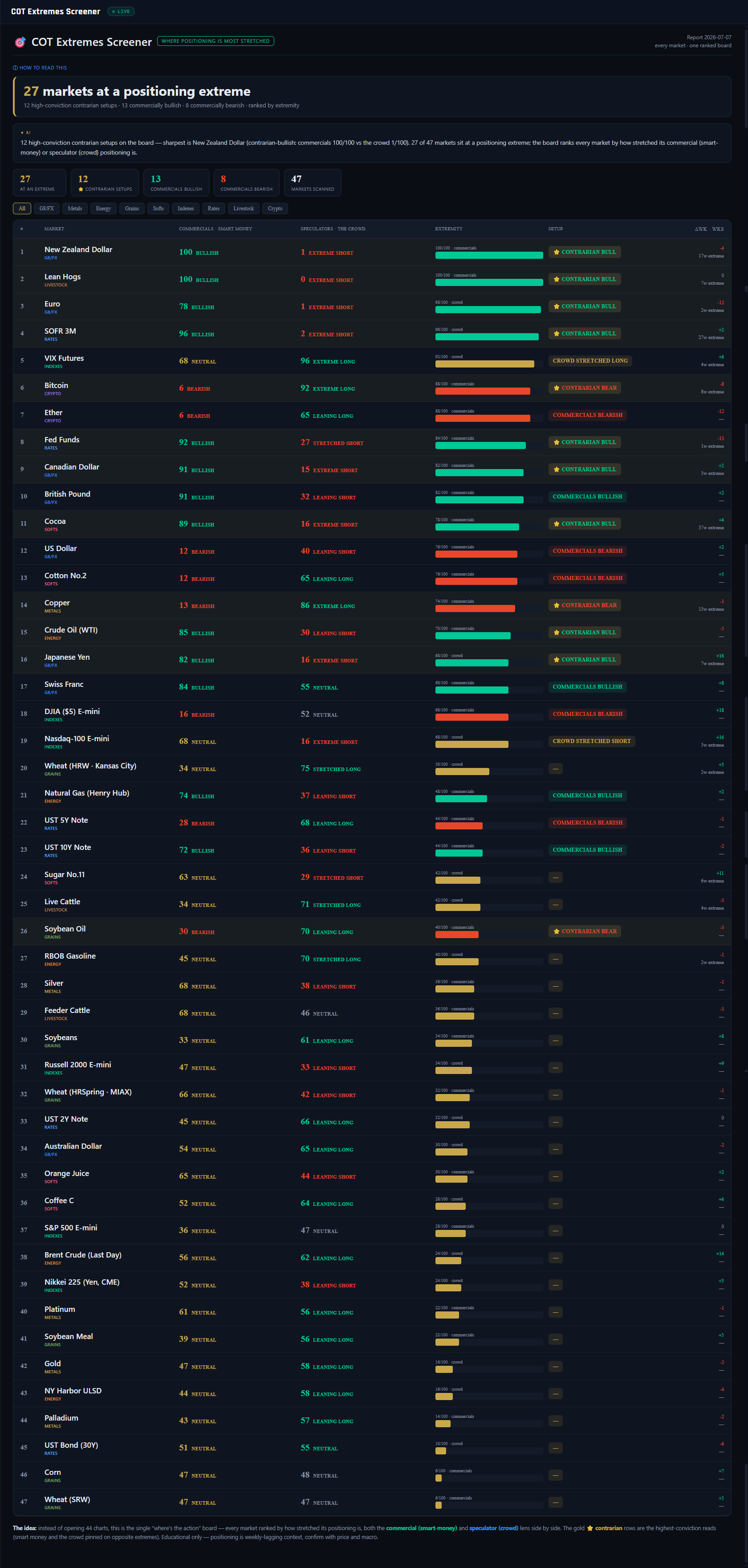
1
2
3
4
5
6
7
8
9
10
11
12
What it is
The "where's the action" board. Instead of opening 47 charts, the screener ranks every COT market by how stretched its positioning is — reading both legs at once: the commercial index (the hedgers) and the speculator index (Managed Money / Leveraged Funds, the professional crowd). One sorted table, most extreme at the top, with a setup chip that names what kind of stretch each market is showing.
What it measures
Each market's extremity is the more stretched of its two legs: distance of that leg's 0–100 index from a neutral 50, doubled back to a 0–100 scale. A market counts as "at a positioning extreme" once either leg reaches 70+ or 30-or-below. The setup chip then classifies the shape: ★ CONTRARIAN BULL / BEAR — the high-conviction pattern, commercials AND the crowd both pinned at opposite extremes (on this screenshot, NZD ranks #1 with commercials at 100 against the crowd at 1); COMMERCIALS BULLISH / BEARISH — the hedger leg alone is extreme; CROWD STRETCHED LONG / SHORT — only the speculators are extended, which reads as caution rather than a directional lean.
Why it's useful to you
It solves the search problem, honestly. But understand what the ranking is: extremity is a level, not readiness. The board tells you where the spring is most stretched — it says nothing about whether the spring is about to release, and extremes routinely persist for weeks. So work it as radar, then vetting: the screener produces this week's shortlist; the single-market engines — Pressure & Squeeze, Unwind Tracker, Crowding — tell you whether any name on it is actually primed. A market that tops this board AND shows a pressurized spring is a genuine candidate; a market that merely tops this board is a headline.
The 10-second read
Summary tiles, then the ★ CONTRARIAN rows at the top. Anything starred on your watchlist goes straight to the Pressure gauge for vetting. Done.
Use it with: Pressure & Squeeze (is the stretch primed to release?) ·
Unwind Tracker (or already releasing?) ·
COT Triggers (which extremes are NEW this week, not standing)
1
Report date. The CFTC week the whole board reads (2026-07-07) — one ranked board per report, refreshed when the new release lands.
2
Headline banner. The census: "27 markets at a positioning extreme." A number this high isn't a buffet of trades — it tells you stretch is cheap this week and the vetting step matters more, not less.
3
AI note. The AI note names the sharpest setup on the board — here the New Zealand Dollar — and how many high-conviction contrarian patterns are live.
4
Summary tiles. 27 at extreme / 12 contrarian setups / 13 commercially bullish / 8 commercially bearish / 47 scanned. The bull-vs-bear split of the commercial extremes is a one-glance tilt of the whole futures landscape.
5
Class filter chips. All / G8FX / Metals / Energy… — narrow the board to your hunting ground without losing the cross-market ranking logic.
6
COMMERCIALS column. The hedgers' 0–100 index with a bias word. Platform convention: high = commercials heavily net long = bullish backdrop. This is the leg with the historical track record — the anchor of every setup classification.
7
SPECULATORS column. The professional crowd's index (Managed Money / Leveraged Funds). Read it as the mirror: a crowd pinned at 1 while commercials sit at 100 means the two sides of the market maximally disagree.
8
ΔWK · WKS column. This week's index change and how many consecutive weeks the market has been pinned. A 12-week-old extreme that stopped moving is stale; a fresh cross with momentum is a different conversation.
9
Row 1 — New Zealand Dollar. Commercials 100 vs crowd 1: the most stretched stand-off on the entire board, and a textbook contrarian-bull shape. Still a level — the vetting panels decide if it's ready.
10
EXTREMITY bar. The 0–100 ranking metric, drawn so you can see which side is pinned — teal toward the long/bullish edge, red toward the short/bearish edge.
11
SETUP chip. The classification: ★ CONTRARIAN BULL/BEAR (both legs extreme, opposite sides), COMMERCIALS BULLISH/BEARISH (hedger leg only), CROWD STRETCHED (speculator leg only — caution, not direction).
12
"The idea" footer. The board's own honest framing: one ranked view instead of 47 charts — a radar for where positioning is stretched, never a list of trades.
32COT Triggers — What Fired This Week
VaultWhole-board view
Nav → Advanced → COT Triggers
№ MAP PINS — the gold markers on this screenshot point at locations on the panel; each is explained in the legend beside it. (They are separate from the teal STEP numbers in Part 1.)
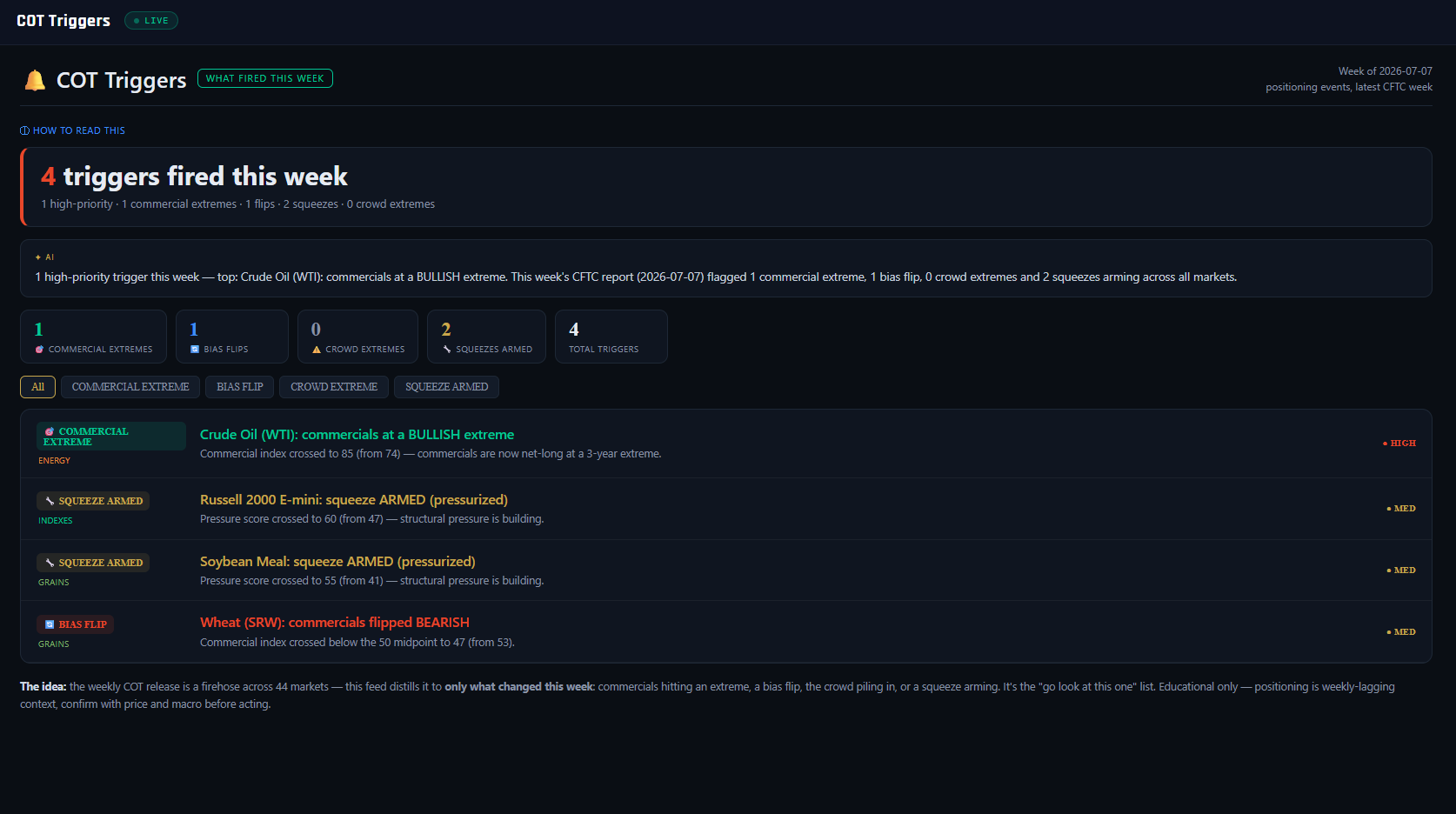
1
2
3
4
5
6
7
8
9
10
11
12
What it is
An event log. Every Friday the CFTC release is a firehose across the whole market universe — Triggers distills it to what actually changed. The panel compares the newest report week to the prior one, market by market, and logs only the crossings: a positioning index breaking into extreme territory, a commercial bias flipping sides, a squeeze arming. If nothing fired, the panel says "a quiet week" — silence is a valid output, and one of the most useful.
What it measures
Four event types, each a week-over-week crossing. COMMERCIAL EXTREME (high priority): the commercial index crossed into the 80+ or 20-and-below zone — the hedgers just reached a 3-year extreme, the platform's highest-value event. BIAS FLIP: the commercial index crossed the 50 midpoint — with a buffer (it must clear ~52 from below ~48, and vice versa) so week-to-week wobble around 50 can't spam the feed. CROWD EXTREME: the speculator index crossed 80/20 — trend-followers just piled in, a crowded-exit caution rather than a directional call. SQUEEZE ARMED: a market's pressure score crossed the pressurized threshold (55) or went critical (80). Priority (HIGH / MED) follows the event's weight, and the counter tiles total each type.
Why it's useful to you
The Extremes Screener answers "where is positioning stretched?" — a snapshot that can look nearly identical for weeks. Triggers answers the sharper question: what is new this week? A commercial extreme that's been standing for two months is background; the week it first crosses is information. This is the panel that turns the weekly release into a five-minute routine — open it after each report, read the fired events, and let the rest of the board stay unopened with a clear conscience.
The 10-second read
Headline count, then the HIGH-priority rows. Anything on your watchlist that fired gets a full read in Market HQ; a quiet week means your existing view stands.
Use it with: Extremes Screener (the standing extremes behind the new ones) ·
Pressure & Squeeze (open on any squeeze-armed market) ·
Market HQ (the full read on whatever fired)
1
Panel title. "COT Triggers — what fired this week." Events, not levels: everything below happened on this report, not before it.
2
Week chip. The CFTC week being compared (2026-07-07, the latest release). Every trigger is a change from the report one week earlier.
3
Headline. "4 triggers fired this week" plus the breakdown line. Four events out of the whole universe is a normal week — the panel's job is exactly this compression.
4
AI summary strip. The AI summary leads with the top event — here Crude Oil (WTI) — and totals the week's extremes, flips and squeezes in one sentence.
5
Counter tiles. 1 commercial extreme / 1 bias flip / 0 crowd extremes / 2 squeezes armed / 4 total. The mix matters: a week heavy on commercial extremes reads very differently from one heavy on crowd extremes.
6
Filter chips. All / COMMERCIAL EXTREME / BIAS FLIP / CROWD EXTREME / SQUEEZE ARMED — isolate one event type when you're working a specific playbook.
7
Trigger 1 — Crude Oil (WTI). Commercials crossed to a BULLISH extreme, index 74 → 85. The exact crossing week of the platform's highest-value event — this is what the whole panel exists to catch.
8
Priority column. HIGH for commercial extremes and critical squeezes, MED for flips, crowd extremes and standard armings. Sort your attention top-down.
9
Trigger 2 — Russell 2000. Squeeze ARMED: the pressure score crossed the pressurized line, 47 → 60. Structural pressure is now building — a cue to open the Pressure gauge, not to act.
10
Trigger 3 — Soybean Meal. Second squeeze arming of the week. Two unrelated markets arming in the same report is coincidence until the Pressure gauge says otherwise — check each on its own merits.
11
Trigger 4 — Wheat (SRW). Commercials flipped BEARISH, crossing the 50 midpoint (53 → 47). A flip is direction news, not extreme news — the hedgers changed sides, but from mid-range, not from a 3-year edge.
12
"The idea" footer. The panel's own framing: the weekly firehose distilled to what changed. Read it once after every release; when it's quiet, that IS the read.
GROUPReference & education
33COT Pressure Gauge (Legacy) — The Original Squeeze Desk
VaultReference view
Nav → Reference → Pressure Gauge & Squeeze
№ MAP PINS — the gold markers on this screenshot point at locations on the panel; each is explained in the legend beside it. (They are separate from the teal STEP numbers in Part 1.)
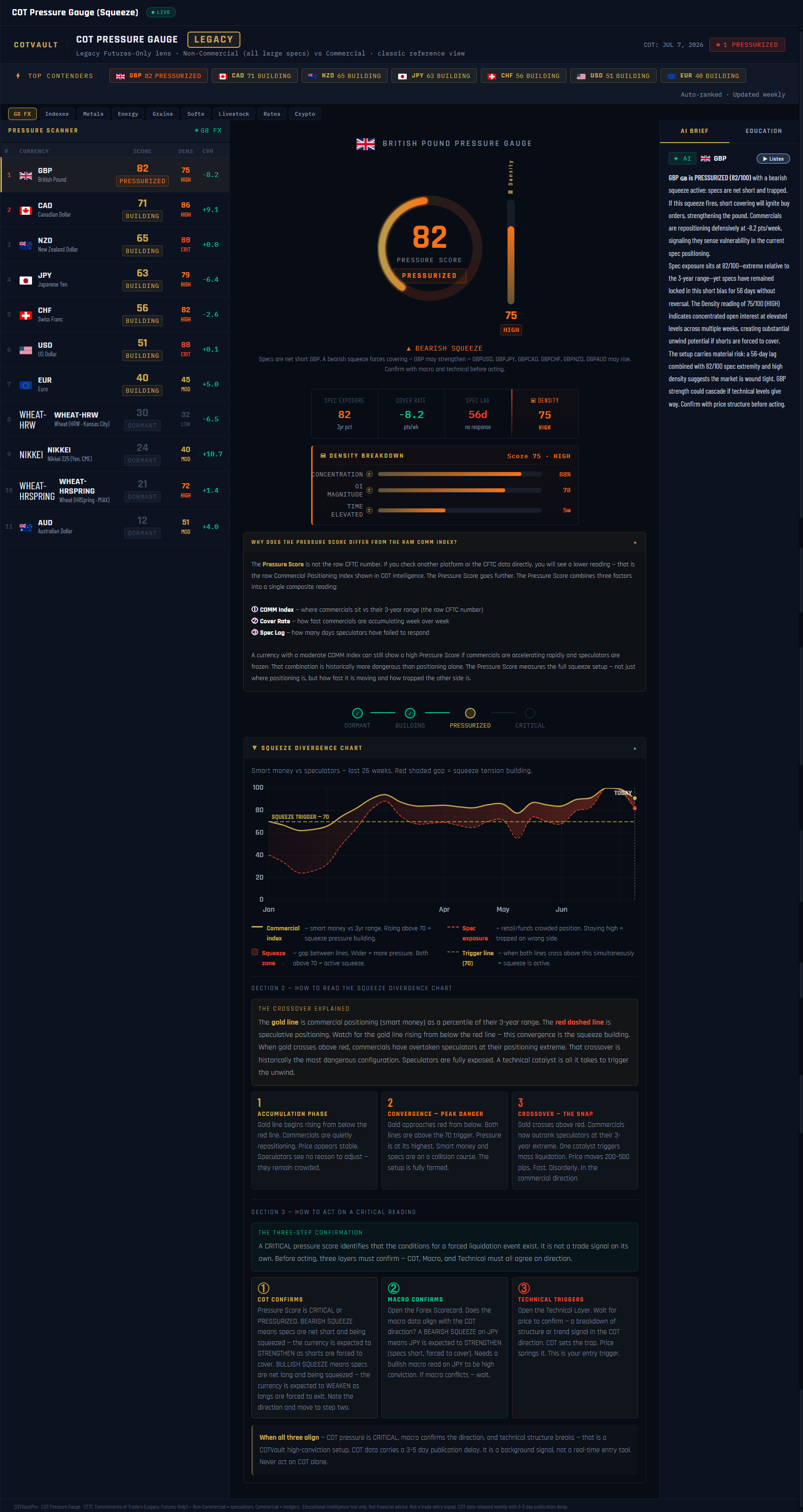
1
2
3
4
5
6
7
8
9
10
11
12
What it is
The platform's original squeeze desk, kept deliberately as a reference view. It runs its own pressure model on the Legacy futures-only report — Non-Commercials (all large speculators as one group) versus Commercials — while the Advanced-tier Pressure & Squeeze Gauge reads the Disaggregated/TFF report (Managed Money or Leveraged Funds versus the hedger categories). Different report family, different cohort split — so the two gauges can legitimately disagree, and that's the point: this one is the classic, coarser lens, and a second opinion on the same spring. When both read pressurized, take notice.
What it measures
The Pressure Score (0–100) is a three-input composite built from the COMM Index: spec exposure (55% weight — how far the COMM Index sits from a neutral 50, doubled; in the Legacy report the speculators are the commercials' mirror, so this is how extreme the stand-off is), commercial cover rate (25% — the week-over-week change in the COMM Index, i.e. how fast the hedgers are repositioning), and spec lag (20% — how long positioning has stayed pinned at an extreme). The ladder: DORMANT 0–39 → BUILDING 40–74 → PRESSURIZED 75–89 → CRITICAL 90–100. The separate Density index answers "how much fuel?" — concentration of the stand-off (45%), market size via OI percentile (35%), and time elevated (20%). High pressure in a dense market unwinds hard; both CRITICAL at once is the panel's kill-zone condition.
Why it's useful to you
Squeezes are where COT stops being slow context and starts explaining violent weeks. When one side of a market is extreme, stale and concentrated, its exit is small — a catalyst forces covering, covering moves price, and the move feeds itself. This panel scores that stored energy per currency, names the trapped side (a bearish squeeze means the speculators are net short and trapped — resolution forces the currency up as they cover), and then hands you the discipline: the three-step confirmation at the bottom insists COT, macro and your own technicals agree before anything becomes a trade. Pressure is potential energy — never a trigger by itself.
The 10-second read
TOP CONTENDERS strip: anything PRESSURIZED or CRITICAL? Click it, read the squeeze direction and density, then cross-check the Advanced gauge. Two lenses agreeing beats one lens screaming.
Use it with: Pressure & Squeeze Gauge (the canonical Disaggregated/TFF model — compare the two reads) ·
Unwind Tracker (has the release started?) ·
COT Triggers (the week a squeeze arms, logged)
1
Title + LEGACY badge. The badge is a data label, not an age warning: this gauge reads the CFTC's Legacy futures-only report — Non-Commercial (all large specs) vs Commercial — the classic reference lens.
2
TOP CONTENDERS strip. The highest-pressure markets right now — GBP 82 PRESSURIZED, CAD 71 BUILDING… Your entry point into the panel every week.
3
Pressure Scanner table. Every market ranked by pressure score (the class filter defaults to G8 FX). Click a row to load its full gauge — GBP is selected here.
4
SCORE / DENSITY / CVR columns. The composite score, the fuel index, and the cover rate (CVR — this week's COMM Index change). A high score with a big cover rate means the hedgers are already moving.
5
Circular gauge. The selected market's pressure score — GBP at 82, PRESSURIZED. One number for how coiled the commercials-vs-speculators spring is.
6
Density thermometer. 75 — HIGH. The breakdown below it shows the inputs: concentration of the stand-off 88, OI magnitude 78, time elevated 5 weeks. Pressure says a move is loaded; density says how big the tank is.
7
Squeeze direction verdict. BEARISH SQUEEZE — commercials are net long, so the speculators are net short and trapped. Resolution of a bearish squeeze forces the currency up as the shorts cover: GBPUSD and GBPJPY rising.
8
Metric cards. The composite, unbundled: SPEC EXPOSURE 82 · COVER RATE −8.2 (the COMM Index moved 8.2 points this week — fast hedger repositioning) · SPEC LAG 56 days pinned at an extreme · DENSITY 75. The panel also explains why this composite can differ from the raw COMM Index alone.
9
AI BRIEF column. The AI narrative for the selected currency — what the score, density and direction add up to this week — with a Listen button.
10
Stage strip. DORMANT → BUILDING → PRESSURIZED → CRITICAL, with the current market placed on it. CRITICAL plus CRITICAL density is the kill-zone configuration — maximum stored energy, disorderly unwind risk.
11
Squeeze divergence chart. The gold commercial index line against the red spec exposure line over 26 weeks, with the trigger line at 70. The panel reads the sequence as accumulation → convergence → crossover — the lines converging and crossing is historically the most dangerous configuration, the spring at full compression.
12
Three-step confirmation. The discipline block: COT confirms → macro confirms → your technicals trigger. Pressure alone never places the trade; extremes can persist for weeks before resolving, and this panel says so in its own footer.
34COT Academy — The 30-Lesson Course
Vault · all 30 lessons30-lesson course
Nav → Advanced → COT Academy
№ MAP PINS — the gold markers on this screenshot point at locations on the panel; each is explained in the legend beside it. (They are separate from the teal STEP numbers in Part 1.)
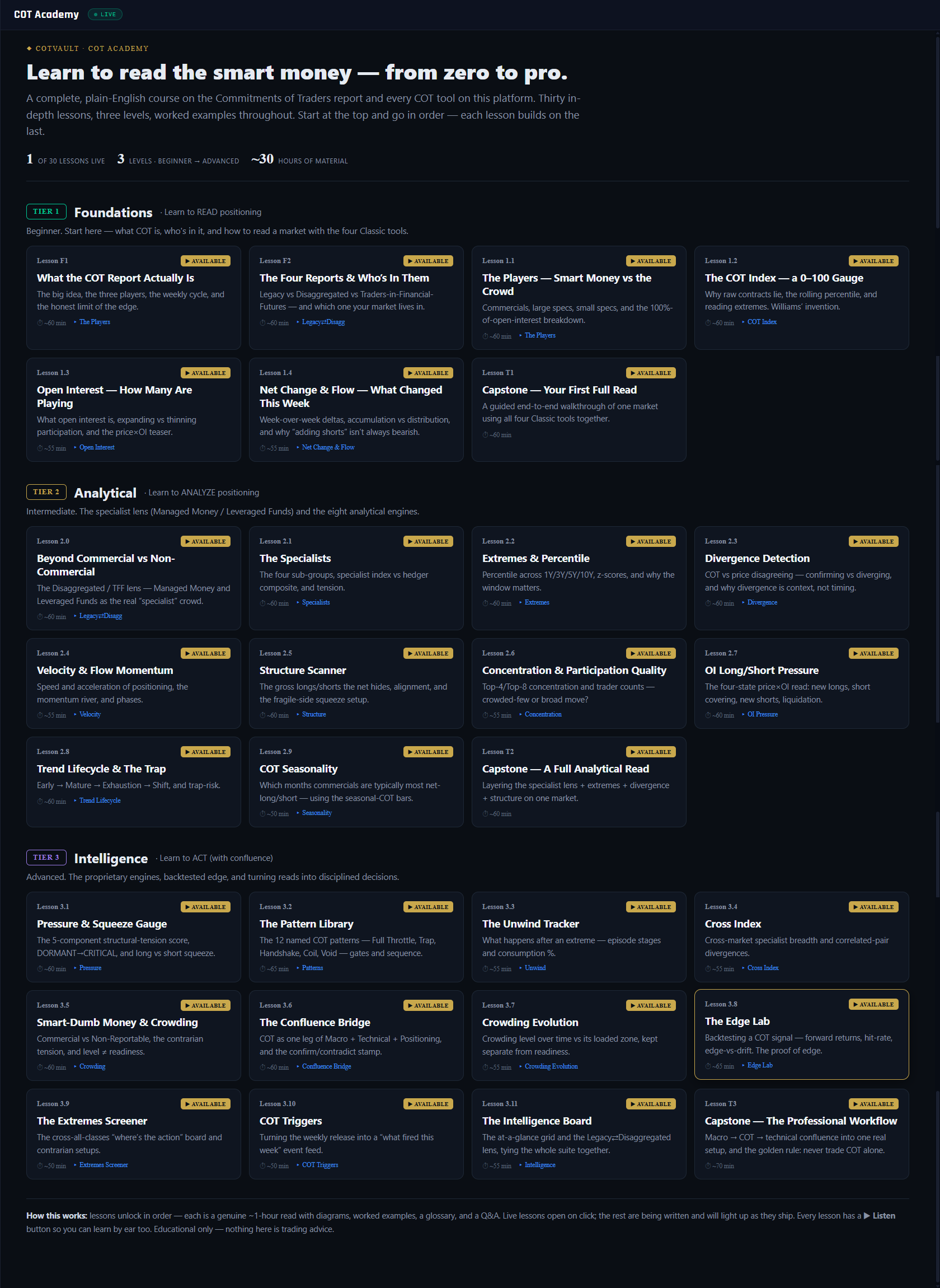
1
2
3
4
5
6
7
8
9
10
11
12
What it is
The Academy is the classroom behind every panel in this manual: a complete, plain-English course on the Commitments of Traders report and every COT tool on the platform. Thirty in-depth lessons across three levels — each a genuine ~1-hour read with diagrams, worked examples, a glossary and a Q&A — designed to be taken in order, because each lesson builds on the last.
What it measures
Nothing live — this is the one entry in the manual with no gauges. Instead it maps the curriculum: Tier 1 Foundations (7 lessons — what the COT report is, the three trader groups, the COT Index, open interest, weekly flow, capped by a full guided read), Tier 2 Analytical (11 lessons — the Disaggregated and TFF reports, the specialist cohorts, extremes, divergence, velocity, structure, concentration, OI pressure, lifecycle, seasonality), and Tier 3 Intelligence (12 lessons — the proprietary engines: pressure, patterns, unwind, cross index, crowding, the confluence bridge, the Edge Lab backtests, screeners, triggers, and the professional workflow capstone). Every lesson is tied to the live panel it teaches, so theory and tool stay one click apart.
Why it's useful to you
Every panel on this platform is readable in ten seconds — but the traders who profit from COT are the ones who understand why the gauges say what they say: why Commercials fade trends, why raw contract counts lie without a percentile, why an extreme is fuel rather than a trigger. The Academy is the difference between renting the platform's conclusions and owning the method. Tier 1 alone will change how you read every board in Part 2 of this manual.
The 10-second read
Check the progress strip for what's live, then start at the top of Tier 1 and go in order. Lessons unlock sequentially — there is no useful way to skip ahead.
Use it with: The Players (the panel Lesson F1 teaches first) ·
COT Checklist (practice the Tier 1 capstone routine live) ·
Edge Lab (Lesson 3.8's proof-of-edge, live)
1
Hero — the course promise. From zero to pro: a complete course on reading institutional positioning, written in plain English with worked examples throughout. The instruction under it is the only study plan you need: start at the top, go in order.
2
Progress strip. Three counters: lessons live (1 of 30 at the time of the screenshot — the rest light up as they ship), 3 levels from beginner to advanced, and ~30 hours of total material. Roughly one hour per lesson is the honest expectation.
3
TIER 1 — Foundations · "Learn to READ positioning." Beginner. Seven lessons: what the COT report actually is, the four report types and who's in them, the three trader groups, the COT Index, open interest, and net change & flow — the four Classic tools, one lesson each.
4
Lesson card F1 + AVAILABLE badge. "What the COT Report Actually Is" — the big idea, the three players, the weekly cycle, and the honest limit of the edge. The AVAILABLE badge marks live lessons; cards without it are written next and light up when they ship. Each card names the panel it teaches and its reading time.
5
Tier 1 Capstone — Your First Full Read. A guided end-to-end walkthrough of one market using all four Classic tools together. Each tier ends with a capstone like this: the lessons teach the lenses, the capstone teaches the sequence.
6
TIER 2 — Analytical · "Learn to ANALYZE positioning." Intermediate. Eleven lessons opening with the Disaggregated/TFF lens (Managed Money and Leveraged Funds as the true specialist crowd), then one lesson per analytical engine: extremes, divergence, velocity, structure, concentration, OI pressure, lifecycle, seasonality.
7
Lesson 2.0 — Beyond Commercial vs Non-Commercial. The gateway lesson of Tier 2: why the Legacy two-group split is the beginner's view, and how the professional reports carve the same open interest into sharper cohorts.
8
Tier 2 Capstone — A Full Analytical Read. Layering the specialist lens, extremes, divergence and structure on one market — the routine the Market HQ and Checklist panels automate for you.
9
TIER 3 — Intelligence · "Learn to ACT (with confluence)." Advanced. Twelve lessons on the proprietary engines — pressure & squeeze, the 12-pattern library, the unwind tracker, cross index, crowding, the confluence bridge, screeners and triggers — and on turning reads into disciplined decisions.
10
Lesson 3.8 — The Edge Lab. Backtesting a COT signal: forward returns, hit rates, edge versus drift. The lesson that separates believing a signal works from knowing its base rate — the platform's honesty policy, taught.
11
Tier 3 Capstone — The Professional Workflow. Macro → COT → technical confluence assembled into one real setup, and the golden rule the whole course keeps returning to: never trade COT alone.
12
HOW THIS WORKS footer. The mechanics: lessons unlock in order, live ones open on click, and every lesson carries a ▶ Listen button so you can take the course by ear. Educational only — nothing in the Academy is trading advice.
Educational reference only. COT positioning is weekly, lagging context — never act on it alone. Source: CFTC Commitments of Traders. © COTVault