08COMM Index Chart — Price Over Positioning
VaultSingle-market view
COT by Market → click either history chart
№ MAP PINS — the gold markers on this screenshot point at locations on the panel; each is explained in the legend beside it. (They are separate from the teal STEP numbers in Part 1.)
1
2
3
4
5
6
7
8
What it is
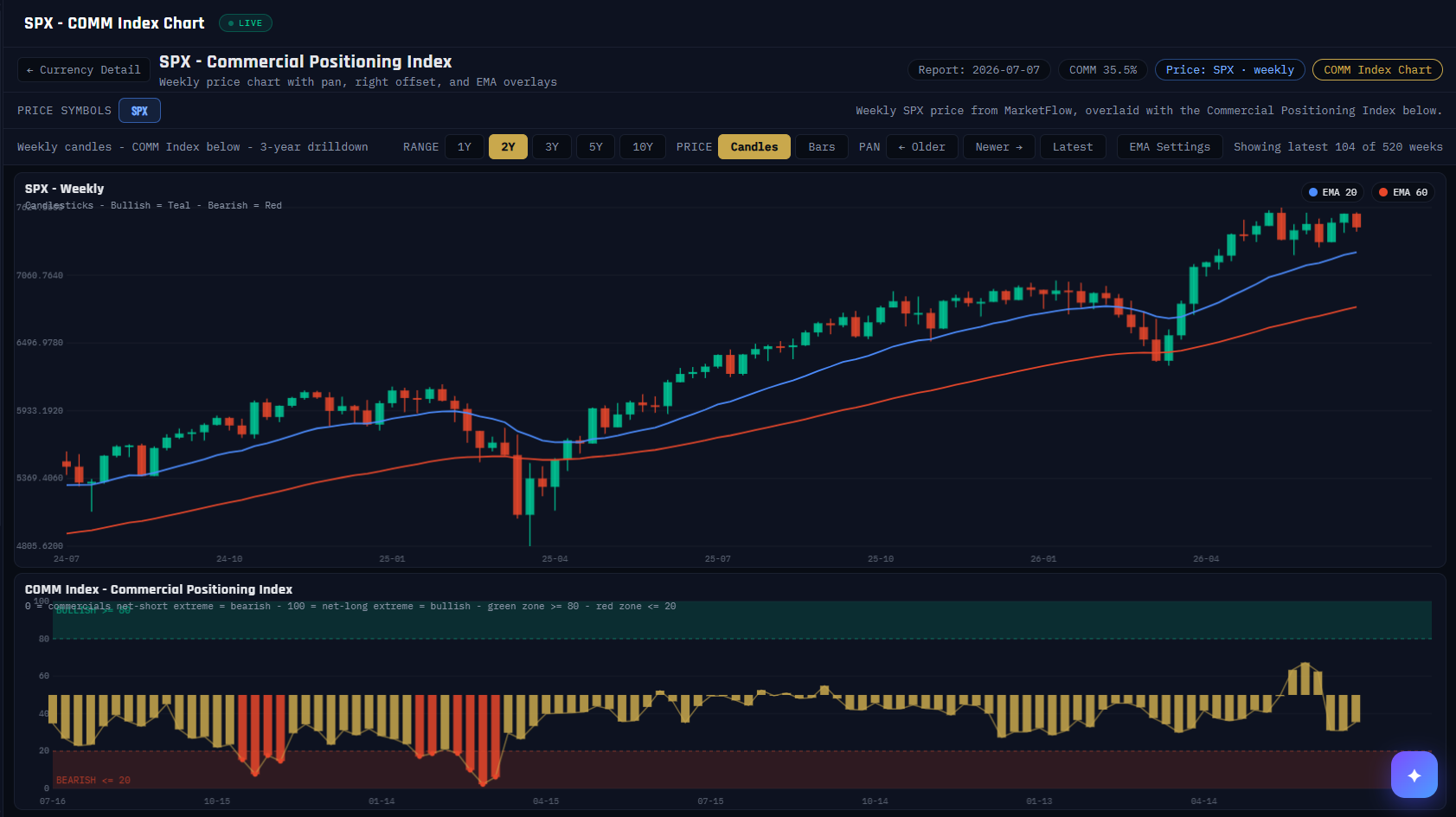
The panel where positioning finally meets price: weekly candles on top, the Commercial Positioning Index bar-for-bar underneath, on one shared timeline. This is where the theory of every other panel becomes visible — you can see commercial extremes lining up with turns in the actual chart.
What it measures
Top pane: weekly OHLC candles (teal up, red down) with 20- and 60-week EMA overlays, pannable across up to ten years. Bottom pane: the COMM Index, 0–100 — on this chart 100 = commercials at their net-long extreme = bullish backdrop, with the green zone ≥ 80 and red zone ≤ 20 shaded on the scale itself.
Why it's useful to you
It’s the receipts for the contrarian thesis. Scroll any market’s history and watch what happened after the bars pinned in a zone. It’s also the honesty check — you’ll see extremes that resolved slowly or late, which is exactly why the platform pairs positioning with pressure, readiness and your own price analysis before anything is acted on.
The 10-second read
Find the last time the lower pane entered a shaded zone, then look straight up at what the candles did next. Repeat across history — that’s the panel’s whole lesson.
Use it with: COT by Market (above) ·
The COT Index ·
Divergence Detection
1
Title + back link. Which market and which lens (COMM here; a SPEC variant exists for the crowd’s side), with a one-click return to the detail page.
2
Context chips. The report week, the current COMM Index reading, and the price series being drawn (weekly, from the live price feed).
3
Range + style controls. 1Y–10Y windows, candles or bars, and PAN to walk backward through history — Older / Newer / Latest.
4
Window counter. How much of the available history you’re seeing (here 104 of 520 weeks).
5
Price pane. Weekly candles with EMA-20 and EMA-60 overlays — enough structure to see trend without turning this into a trading terminal.
6
EMA legend. Which overlay is which; EMA settings are adjustable.
7
COMM Index pane. The same weeks as the candles above, bar for bar. Gold bars = mid-range; bars turn red in the bearish zone. Alignment with the price pane is the entire point.
8
The zones. BULLISH ≥ 80 (commercials near their net-long extreme) and BEARISH ≤ 20 shaded directly on the scale — no mental math required.